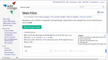
@Anomie pointed out the newline between the "Namespace:" label and the selector doesn't look very nice. And I then noticed there's a giant space between the checkboxes and the "Go" button.
Description
Related Objects
- Mentioned In
- rMW940815a8ebdb: Revert "Use OOUI HTMLForm for Special:Watchlist"
rMW8fd96347747e: Revert "Use OOUI HTMLForm for Special:Watchlist"
T107414: Box 'Watchlist options' too wide on de.wikivoyage
T99256: Convert non-JS version of Special:Watchlist to HTMLForm (Codex) - Mentioned Here
- T107414: Box 'Watchlist options' too wide on de.wikivoyage
T99256: Convert non-JS version of Special:Watchlist to HTMLForm (Codex)
Event Timeline
The namespaceselector is wrapped in a PaneLayout, which has a fixed width of 60em (in OOUI default 50em), and all elements in the namespace selector has display table-cell. The NamespaceInputWidget inherits an OOUI-widget where this is the default and expected, but that doesn't look very good here. @matmarex said yesterday[1] (iirc) that he want's to rewrite the NamespaceInputWidget anyway, because it doesn't support title and id and other attributes for each element in it out of the box. I don't know, how this will look like, but I think something like a horizontal Widget, where each element (including the label) is inline-aligned. I don't want to slide in MatmaRex's work, if he already is working on it?
My plan for NamespaceInputWidget is:
- Implement a FlowLayout in OOjs UI, that would arrange its contents in a single line (using display: inline-block for its items)
- Extend OOjs UI's PHP LabelWidget, so that passing a input config option will generate an actual <label for> pointing to the right widget, possibly generating the id attribute where necessary
Then:
- Refactor NamespaceInputWidget into two, NamespaceInputWidget + ComplexNamespaceInputWidget: the former would be only the dropdown (and inherit from DropdownInputWidget), the latter would be dropdown plus two checkboxes
- Use the new LabelWidgets for checkbox labels, to replace the FieldLayouts
- Use the new FlowLayout to wrap the dropdown and checkboxes, to replace custom CSS we have
- Refactor ComplexNamespaceInputWidget to take nested configuration options for invert, associated, and namespace, rather than require parameters like invertName and so on for every combination. We already have this on JS side in e.g. PopupButtonWidget to pass all the parameters for the PopupWidget inside using popup config option, or in DropdownWidget to pass parameters for the MenuSelectWidget inside using the menu config option.
(If anybody wants to work on it, or has better ideas, feel free to start. Otherwise I plan to do it tomorrow.)
From a functional perspective: While I find this spacy style useful on mobile devices (big fingers ...), on desktop I have a very precise mouse and a good screen and good light conditions so there is no need for the space.
If a designer would contradict, then I'd ask the designer to present a concept for an overhaul of the entire watchlist, as design should not be only awesome to look at but also functional. As of now, the watchlist is not really nice to look at - in particular the entries are squashed together while the form controls are spacy - and part of their functionality was lost by wasting >100px.
I spotted the new OO UI design earlier in other forms but on the watchlist it is the first time for me that the design looks
overdimensioned:
- Colored buttons very prominent on the page -> eye catcher what I do not like on the watchlist
- Too much white space around the OO UI elements
- No wrap in case of lower screen resolution as FriedhelmW mentioned
Hmm, I didn't realize that there's no line-wrapping on the namespace selection form now, that is definitely problematic and probably should be fixed now rather than soon.
From T107414:
(I can't do it now, but I'll investigate this in a few hours and submit a simple fix, or a revert until we solve the problem.)
The whitespace is indeed too much and the difference in button size is huge. Also, because this was not communicated to the local communities, this is even a much bigger change because it's suddenly there. It's just a few minutes live and people already start complaining at my homewiki (nlwiki).
Reverted in https://gerrit.wikimedia.org/r/#/c/228046/. The lack of communication was a failure on my part, I shouldn't have merged this right before the branch cut. I've re-opened T99256 and will copy over the relevant comments.
That probably a side-effect of using display:table-cell without any parent element having any display:table dealing with auto margins, width etc. You're better off like you said earlier going with display:inline-block to keep everything in a single "row".


