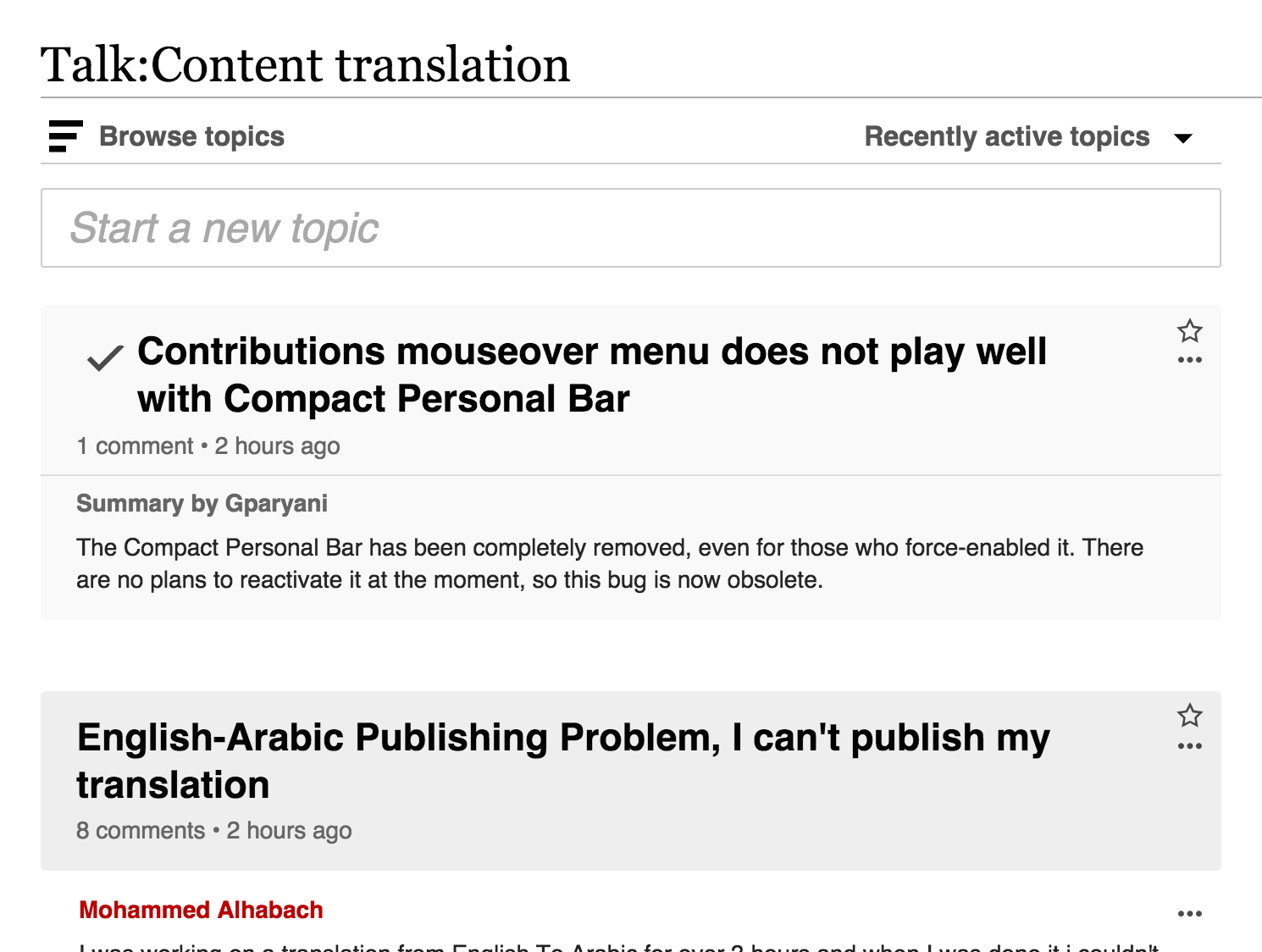
Reduce topic title from 1.75em to 1.5em.
Make sure that the checkmark lines up with the new title size.
We may make some small adjustments to the margins at the top and bottom of the topic header; we'll eyeball it and see what looks good.
| • DannyH | |
| Aug 6 2015, 10:59 PM |
| F2541306: Screen Shot 2015-09-04 at 2.59.21 PM.png | |
| Sep 4 2015, 10:01 PM |
| F2541305: Screen Shot 2015-09-04 at 2.59.30 PM.png | |
| Sep 4 2015, 10:01 PM |
| F2458842: Screen Shot 2015-08-27 at 09.06.42.png | |
| Aug 27 2015, 1:09 PM |
| F2458828: Screen Shot 2015-08-27 at 09.06.34.png | |
| Aug 27 2015, 1:09 PM |
| F2367786: flow-font-16em.png | |
| Aug 26 2015, 9:18 AM |
| F2367782: flow-font-175em.png | |
| Aug 26 2015, 9:18 AM |
| F2367789: flow-font-15em.png | |
| Aug 26 2015, 9:18 AM |
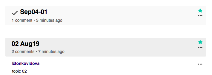
Reduce topic title from 1.75em to 1.5em.
Make sure that the checkmark lines up with the new title size.
We may make some small adjustments to the margins at the top and bottom of the topic header; we'll eyeball it and see what looks good.
Using a big font size can help with scalability (which is useful in long boards especially when search and filtering is not available) but does not work that well with long topic titles. After some considerations, I think it can be worth it to reduce the font size but trying not to go too far. I'd propose going with 1.6em. More details below.
Currently, the topic headers font size is 1.75em (which results in 24.5px). The standard Mediawiki subheader is 1.5em (which results in 21px) but it also has a bottom border which makes the whole element to look higher.
I'd recommend going with something in between the above range.
I won't use lower values since the size may become too close to the content font that may make the size hierarchy less clear, and may require more attention when skimming a long board.
I applied the sizes to illustrate the differences below (feel free to expand the image and move next to compare sizes more clearly):
Current (1.75em):
Proposed (1.6em):
Smaller (1.5em):
Additional considerations
Note that as the size of the title is reduced, the tick mark of resolved topics looks more misaligned. We need to make sure it aligns properly to the same side as the text content.
1.5em still looks very big to me. Can we see what it looks like, going down past the level that's actually too small? It would help to see what that whole range looks like.
Change 234171 had a related patch set uploaded (by Catrope):
Reduce font size and vertical padding of topic header
As the outcome of the last discussion about this design change:
Regarding the patchset, beyond the font-size aspects:
My urgency about this came from the conversations I had at Wikimania. There was a sizeable number of people that I talked to about Flow who independently brought up how much they dislike the size of the topic header. Even people who are huge Flow supporters and love the functionality have gone out of their way to tell me that the header is too big.
There comes a time in every product manager's life when you have to say, you know what? Maybe the header is just too big.
Change 234448 had a related patch set uploaded (by Catrope):
Hackily move the check icon a bit so it appears to align better
The tick mark is actually aligned, DOM-wise; it's just that the SVG itself has blank space all around it, which is making it appear unaligned. The patch above (which I made a separate patch because it also depends on an RTL fix) hacks around this by setting a negative margin that's about the same as the distance between the edge of the check mark and the SVG's box.
There comes a time in every product manager's life when you have to say, you know what? Maybe the header is just too big.
Just to clarify, in case there is any confusion: I have not opposed to the idea of reducing the current size of the Flow headings any single time in the whole discussion in this ticket.
I proposed to start with a 9% reduction, for which I gave a rationale, and I'm open to consider further steps based on more detailed user feedback once the change is in use by our users. You seem to prefer a 14% reduction instead, but I really don't see how the specific amount to reduce is derived from community input or any detail on which especific issues is solving much better than the reduction proposed.
Change 234171 merged by jenkins-bot:
Reduce font size and vertical padding of topic header
Change 234448 merged by jenkins-bot:
Hackily move the check icon a bit so it appears to align better
Betalabs - reduced from 1.75em
div#content h2.flow-topic-title {
    font-size: 1.5em;
beta
vs