Page MenuHomePhabricator

Split notifications: minor display issues
Closed, ResolvedPublic

Description

1) The bell icon for Alerts stays in unseen state
From

.mw-echo-ui-notificationBadgeButtonPopupWidget-alert.oo-ui-flaggedElement-unseen > .oo-ui-buttonElement-button {
    background-color: #D11813;

Screen Shot 2015-09-03 at 10.12.02 AM.png (157×660 px, 27 KB)

After clicking on Alerts with red&unseen(inverted) icon - there'll still be the unseen img but displayed on a grey background:

Screen Shot 2015-09-03 at 12.16.54 PM.png (99×615 px, 21 KB)

.mw-echo-ui-notificationBadgeButtonPopupWidget > .oo-ui-buttonElement-button {
    border-radius: 0.2em;
    background-color: #d2d2d2;

Only after refreshing the page the unseen image changes:

Screen Shot 2015-09-03 at 12.17.56 PM.png (179×626 px, 28 KB)

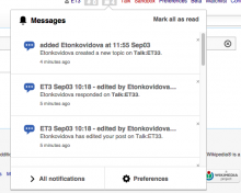
2) The upper horizontal line is not present anymore

Screen Shot 2015-09-03 at 12.00.16 PM.png (444×555 px, 75 KB)

mediawiki

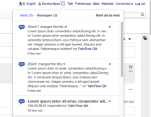
Screen Shot 2015-09-03 at 10.14.28 AM.png (478×615 px, 112 KB)

3) The small cross icon to mark a message as Read is placed too closely to the right edge. Look at the previous screenshot.
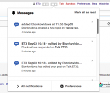
However, if click in the box, or hover - the cross icons moved away from the edge:

Screen Shot 2015-09-03 at 12.00.29 PM.png (462×542 px, 75 KB)

Event Timeline

Etonkovidova raised the priority of this task from to Needs Triage.
Etonkovidova updated the task description. (Show Details)
Etonkovidova subscribed.

Is #3 specific to Chrome?

It's happening because we're redrawing after the silly scrollbars appear :(
I don't know how to fix it except for showing scrollbars regardless and then getting rid of them after load or something hacky like that.

Is #3 specific to Chrome?

It's happening because we're redrawing after the silly scrollbars appear :(
I don't know how to fix it except for showing scrollbars regardless and then getting rid of them after load or something hacky like that.

I think there's a limit to how much time we have to spend working around bugs in specific browsers.

Yes, #3 seems to be specific to Chrome.

There is another teeny-tiny annoyance which presents only in FF - watch for a space above number in small notification counter boxes.

Screen Shot 2015-09-03 at 1.52.41 PM.png (164×629 px, 43 KB)

Screen Shot 2015-09-03 at 1.52.16 PM.png (204×641 px, 62 KB)

Change 235885 had a related patch set uploaded (by Mooeypoo):
Fix the badge icon update

https://gerrit.wikimedia.org/r/235885

Change 235891 had a related patch set uploaded (by Mooeypoo):
Add a border between the popup head and notification list

https://gerrit.wikimedia.org/r/235891

Change 235891 merged by jenkins-bot:
Add a border between the popup head and notification list

https://gerrit.wikimedia.org/r/235891

Change 235885 merged by jenkins-bot:
Fix the badge icon update

https://gerrit.wikimedia.org/r/235885

Checked in betalabs in Chrome and FF.

DannyH subscribed.

Beautiful, thank you for the super fast discovery, diagnosis and fix.