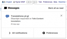
The notification panel footer (where the "all notifications" and "preferences" actions are available) seems too big compared to the header of the panel (where the Messages/Alerts title is shown).
There is no reason for giving such weight to the footer area. The footer of the panel should be reduced to be the same height as the header in order to provide a better balance.
