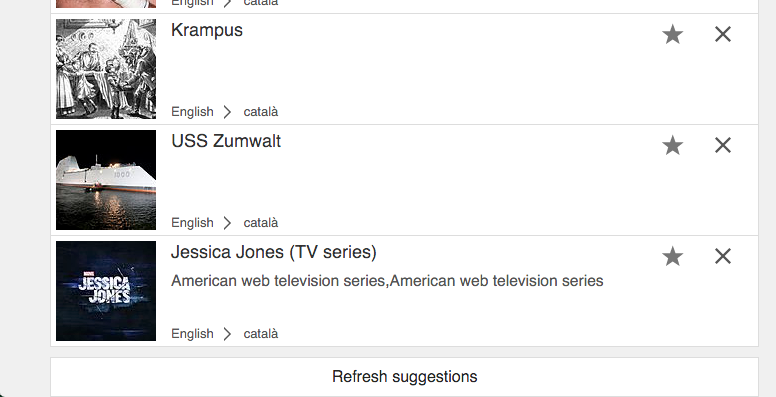
Currently the refresh action at the end of the suggestions list looks like this:
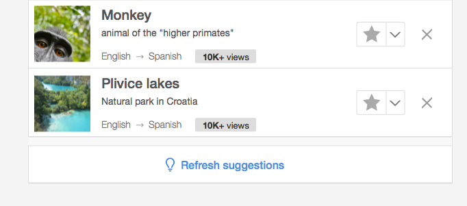
We may want to make it more easy to spot and better communicate that it is the next logical step at that point. For that purpose we can do the following:
- Adding an icon
- Making the action quiet-progressive (i.e., using a blue label).
- Adding some margin below the button so that it does not appear at the very end of the page.
This is illustrated below:
