| Before | After | After T145675 |
|---|---|---|
 |  |  |
Description
Description
Details
Details
| Subject | Repo | Branch | Lines +/- | |
|---|---|---|---|---|
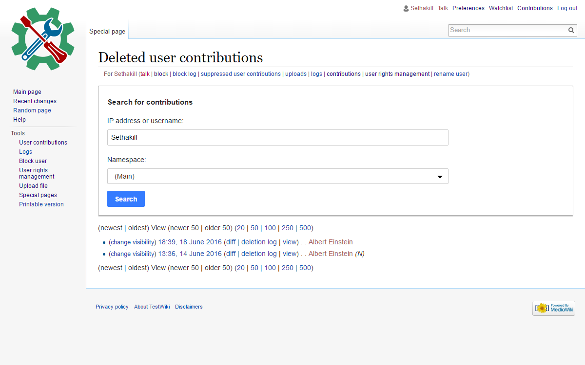
| Convert Special:DeletedContributions to use OOUI. | mediawiki/core | master | +51 -94 |
| Status | Subtype | Assigned | Task | ||
|---|---|---|---|---|---|
| Open | None | T49145 Formally deprecate jQuery UI after we've stopped using jQuery UI in extensions and core | |||
| Open | None | T100270 Replace use of jQuery UI and MW UI with OOUI across all Wikimedia-deployed extensions and core | |||
| Open | None | T100161 Convert all of MediaWiki core to OOUI PHP (tracking) | |||
| Open | None | T107037 Convert all MW core special pages to OOUI | |||
| Resolved | Sethakill | T134525 Convert Special:DeletedContributions to OOUI |
Event Timeline
Comment Actions
Change 287134 had a related patch set uploaded (by Sethakill):
Convert Special:DeletedContributions to use OOUI.
Comment Actions
Change 287134 merged by jenkins-bot:
Convert Special:DeletedContributions to use OOUI.
Comment Actions
Note: Some frustration was expressed regarding this change, at https://en.wikipedia.org/wiki/Wikipedia:Village_pump_(technical)#More_facebookery
I do agree that the layout seems to have degraded in this particular change, changing from a ~60px tall box, to a ~270px tall box (per screenshots in task description), without any benefit.
Is it currently possible to tweak this change, so that the 2 form elements and the submit button, are all arranged on a single line?
Or, Possibly the ongoing work to improve the density and other accessibility/usability issues, in T136790: Improve form layouts in OOUI MW core forms for better user experience, will improve (or enable the improvement of) this, and related, layout concerns?
CC @Volker_E and @Redrose64
Comment Actions
BTW, we get the same response every single time we do one of these switches and for good reasons (using all screen realestate for UI instead of content). That indicates to me that something is WRONG, and I haven't seen design take a step back on Special pages and properly analyze what a good special page SHOULD look like...
Can that step be taken please ?
Comment Actions
@Quiddity Thanks for providing the pointer. It's ~260px high box currently. No, we don't have a possibility to provide a side-by-side layout AND a top-to-bottom layout of field elements. Here's the catch, if we want to provide a sufficient experience to mobile users with our form views like in this task, which is an important goal of ours, we have to provide them with slightly bigger form widgets for touch interfaces.
There's research about top-to-bottom placement of labels on forms being superior on simple forms in terms of completion time, with the stated caveats that such layout requires more space and it's not ideal for very long forms.
@TheDJ Given the constraints from above and indication that on the opposite side of the critique, the new layout is an improvement for mobile users and it might be useful for new users versus a relearning moment for known users and needing more visual space:
- There's currently no way to rely on core central media queries (I think you've filed a task once) or CSS class for touch-enabled devices in order to adapt the layout (slightly) different approaches – I'm aware of such a solution causing maintenance costs and probably not greatly improving anything, so we should be careful on what path to take…
- How often do users change the form inputs on this view, I'm musing about a hide form after submit possibility with trigger functionality?!
Comment Actions
we have to provide them with slightly bigger form widgets for touch interfaces.
While I agree with the basic premise, anyone knows that there is no such thing as the perfect solution. As this in particular seems to be problematic, we should be looking for more creative solutions to maintain a powerful and information dense interface AND enable mobile usage. My problem is not the size nor the conversion, it's that we are not looking into how we can serve people that require an information dense interface. This seems like a significant challenge that is important to figure out, yet we don't even have a vision for how to do this (even if we are not starting right now).
How often do users change the form inputs on this view, I'm musing about a hide form after submit possibility with trigger functionality?!
I don't think we have metrics for that. But hiding seems a poor mans solution for an audience that requests 'more data' to be in view to serve their needs. What about using horizontal screenspace instead ? Just a thought.