When we are looking through forms on their way of being converted to OOjs UI, there are a few recurring shortcomings / glitches so far:
- People are criticizing the space needs in contrast to the old forms
- form elements don't seem to follow a grid or a pattern in distance to each other, to their labels. We're neglecting gestalt principle of proximity.
- usage of oo-ui-panelLayout-padded oo-ui-panelLayout-framed classes with it's 3D shadow disturb the connection to the rest of the forms
Related to those issues are
- problems with side-by-side arrangements of widgets as found often in current form layouts and
- currently no longer availability of fieldset and legend elements, which is very important for assistive technology (accessibility), see T131823.
White-space if implemented appropriately helps orientation in forms and getting tasks done quicker for users. Some of the criticism might come from familiarity with the old layout and having to re-learn. Listening carefully and adding side-by-side examples helps to clarify.
My proposals furthermore:
- To the second question, one promising way seems to be making all form elements just having applied margin-top / margin-right and override for :first-child instances to support back to IE 7+. With this and clear consistent values, a bit higher for in-between elements (1em) and lower for in between elements of a group (0.5em), like CheckboxMultiselectWidget or label for inputs, the proximity issue get's solved.
- We should also get rid of the oo-ui-panel-* classes and go instead for styling mw-htmlform-ooui-wrapper.
- Replacing paddings with margins as it's a weird use of property to create margins.
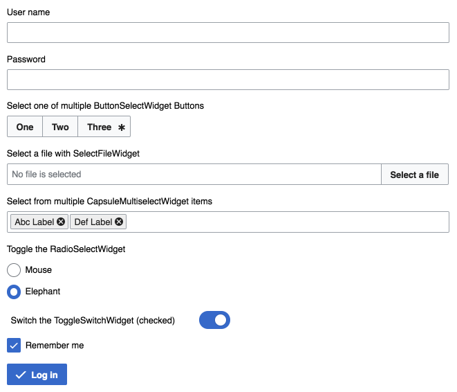
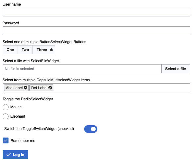
Before  | After (proposal)  |
Update 2018-04-02
- Aligning spacings to newly unified base font-size calculations