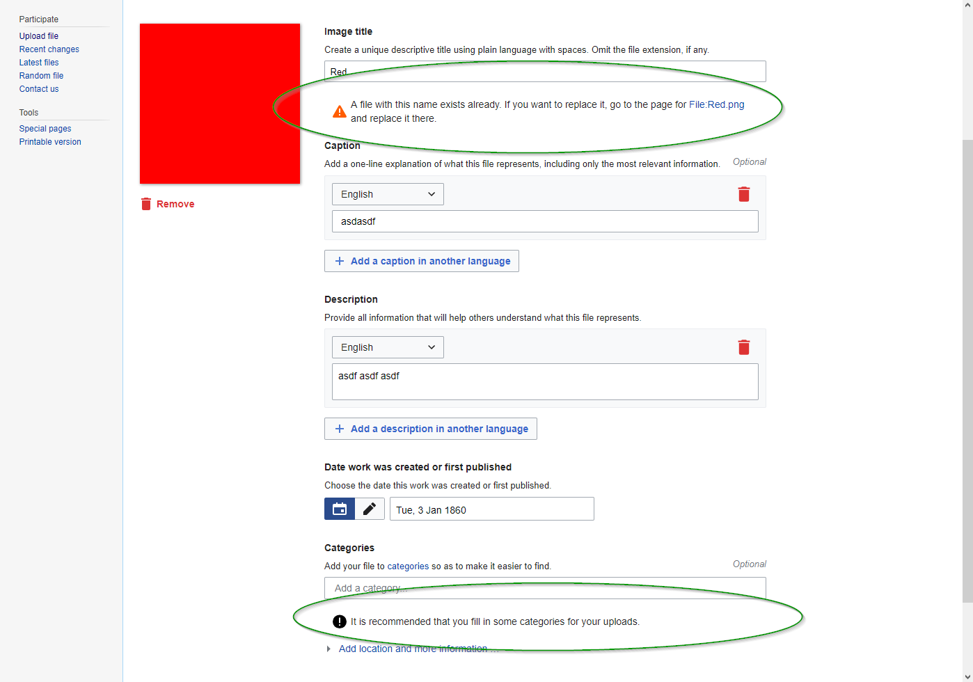
I think the styling in the Apex theme is actually a bit better. (Screenshots below are from https://gerrit.wikimedia.org/r/284902.)
| WikimediaUI | Apex |
|---|---|
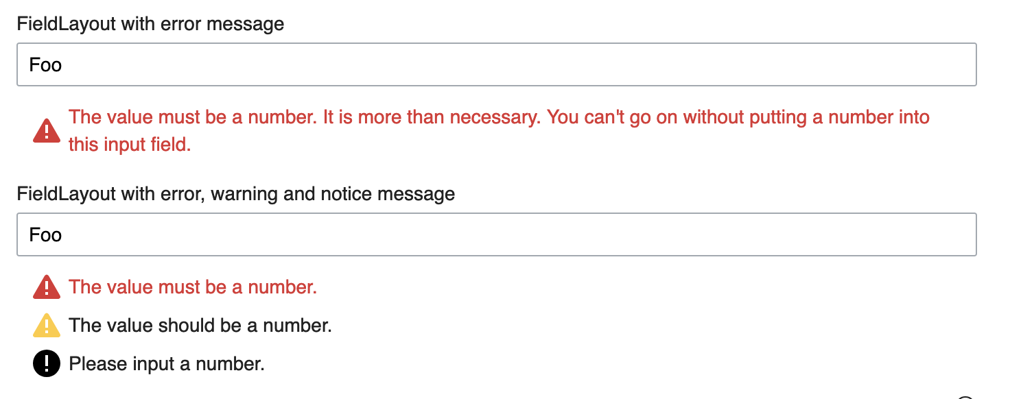
Warnings are even worse, they are set in the same font and color as any random label and only highlighted with a small icon.
The styles here were created by myself when implementing this feature (which we needed urgently for OOUI HTMLForm: T106947) and I probably spent about 30 seconds thinking about them. We should rethink them ;)
We might draw some inspiration from the success/warning/error message boxes in MediaWiki, see T127405: Review current style and integrate Messages and message boxes (errors, warnings) as WikimediaUI component.
Improvements integrated
| WikimediaUI | Apex |
 | 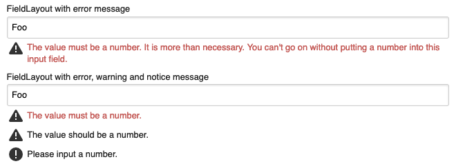 |
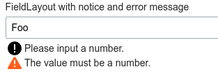
- Increased visibility by changing color of errors to destructive Red50,
- invented a separate warning message with a Yellow50 icon, but black text for achieving WCAG 2.0 level AA contrast (also makes code semantically cleaner)
- gonna provide a tad more whitespace to let messages better focus
- put icon on top position for immediate identification on mobile on multiline messages
- add icons to Apex for better message focus and identification
- clean up some unnecessary properties to remove code duplication