Page MenuHomePhabricator

Convert HistoryAction.php to use OOUI and MW's new DateInputWidget
Closed, ResolvedPublic

Assigned To
Authored By
Jdforrester-WMF
Jul 27 2015, 7:12 PM
Referenced Files
F28953767: image.png
May 7 2019, 12:48 PM
F28620202: T107069-HistoryAction-comparison.png
Apr 11 2019, 10:23 PM
F28604723: image.png
Apr 10 2019, 8:20 PM
F28598626: image.png
Apr 9 2019, 4:16 PM
F28596447: image.png
Apr 8 2019, 11:22 PM
F28596438: ss201904081914Capture.JPG
Apr 8 2019, 11:15 PM
F28596357: Screen Shot 2019-04-08 at 10.08.18 PM.png
Apr 8 2019, 10:11 PM
F28074885: image.png
Jan 31 2019, 1:15 AM
Tokens
"Dislike" token, awarded by Pppery."Party Time" token, awarded by Volker_E.

Description

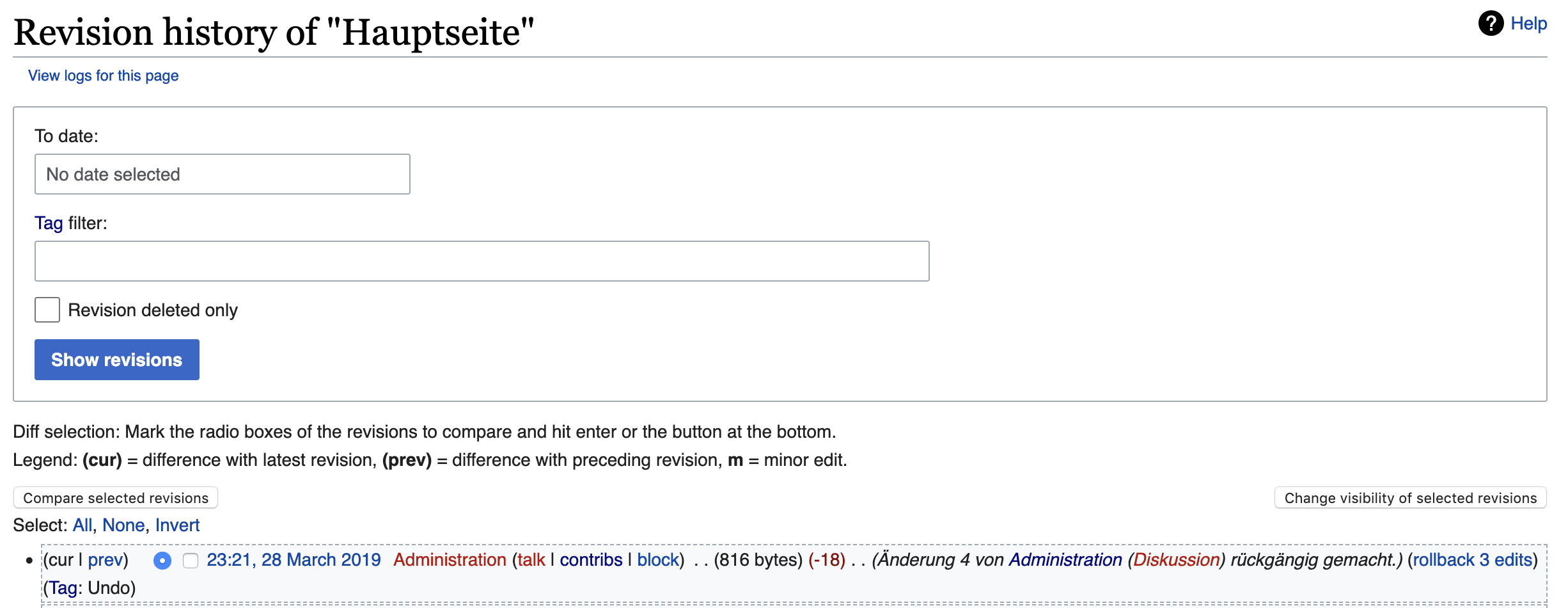
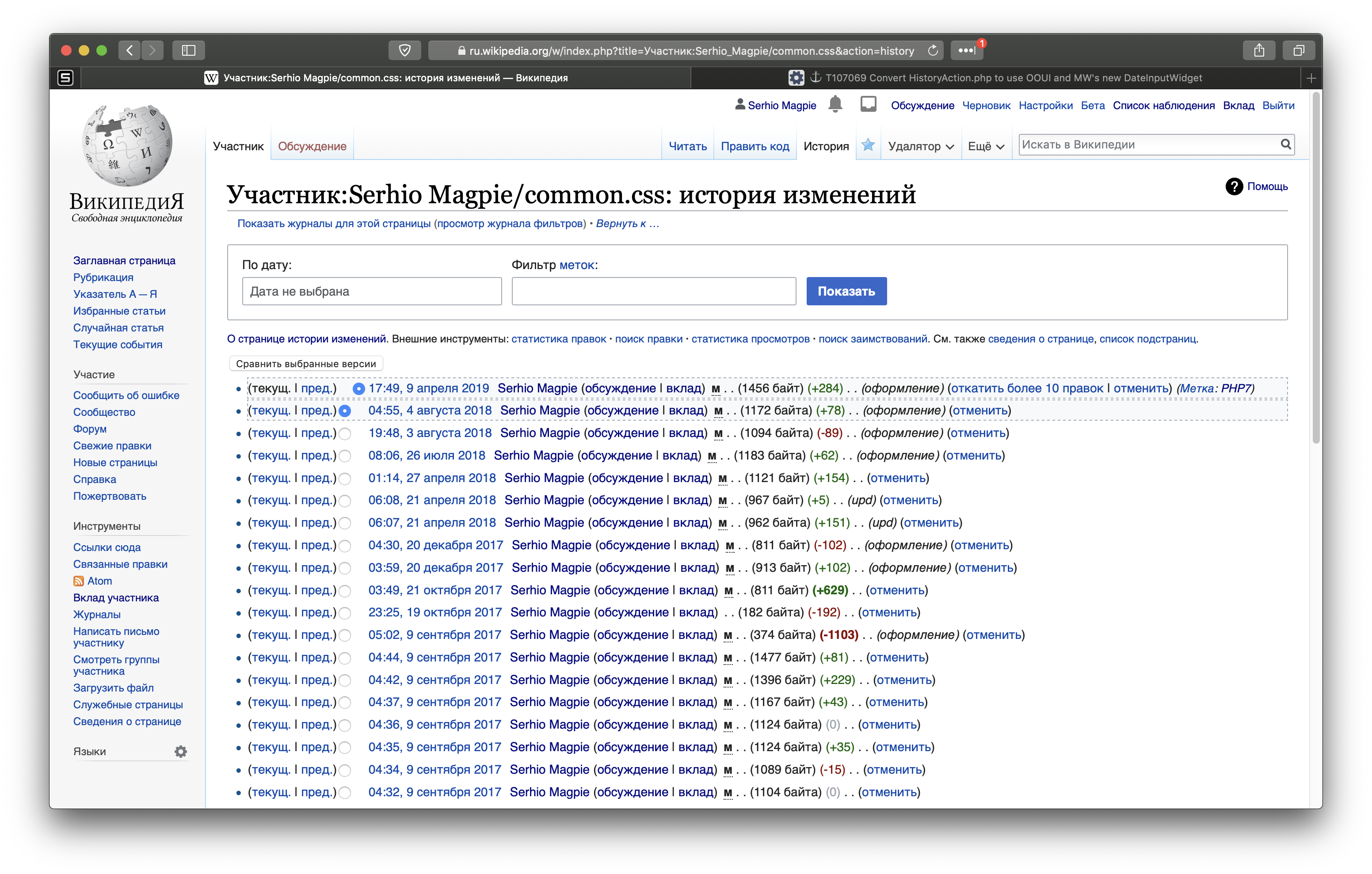
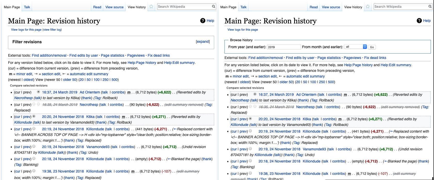
Now we have a DateInputWidget it'd be nice to convert the top-of-the-page "browse history" section for action=history, which is also used a few other places.

image.png (420×1 px, 87 KB)

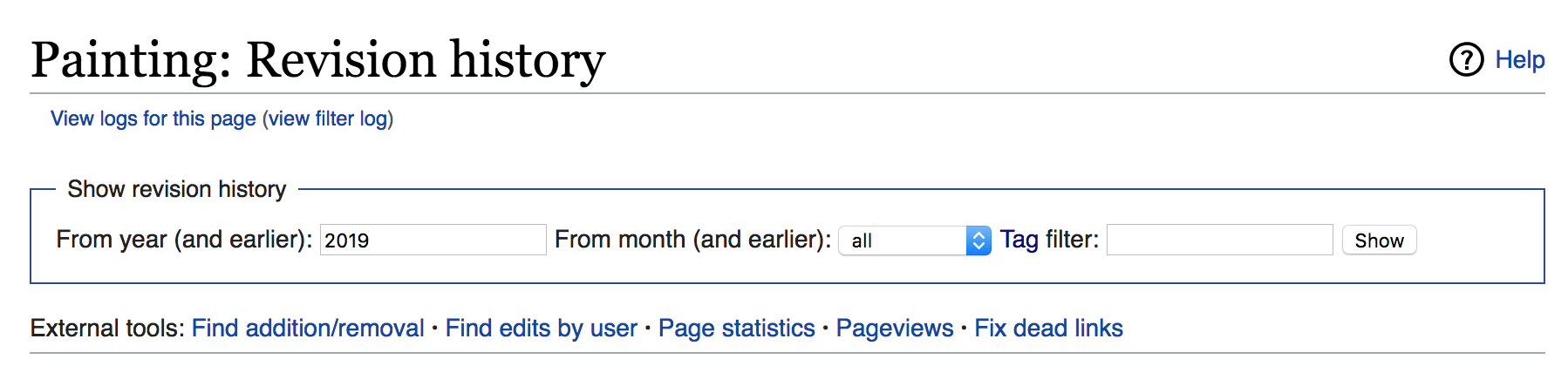
Proposed improvements

  • Transform to OOUI
    • With DateInputWidget in, we can additionally let users choose a day as starting point

image.png (882×2 px, 457 KB)

Related Objects

Event Timeline

There are a very large number of changes, so older changes are hidden. Show Older Changes

Change 499347 merged by jenkins-bot:
[mediawiki/core@master] Make HistoryAction form use OOUI

https://gerrit.wikimedia.org/r/499347

Volker_E assigned this task to Jdlrobson.
Volker_E removed a project: Patch-For-Review.
Volker_E updated the task description. (Show Details)
Volker_E awarded a token.

This new form (often unused) makes longer page to scroll to actual list. And tag input is too wide ;), and still primitive. Are non-horizontal forms standard now? Where to discuss this change?

Hi @Wargo, this is the right place for this specific form.
First off, we are currently tackling the form experience in several places:

Second, even if you might not use the form, doesn't mean that it's not used frequently. We're trying to get more data behind the usage of those forms and its elements as part of Advanced Mobile Contributions project.

The TagFilter input is only following default OOUI form input maximum width, as visible on all other transformed special pages T107037, like for example https://en.wikipedia.org/wiki/Special:AllMessages or https://en.wikipedia.org/wiki/Special:AllPages and so on.

Regarding the "form experience" - yuck. See also https://en.wikipedia.org/wiki/Wikipedia:Village_pump_(technical)#Hideous_history_page.
The example in the description showed all elements side by side, now there are huge gaps and the vertical layout makes this take up about a third of the screen.

@Xaosflux Agreed, but wasn't that the prior version (before ooui-ification) rather than an example?

Yes, it was the "prior" but moving to OOUI forms certainly could have been used while maintaining the layout right?

While "yuck" is not helpful feedback, huge gaps sound like something we should look into. How huge?

@Xaosflux could you please share a screenshot of what you are seeing? The history page is certainly not taking up "half the history page" for me (and I'm not sure if that's an over exaggeration or something serious), so I'm curious whether there are gadgets/user styles that are impacting your experience.

Just fyi, I would describe half as an underexageration. Screenshot incoming

Screen Shot 2019-04-08 at 10.08.18 PM.png (900×1 px, 425 KB)

Screenshot. Note that not a single row of the history page shows up. (Note: My font size may be mildly above normal. Some of us like big letters to help our eyes. Notwithstanding that, I would consider this an unreasonable amount of screen real-estate being taken up).

To further clarify, I think that'd be fine if that was the primary point of the page. But this box represents an obscure action that's barely ever used and now its pushing the primary use of the history page to be below the fold.

Hi @Wargo, this is the right place for this specific form.

[..]

Second, even if you might not use the form, doesn't mean that it's not used frequently.

True, but conversely, it also doesn't mean that it is used frequently enough to justify enlarging it at the expense of other page elements ;)

We're trying to get more data behind the usage of those forms and its elements as part of Advanced Mobile Contributions project.

That's a good idea. Does someone happen to have a link to the corresponding data analysis task?
There is T214935, but measuring the usage of those forms has not been in the scope of that ticket (it would likely require new instrumentation).
And in fact, the results there so far point in a very different direction. E.g. in T214935#4917889 we found that for logged-in users on enwiki, only about 6% of clicks on history pages go to "other action=history views". This includes both submissions of this date/tag search form and all clicks to the "older 50" etc. links located at the top and bottom of the revision list.
I.e. usage of the form that has been enlarged here is probably even lower than 6% in that situation. On the other hand, clicks on diff links made up 43%, and links to old revisions 10% . So we already know that the revision list - which has been pushed further down the page by this change - gets more than half of the usage. (It is probably much more than 50%, because it contains other kinds of links - user pages, user talk pages, contributions - which also occur outside the list, so we can't easily determine whether a click on them came from inside or outside the list).

ss201904081914Capture.JPG (1×1 px, 278 KB)

Note, I'm not the one who said it was 50%, it appears to be about a third of the content area.

The issue here is we've gone from one line to like six lines, but there isn't any more actual stuff to it. If anything, the usage is even more limited, as the date selector is just not made for this sort of random year input...

Please take into account, that after T220048 and T220049 the resulting layout is

image.png (950×2 px, 193 KB)

This is live on the beta cluster btw, if you want to try it out https://en.wikipedia.beta.wmflabs.org/wiki/Spain?action=history
The new form meets the Web Content Accessibility Guidelines requirements and best-practices, is more mobile touch friendly (we plan to roll this page with form out on mobile within the next month) and consistent with other forms across the MediaWiki software, so ask for patience as we consolidate these things with the height.

All that wasted horizontal area, combined with the much longer vertical usage seems to be the main complaint here, not so much the box decorations, if space is limited sure let it scroll to multiple lines, but when there is plenty of space to the right, use it. I'm certainly not looking forward this this same design layout coming to watchlists either.

@Jdlrobson for mobile touch friendly - sure, use it when someone is in mobile mode - not in keyboard and mouse mode.

To further clarify, I think that'd be fine if that was the primary point of the page. But this box represents an obscure action that's barely ever used and now its pushing the primary use of the history page to be below the fold.

All that wasted horizontal area, combined with the much longer vertical usage seems to be the main complaint here

I think these form the crux of the matter. With delete, move, and block, the form is the major focus of the page. Even Special:Log isn't a major issue because nearly everyone interacts with the form at some point. But the general use and interaction of the history page is quite different. Likely to be relevant for T117736, although the mockup there doesn't appear overly big.

"Yuck" indeed. It seems that reaching out to the end users and getting their opinion on changes like this would save time and headaches for many involved. Pushing out unwanted changes continues, I guess.

With that being said, it is not an oft-used function of the page, so having it take up so much room is a ridiculous. Return it to one line, move it to the bottom of the page, or implement a show/hide function.

Please provide a way for them to be on one line like they were hitherto. There's enough space for more than that; cf. T107069#5098041. Alternatively provide a way to hide the box entirely if you're reluctant to do the former.

It is not really even obvious what this new thing does, or where the useful slider GUI went. Whatever choices the developers are making, can you please move these experiments to the bottom of the page, or into a collapsed box, so that busy editors can see the actual links in the actual revision history, which is the title of the page, after all. Thanks.

Technical note: date widget doesn't have a max-width. (Or rather, not one that works with the default width it configures. This causes it to overflow the form border in very narrow screen sizes.

"where the useful slider GUI went"

the history page doesn't have such a feature. If you had something like that, that might be gadget that needs to be updated. Or you are thinking about the diff page, which does have revision slider.

Iniquity subscribed.

I sincerely apologize, but it's terrible. Why do you use so different lengths of fields for dates and labels? Why do you occupy all the space with a huge block, which is 3 times more than before, with a huge amount of empty space? Why do you make the "show" button the main one, when the main button is "compare versions"?

Did you research to change behavior so much? Why do you completely ignore this message T107069#5095853? Do you understand that this block is not needed to anyone? But you make it the main and place on the top position.

Thanks for the feedback. It's revealing to know the history form is not a primary action on history pages from a variety of people.

The feedback around the form has been heard, we understand people are upset and we will take care of this problem.

this block is not needed

I agree, it's not needed at all. Yet it takes not only an enormous amount of precious screen space, but also a noticeable time to load, which slows things down with no benefit whatsoever. Especially irritating with tasks that require a quick response, such as e.g. fighting vandalism. I guess there should be an option to opt out of this.

I think it should be on one line, not multiple lines. I made smth similar using custom styles:

image.png (1×3 px, 1 MB)

Repeating my comment in T220555 here for wider visibility:
We've merged a patch by @Jdlrobson to collapse form by default and make it expandable. After looking through VillagePump, through the comments on T107069 and talking to more long-term contributors: The overwhelming majority of use case seems NOT to involve interacting with the form at all.

With the patch we're focussing on three sides:
a) if functionality is rarely used, it's useful to have it hidden by default,
b) if vertical space is main issue – collapsing is providing more vertical space than before OOUI transformation without
c) introducing technical/user experience debt by inlining form elements unlike other OOUIfied forms.

The change can already be tried out on Beta Cluster and we could SWAT it 24h of now, depending on feedback here from you volunteer contributors…

@Volker_E almost all of the feedback is that there is much wasted horizontal space. The collapsing may be nice as well, but why the insistence on making this such a long vertical form when there is screen real estate available?

Thanks for the quick patch, but wouldn't it make more sense to roll this out with the normal Thursday/Friday patch cycle? Now that I think of it, why was this non-urgent change applied out-of-cycle in the first place, without the usual announcement in Technical News? (As always, I am probably misinformed about how this process works; I am merely a volunteer editor, not a developer or other insider.)

@Jonesey95 I mentioned this in the link in T107069#5095549, but there was a block on pushing the latest version out (see email and T206678) that led to it being deployed Monday instead. This was listed among the many other changes in that version.

Added some more tickets. I also notice that the JS infusion sometimes happens before the JS CSS is loaded OR that the element is removed before the JS element is inserted (instead of swapped inline). I can clearly see the form field 'collapse' a line during loading at times, which isn't supposed to happen with infusion.

@VolkerE the collapsing short term could work like this, but I think it's better if it worked similar to the revision slider and the Advanced parameters of Search. Consistency seems advisable at least.

Lastly the form title changed from "Browse history" to "Search for revisions" but it's filtering and pagination not search. "Filter revisions" seems better to me. Search makes me think of searching within the content or edit summaries of the revisions.

Change 502864 had a related patch set uploaded (by VolkerE; owner: VolkerE):
[mediawiki/core@master] HistoryAction: Clarify form legend for edit history page

https://gerrit.wikimedia.org/r/502864

@TheDJ In discussion with @Jdforrester-WMF he brought up, that revisions is tech-jargon. While I agree with this, given that we're consistent in using “revisions” in English and in several places on this page, IMO it makes most sense to stick with it for now. “Filter” is indeed an improvement and is taken care of in above patch.

@Volker_E almost all of the feedback is that there is much wasted horizontal space. The collapsing may be nice as well, but why the insistence on making this such a long vertical form when there is screen real estate available?

  • Top to bottom, single column forms are generally easier scannable and lead to quicker usage as a rule of thumb. Citing from https://www.nngroup.com/articles/web-form-design/ “Rather than requiring users to visually reorient themselves, keep them in the flow by sticking to a single column with a separate row for each field”. There are some exceptions from this rule, but it's a safe default.
  • As user you don't have to reorient when you use the form on mobile or on desktop, the layout remains the same independent of the device you are using.

We would not only tame the most raised concern of reduced vertical space with the collapsed form, but provide even more space with this solution in contrast to the old form.

Change 502864 merged by jenkins-bot:
[mediawiki/core@master] HistoryAction: Clarify form legend for edit history page

https://gerrit.wikimedia.org/r/502864

Top to bottom, single column forms are generally easier scannable and lead to quicker usage as a rule of thumb.

That is not a form for single use of newcomer, but a power tool for advanced editor. Main priority is displaying content not a form.

provide even more space with this solution in contrast to the old form.

Are you sure?

image.png (729×2 px, 1 MB)

I really liked this change because of the ability to pick a concrete date, but the interface clearly wasn’t fledged out. Collapsing the form now seems not like a complete fix of the design, but like a quick and dirty change to appease people. This is especially visible on the screenshots provided here, where OOUI clearly doesn’t support collapsing forms like this and bottom margin is still visible in collapsed view.

If collapsing the form is being suggested as an end solution, I want to object to it. Hiding stuff should be a last resort and if the form is being used (and it is being used when people need those options), we should fix OOUI to have a proper designed solution, not hide the form because of library’s restrictions.

In my testing, HorizontalLayout already can be used to have a form that will look more like the old one and not like something you should hide from the interface.

Top to bottom, single column forms are generally easier scannable and lead to quicker usage as a rule of thumb.

That is not a form for single use of newcomer, but a power tool for advanced editor. Main priority is displaying content not a form.

provide even more space with this solution in contrast to the old form.

Are you sure?

image.png (729×2 px, 1 MB)

First off, we've also have a patch merged that amends bottom margin of label in T220555.
Second, the screen compares two different states of the page – logged-in vs logged-out.
This is a comparison of the same views after/before with collapsed form:

T107069-HistoryAction-comparison.png (699×1 px, 106 KB)

I really liked this change because of the ability to pick a concrete date, but the interface clearly wasn’t fledged out. Collapsing the form now seems not like a complete fix of the design, but like a quick and dirty change to appease people. This is especially visible on the screenshots provided here, where OOUI clearly doesn’t support collapsing forms like this and bottom margin is still visible in collapsed view.

The design could be improved (the "Expand" button could be more visible and more in line with the rest of the design, you might not even notice it floating at the far right of the page), but I think the core idea of collapsing the form is the best solution here. It definitely seems like barely anyone ever uses the form.

If collapsing the form is being suggested as an end solution, I want to object to it. Hiding stuff should be a last resort and if the form is being used (and it is being used when people need those options), we should fix OOUI to have a proper designed solution, not hide the form because of library’s restrictions.

I don't think that's a good article to prove your point. It seems to me that the author, in our situation, would argue for removing the inessential form entirely. :)

@Volker_E is this done? If not, what is left ?

The way the form is presented now, with our improvements based on feedback here and on Village:Pump along the way is presented like this:

image.png (882×2 px, 457 KB)

Given @Tbayer's analysis above, we have a form that is provided for the <6% of users interacting with it when uncollapsing, while at the same time providing more space for results in collapsed mode (by default).

With that, changing to resolved.

It seems that no one thanked Volker for this "improvement". No one at all! See this ridiculous talk at enwiki where he had suggested masking it with CSS {display:none} when I asked him about the performance. You know, I still won't upgrade my hardware just because of your useless features, but now every time I chase a vandal at enwiki (one of my main activities) I have a time for recalling some things before the edit history opens. First, I recall the name of the developer who imposed such a wonderful gift on me. It's Volker. Then, who that Volker is? He's [censored], [censored] and [beep]. Did the edit history open yet? Not yet, wait some more. Then Volker is [beep] [beep] [beep]. And the edit history is still not avalable. It finally ends with someone else reverting the vandalism, but it's not me. Thank you Volker, I'll never forget you!

Do I need to mention that I haven't even tried your new functions at all and don't suppose to? Well, please Volker please Volker please Volker please... but it makes as much sense as to talk to anonymous vandals, with the only difference that for anonymous vandals we have AIV. :-\

@Mike_Novikoff Your behaviour here is inappropriate, and will lead to you being censured or blocked if you continue it. Please follow the Code of Conduct.

If there is a bug please create a new task describing the problem (in a respectful fashion) with replication steps. Thank you.

OK, I'll try to install 1.4GHz Tualatin with 512K cache (my treasure!) instead of my current 1Ghz Coppermine with 256K (I know you may not believe it), but I still don't understand your approach to consensus. Doesn't enwiki demonstrate a clear consensus to remove the update? You impose it nevertheless, and it makes me wonder.