In contrast to finding different solutions for every single, transformed Special:Page to OOUI, resolving one of the biggest point of critique, the vertical space needed, we should evaluate a central solution.
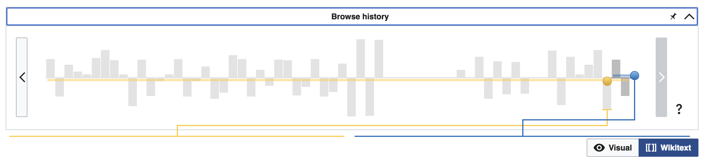
A collapsible form similar to RevisionSlider comes to mind.
Update 2019-09
With htmlform->setCollapsibleOptions there's now the ability to make OOUIHTMLForms collapsible.
Examples are:
- HistoryAction
- Special:Contributions (proposed)
It is configurable and should be used only when clear user experience need is given. To understand core forms' differences, @Prtksxna's comment below is a good start.