I thought we already had a task for Special:WhatLinksHere, but I haven't found it (so maybe it doesn't really exist).
Before:
| Florian | |
| Nov 4 2015, 5:46 PM |
| F35164089: Screen Shot 2022-05-22 at 7.01.07 PM.png | |
| May 22 2022, 11:02 AM |
| F35164092: Screen Shot 2022-05-22 at 6.59.36 PM.png | |
| May 22 2022, 11:02 AM |
| F35164090: Screen Shot 2022-05-22 at 6.59.57 PM.png | |
| May 22 2022, 11:02 AM |
| F31834180: image.png | |
| May 20 2020, 4:19 PM |
| F31834182: image.png | |
| May 20 2020, 4:19 PM |
| F16639034: image.png | |
| Apr 3 2018, 8:23 PM |
| F16638824: image.png | |
| Apr 3 2018, 8:21 PM |
| F4032805: cswiktionary-msg-repurposed-l10n-issue.png | |
| May 20 2016, 12:53 AM |
I thought we already had a task for Special:WhatLinksHere, but I haven't found it (so maybe it doesn't really exist).
Before:
| Status | Subtype | Assigned | Task | ||
|---|---|---|---|---|---|
| Open | None | T49145 Formally deprecate jQuery UI after we've stopped using jQuery UI in extensions and core | |||
| Open | None | T100270 Replace use of jQuery UI and MW UI with OOUI across all Wikimedia-deployed extensions and core | |||
| Open | None | T100161 Convert all of MediaWiki core to OOUI PHP (tracking) | |||
| Open | None | T107037 Convert all MW core special pages to OOUI | |||
| Resolved | WhitePhosphorus | T117754 Convert Special:WhatLinksHere to OOUI |
Change 276966 had a related patch set uploaded (by Ajayrahulp):
Convert Special:WhatLinksHere from XML form to OOUI form
Change 276966 merged by jenkins-bot:
Convert Special:WhatLinksHere from XML form to OOUI form
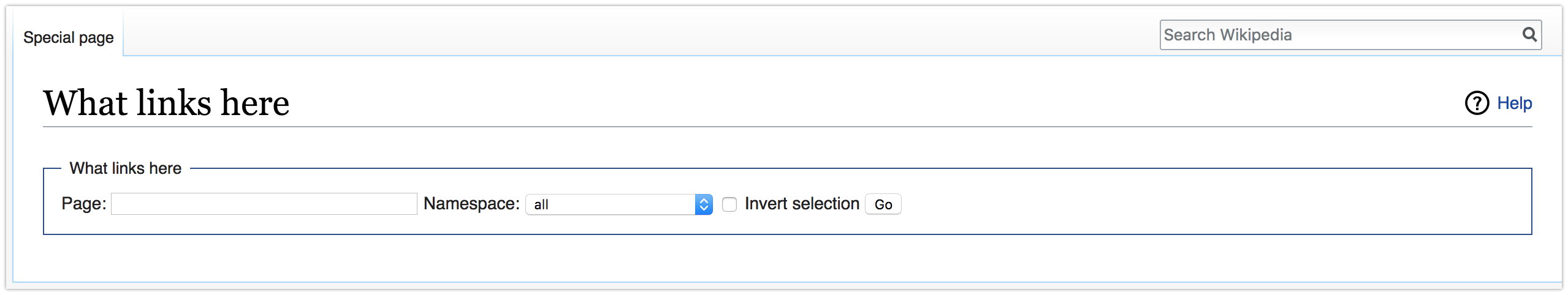
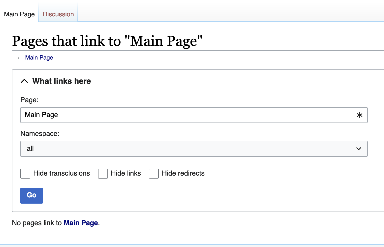
Two actionable (and hopefully doable) suggestions:
Quick mockup (edit of the screenshot above):
Better than the reverted stuff, but still so much unnecessarily space consuming.
Can't the original layout be kept as much as possible?
Why are labels above controls?
Why is ns selector x-times wider than the widest item in it?
Etc...
Even if I might repeat myself. To @Danny_B's points above:
Why are labels above controls?
Because there's lesser cognitive workload when labels are above controls. People are quicker when fulfilling their tasks on forms with labels above fields. See for example https://www.uxmatters.com/mt/archives/2006/07/label-placement-in-forms.php
Why is ns selector x-times wider than the widest item in it?
What is the problem with this?
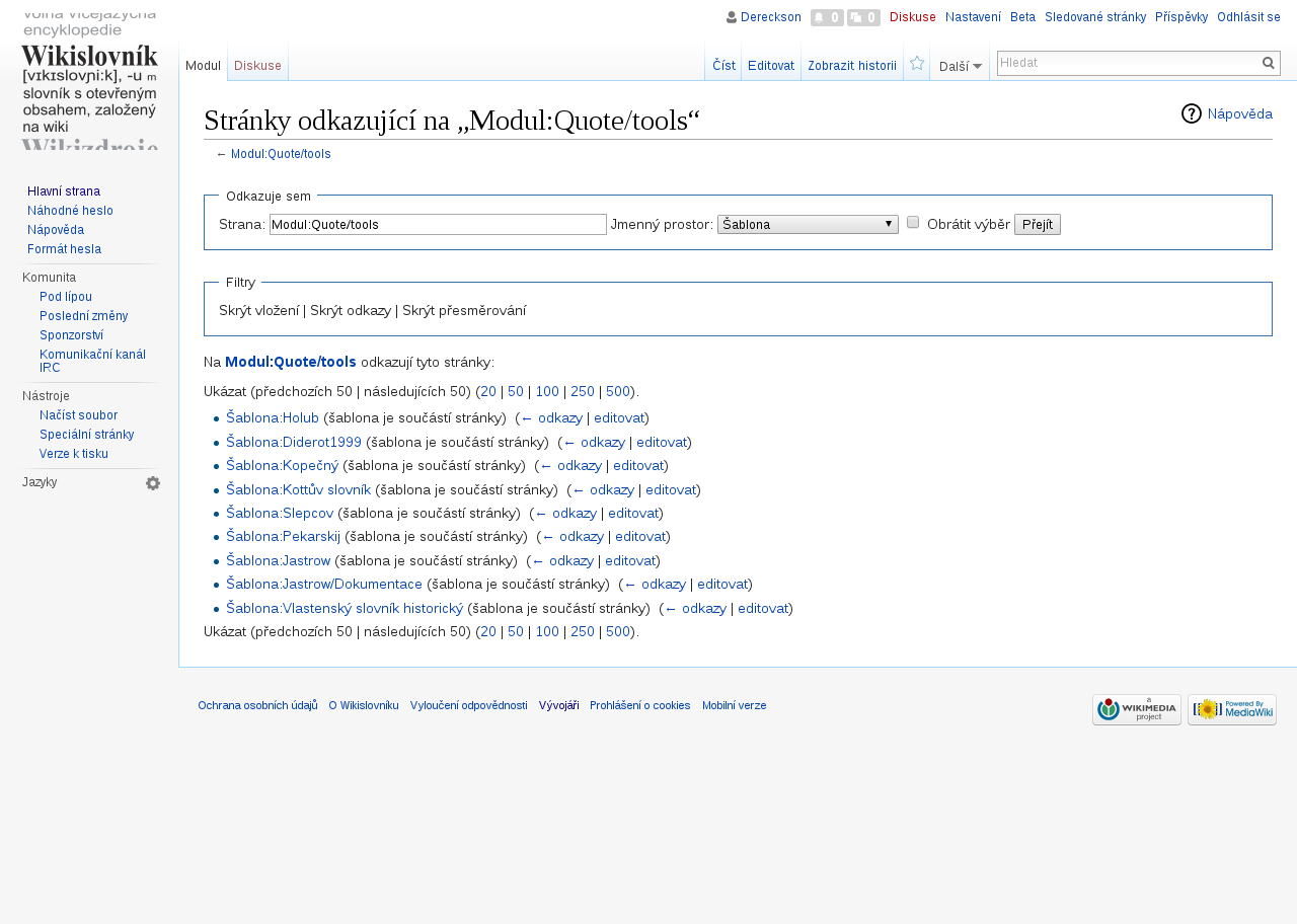
This is not directly related to the task, but I thought some of this may be useful to someone. I'm the maintainer of the AdvancedBacklinks extension that lets you track links through transclusions and can get you easily in a psychiatric hospital. Anyway, this extension has a special page very similar to Special:WhatLinksHere, just enhanced with a few neat features. I recently rewrote some of this special page to use OOUI and the end result is this:
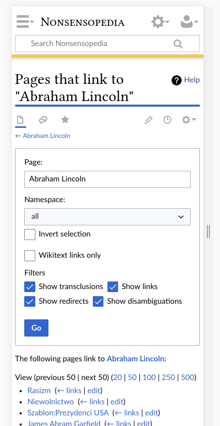
If you want, you can test it out here: https://nonsa.pl/wiki/Special:AdvancedBacklinks?uselang=en (the wiki is unfortunately in Polish)
The relevant merge request with all changes needed to make this work is here: https://gitlab.com/nonsensopedia/extensions/advancedbacklinks/-/merge_requests/77/diffs
There a few caveats, though. These filter checkboxes to my best knowledge require you to break URL compatibility. Another option would be to invert their semantics, that is change their labels to Hide X, not Show X, but frankly that's horrible UI design. You could also support the old URL params as backwards-compat, probably. As we didn't care about URL compatibility, I redesigned it completely. I also completely removed the use of the FormOptions class, it was just annoying.
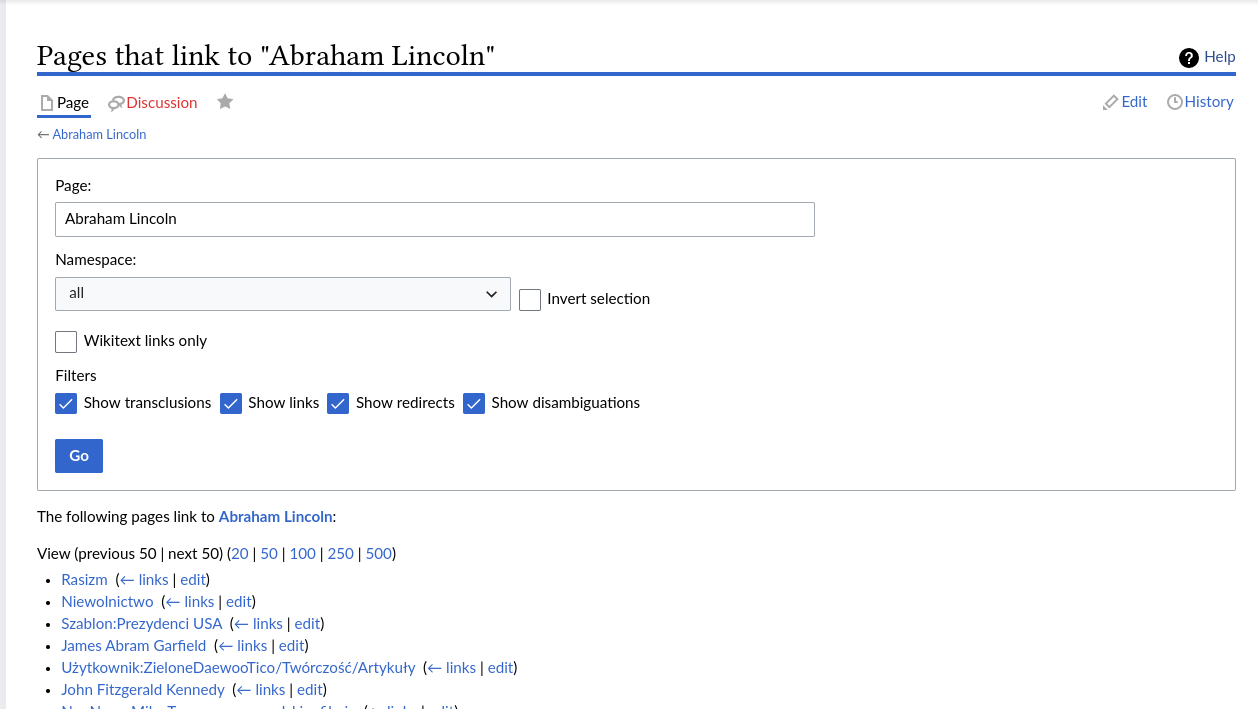
As for the core special page, I think the most similar special page in core that has already been converted to OOUI is Special:NewPages, may be worth looking there.
From the above discussion, here are a few notes I took:
I will try to implement the above design, and any other suggestions are welcomed.
@WhitePhosphorus Can you base your work on top of https://gerrit.wikimedia.org/r/c/mediawiki/core/+/788875? (a small refactoring of SpecialWhatLinksHere code that I'm working on)
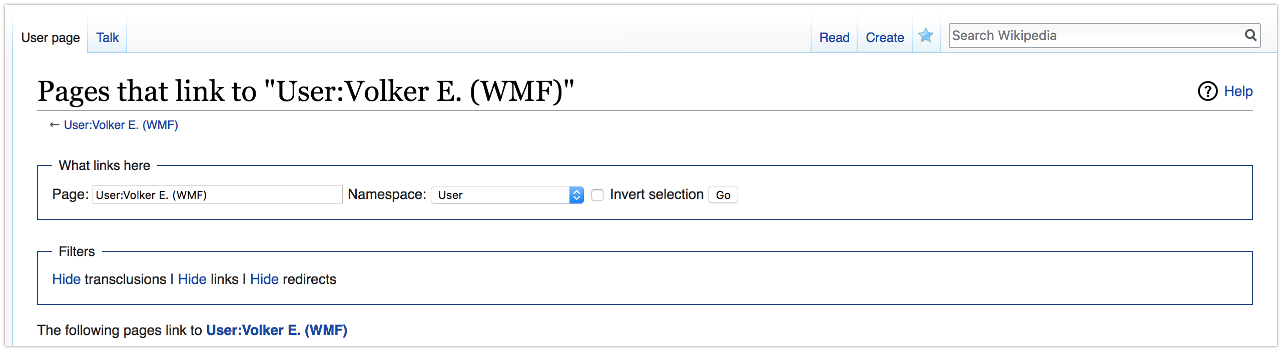
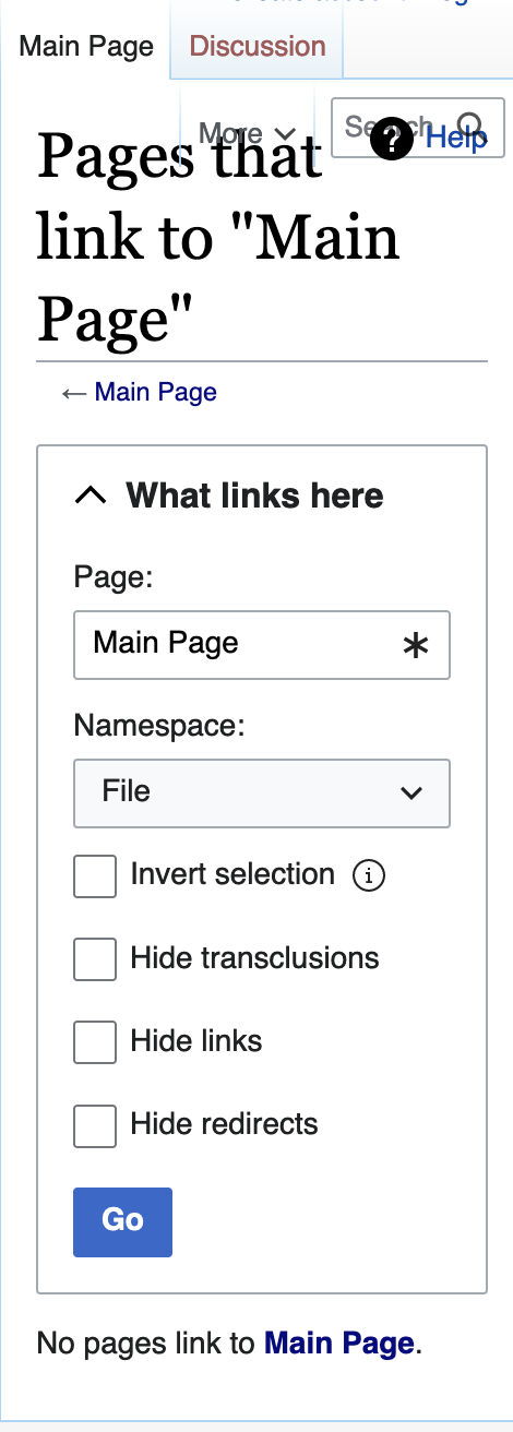
@matmarex sure, I almost finished the patch with parent set to your change, just need a few more local testing. I plan to introduce some css rules in resources/src/mediawiki.special/whatlinkshere.less to position the invert and filter checkboxes. Flexbox for ns selection + invert checkbox to make them in the same line, and display: inline-block for filter checkboxes. I am also going to make the whole box collapsed if target is set which means the user is browsing results. Some screenshots will be posted later.
Change 791710 had a related patch set uploaded (by WhitePhosphorus; author: WhitePhosphorus):
[mediawiki/core@master] SpecialWhatLinksHere: Convert form to OOUI
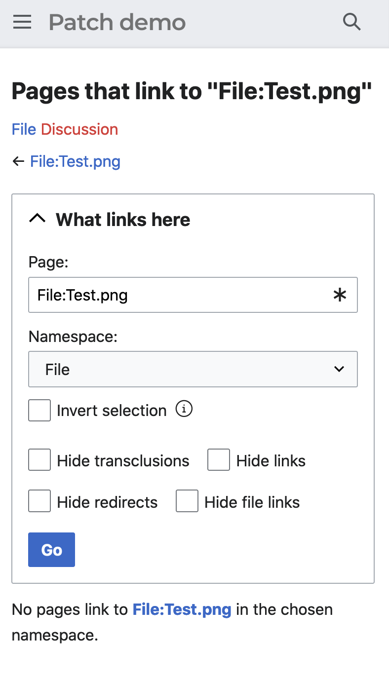
Test wiki created on Patch demo by WhitePhosphorus using patch(es) linked to this task:
https://patchdemo.wmflabs.org/wikis/cd965ac5c5/w/
Everything looks OK now (try it out here), except the padding between page and namespace panels seems too small. Feel free to do more tests on the patch demo.
Test wiki created on Patch demo by WhitePhosphorus using patch(es) linked to this task:
https://patchdemo.wmflabs.org/wikis/eef17f2803/w/
Test wiki on Patch demo by WhitePhosphorus using patch(es) linked to this task was deleted:
Test wiki on Patch demo by WhitePhosphorus using patch(es) linked to this task was deleted:
Test wiki created on Patch demo by WhitePhosphorus using patch(es) linked to this task:
https://patchdemo.wmflabs.org/wikis/d10bb209b4/w/
Updated the patch demo with the current patch set, link to the new demo site. Thanks Bartosz and Volker for code reviewing :) Here are some screenshots from the current design:
Change 791710 merged by jenkins-bot:
[mediawiki/core@master] SpecialWhatLinksHere: Convert form to OOUI
Is there a particular reason why variables were kept in checkbox messages like whatlinkshere-hidetrans ("$1 transclusions")? These are poor lego messages (see i18n hints). It appears that $1 is always "Hide" now, and so it'd seem reasonable to write just "Hide transclusions" without a variable.
They should be changed, I made a note about this at https://gerrit.wikimedia.org/r/c/mediawiki/core/+/791710/5/includes/specials/SpecialWhatLinksHere.php#703.
I didn't ask for this to be done in the initial patch, because it's somewhat counterintuitive how to do it without losing or breaking existing translations (you need to keep the parameter, but don't use it), and it's annoying to undo if the patch needs to be reverted (you need to manually undo any changed translations on Translatewiki). I supposed we can do it now though, I submitted https://gerrit.wikimedia.org/r/c/mediawiki/core/+/804604.
The form shouldn’t have been collapsible in this case. It makes a number of regular use cases of What links here, such as ‘go to the template, see where it’s used’, a bit harder to do without much benefit on mobile viewports (since this form is not long, like on Special:Contribs).
A much longer form at Special:Log, for example, isn’t hidden for the same exact reason of form usability, so I would appreciate if this one would not be collapsible, too.
If you'd like to submit a patch to do that, I'd approve it.
(I don't want to be the person making all the decisions about these changes, because I expect someone to ask for the opposite as soon as we change it… Also, if I wrote that patch, I'd need to find someone else with the rights to approve it.)
Change 808953 had a related patch set uploaded (by Saint Johann; author: Saint Johann):
[mediawiki/core@master] SpecialWhatLinksHere: Uncollapse the OOUI form
Change 808953 merged by jenkins-bot:
[mediawiki/core@master] SpecialWhatLinksHere: Uncollapse the OOUI form
Test wiki on Patch demo by WhitePhosphorus using patch(es) linked to this task was deleted: