Page MenuHomePhabricator

Rendering issues on mobile on [[Valley of the Kings]]
Closed, ResolvedPublic

Description

From a wikipedia weekly thread:

Who here is interested in rendering problems for Wikipedia on Android? From [[Valley of the Kings]]

valley-of-kings.jpg (960×600 px, 77 KB)

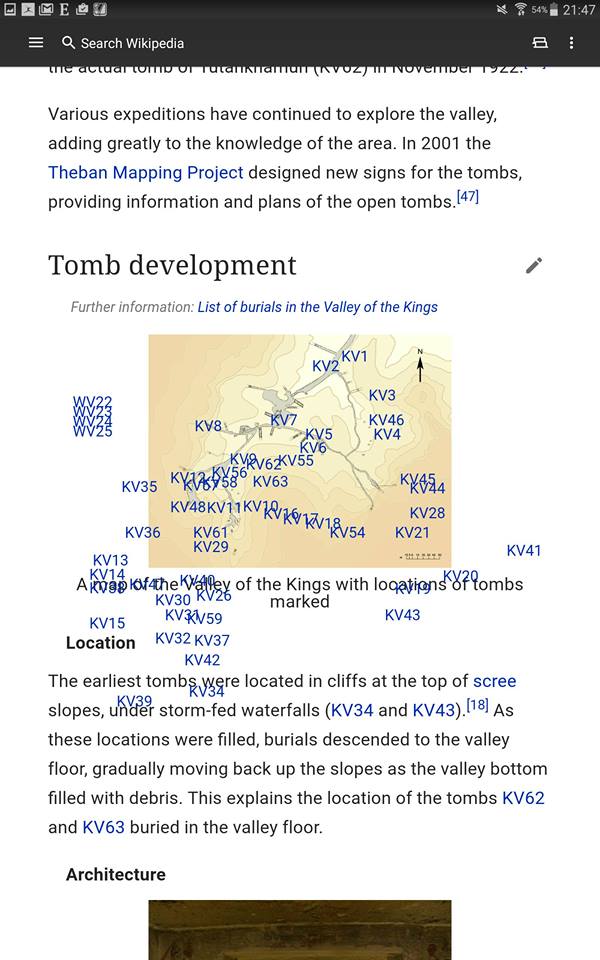
This is caused because the labels are relatively positioned using pixel offset, but the image itself is being scaled down, from the original size that the author included in the Desktop version of Wikipedia and related to the usage of the template:
https://en.wikipedia.org/wiki/Template:Image_label_begin

Event Timeline

[Comments by @TheDJ on the original thread]

1: the screenshots of mobile web show the problem where responsive images do not work because of lazy loaded images.. (Not sure how that is still not fixed, i reported it almost the same day that lazy loaded images went live...). The image is therefor allowed to be wider than the viewport.

2: The original issue that Chris shows in the app. This does NOT use lazy loaded images, and thus the responsive image is scaled down to fit the viewport. The template used (Template:Image label begin) to built this map however uses fixed pixels to position the links, and of course these do not scale along with the image. Template:Location map+ uses percentages and is less sensitive to this problem, although the text because relatively larger.

Solutions non-existant, though long term should probably be sought in something like the Kartographer extension (even though that itself seems to have some mobile view issues atm).

@Aklapper I forked off the one issue into T154478. So this is just a generic issue now, with viewport width limiting as done by all mobile products (assuming that T154478 is going to be fixed).

The iOS app simply cuts off the image (also not really desirable)

fullsizeoutput_b82.jpeg (1×750 px, 163 KB)

Jdlrobson changed the task status from Open to Stalled.Jan 9 2017, 1:18 AM
Jdlrobson subscribed.

What is hoped to be achieved here by making this a Reading bug? Is it purely to track?
As @TheDJ states there's not much that can be done here, apart from rethink the template from scratch / make it behave differently on mobile / adopting SVG or Kartographer for this purpose.

For situations where responsive images are not used (apparently in the mobile apps, which is an inconsistency that makes me wonder what other CSS the apps are missing), I could add to the template: max-width: 100%;overflow-x: scroll; to basically make this behave similar to what we usually do with wide tables. (now done ).

But this does not fix the responsive images case, and I'm also not aware of a good way to deal with that...

FYI There's a noresize class that adds scrolling if it's a child of .thumb

Further improved this by using noresize and adding the thumb class to this specific graph...
But i'm not sure why this noresize class would be limited to thumbs. It's not as if responsive images are limited to thumbs either are they ? Should we just remove the thumb class from that particular selector ?

Change 334754 had a related patch set uploaded (by TheDJ):
Make noresize non-specific to thumbnails and cleanup

https://gerrit.wikimedia.org/r/334754

Change 334754 merged by jenkins-bot:
Make noresize non-specific to thumbnails and cleanup

https://gerrit.wikimedia.org/r/334754

TheDJ claimed this task.
TheDJ removed a project: Patch-For-Review.