Author: davidcraig5
Description:
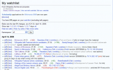
Image of my watchlist on my laptop
While the UI for pages like Special:Watchlist is completely functional the layout and design of said UI is beginning to show it's age. Functionality has been added over time without going back and making sure all special pages follow a theme or are laid out well.
For example displaying Special:Watchlist on my laptop, the header portion takes up over 50% of the available space inside of the boxed area (see attachment). The special pages as a group do not follow the same standard at all. I think it is probably worth having someone who is a UI designer take a look at the useablity of the UI.
Here are just a few examples that I found in a few minutes:
*Special:Contributions has a group box at the top, contributions, watchlist etc do not.
*The history page has help links in the title, other pages don't, the formatting is slightly different here as well
*The fileupload page is totally different
*Special:WhatLinksHere has a random "back" link that is unlabeled at the top (I have seen several users click that link the second they get to that page)
*Special:Contributions vs Special:Watchlist : (for Ravedave) vs For Ravedave (Talk | Block log | Logs)
*Weird combinations of controls Example: Special:WhatLinksHere has a dropdown for namespaces with a Go button, but below that are "Hide Tranclusions" etc that could be checkboxes above with the go button.
- Special:WhatLinksHere, there is random grey text that says: "(List of links)", unlike other pages.
*Pages for images are a weird mismash of information, and is again different from other pages (for example the history list is totally different from article history listings)
Version: 1.12.x
Severity: normal
Attached:
