Overview
Results from the Places usability test suggest that there are a number of design bugs related to search, filter searches and visual design for search within the Places tab:
- Some users have a hard time recovering from filter searches. We might want to rethink how users can return to the default search of 'top articles' or clear their search. Additionally, It's very easy to accidentally select the filter search and receive no results. We might want to re-order which is the top result in searches and when the search button is enabled on the keyboard.
- Search might need an empty state. Users often clicked on the search bar only to close it.
- The limiting of search results to top articles on top article search is not clear to most users.
- Search this area is hard for some users to locate and feels disassociated from search in its current position.
Aid users in selecting the most relevant search result
Please see this ticket: https://phabricator.wikimedia.org/T160701
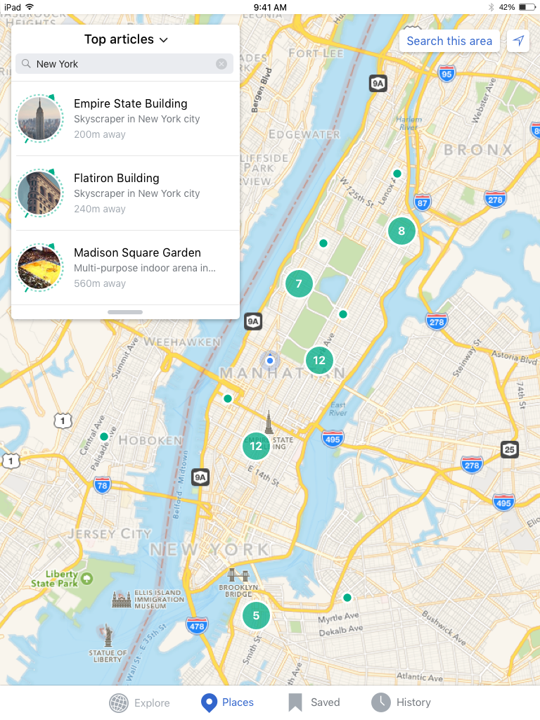
Re-position search this area
Search this area is hard for some users to locate and feels disassociated from search in its current position. Additionally the current position will not work on the iPad layout
 |  |
| iPad | iPhone |
| https://zpl.io/1jdRDF | https://zpl.io/Z2emJT7 |
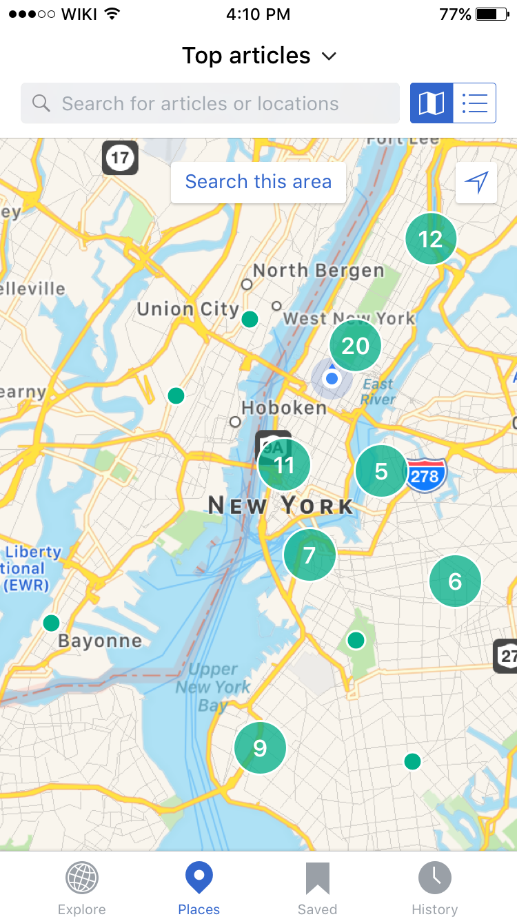
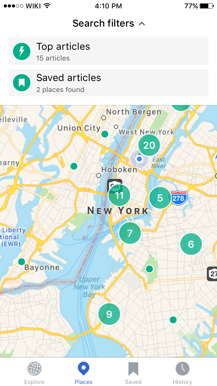
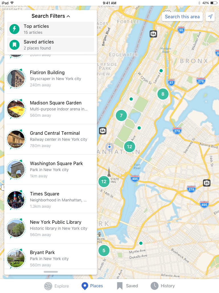
Increase visibility of active filter (Top articles)
The limiting of search results to top articles on top article search is not clear to most users.
iPhone
 |  |  |  | 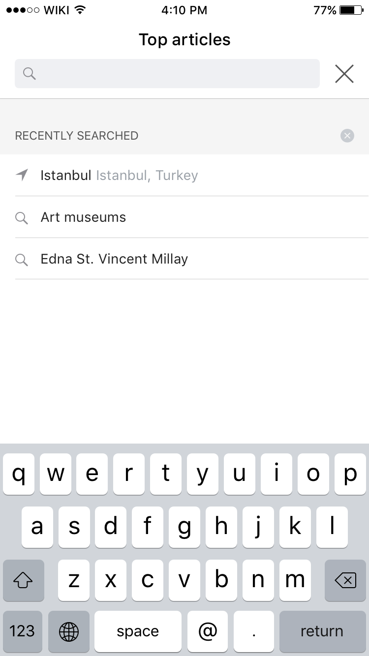 |
| Default state | Drop down with no saved articles | Drop down with saved articles | Search empty state | Search with history |
| https://zpl.io/N6WaE | https://zpl.io/12dGlb | https://zpl.io/Dcb6O | https://zpl.io/1jcwWT | https://zpl.io/Z1LvCXE |
iPad
|  |  |  |
| Default state | Extended list | Drop down overlay | Search |
| https://zpl.io/1jdRDF | https://zpl.io/2iu7qY | https://zpl.io/Z22nBwc | https://zpl.io/Z2nMeB2 |
Note I (Carolyn) am slightly concerned about the interaction of the drop down over the list view on iPad (I think it should be OK on iPhone) and might need to re think this after playing around with it.
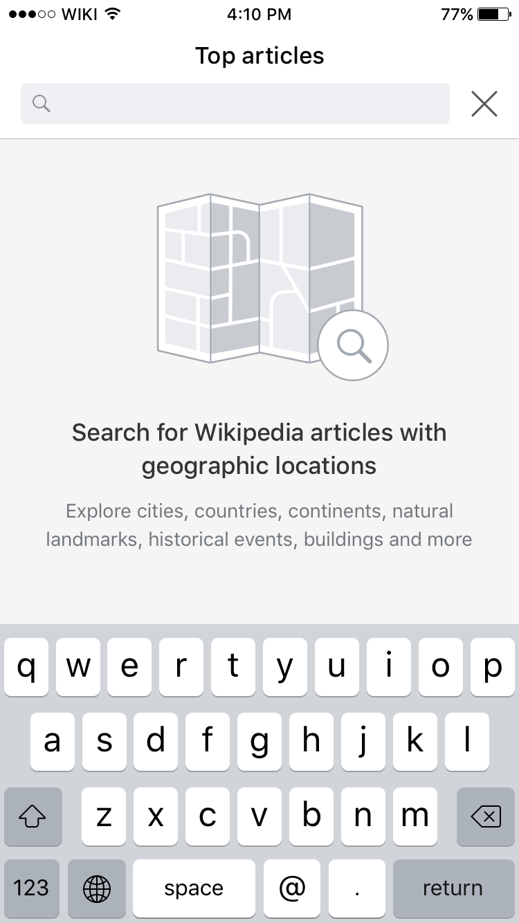
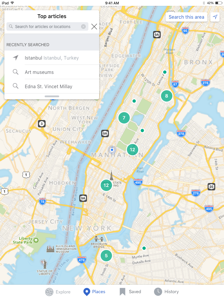
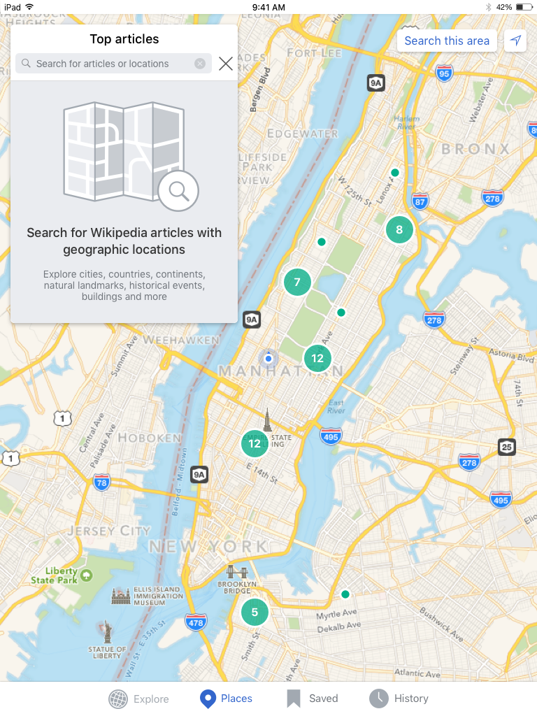
Search empty state
In testing some users requested more guidance in how to use the Places tab, additionally while users were quick to locate the search bar, only 1 of 5 users actually performed a search
The search empty state below will appear when users have no search history or clear their search history in the Places tab.
 |  |
| iPhone | iPad |
| https://zpl.io/1jcwWT | https://zpl.io/rijBg |
Notes
- Empty state illustration will change, this is a placeholder.
- If custom dropdown is too expensive a UI ActionSheet can be used instead