Links
Design document
https://docs.google.com/document/d/10j1xbMJjW8tLUOdWMws6ruUxxOGbpmRWCIgaONnZSDc/edit?usp=sharing
Prototype
https://wikimedia.invisionapp.com/share/BHAEYEQAS#/218570419_01_Map_-_Map_View_-_Selected_Pin
Zeplin
https://zpl.io/Z21KiN7
Tags: T130889 [EPIC] Places, Maps
Abbreviated design document
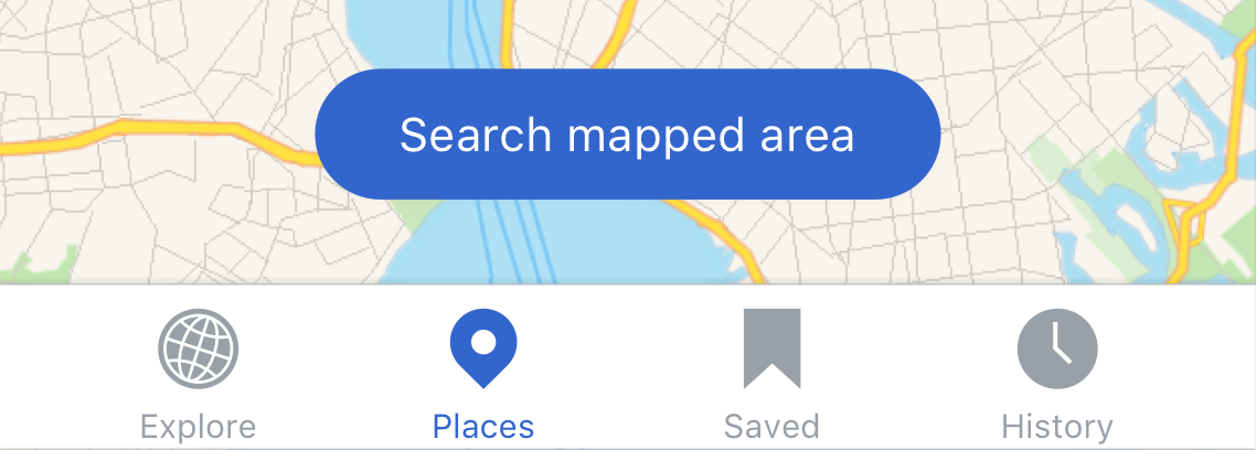
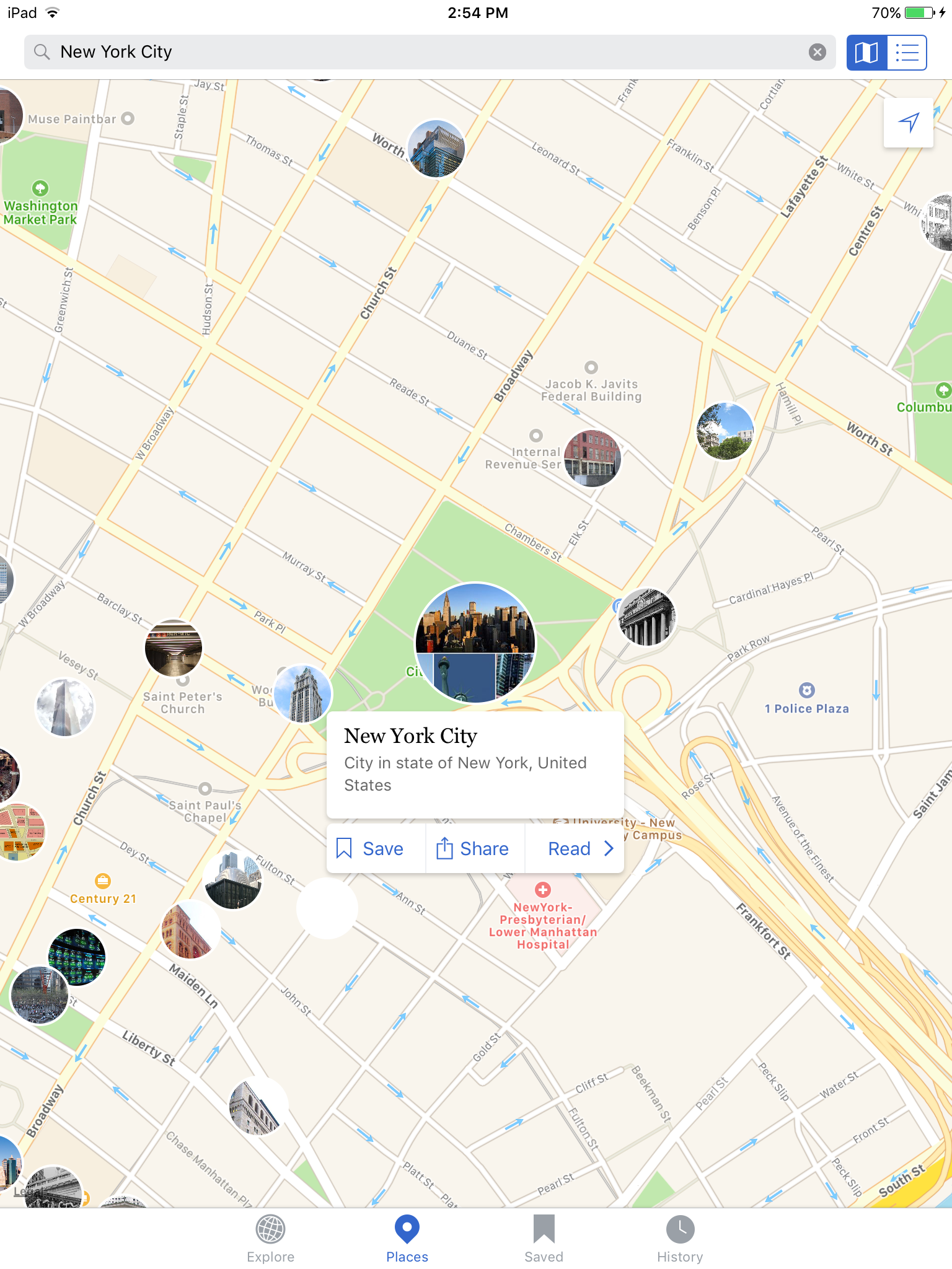
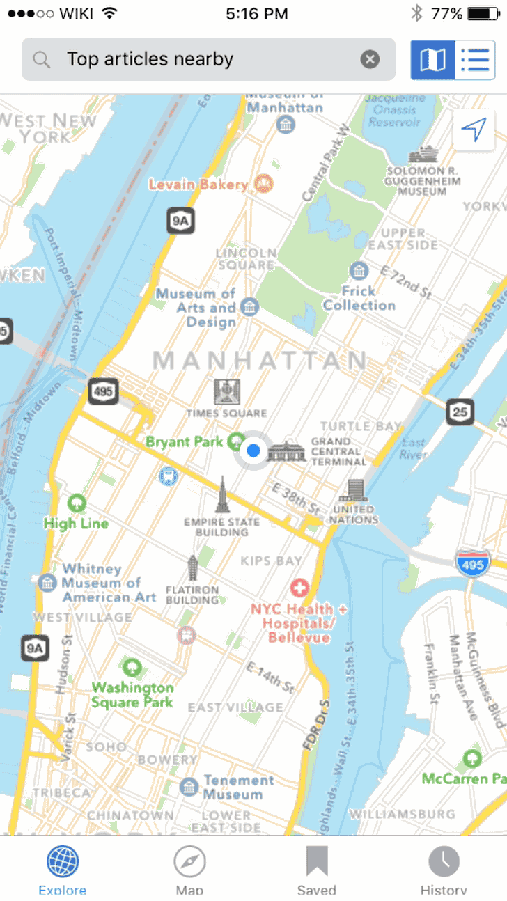
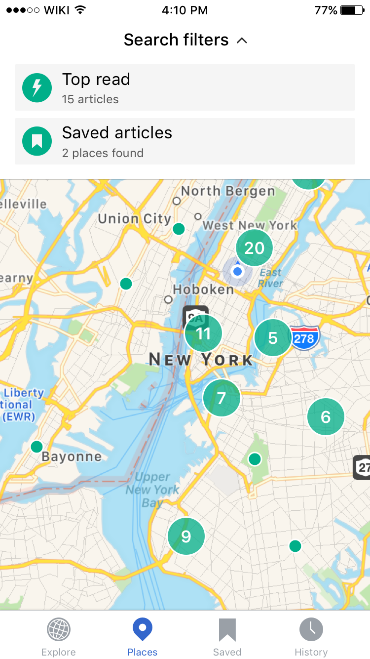
Map View
 |  |
| Map view with selected pin. Center map icon in top right. | Map view with ‘redo search in this area’ pill active. |
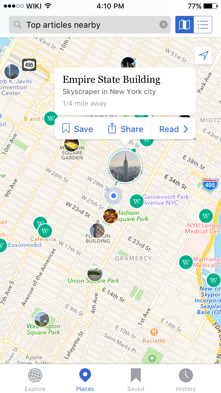
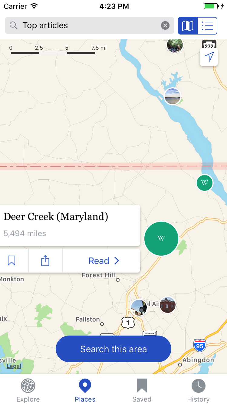
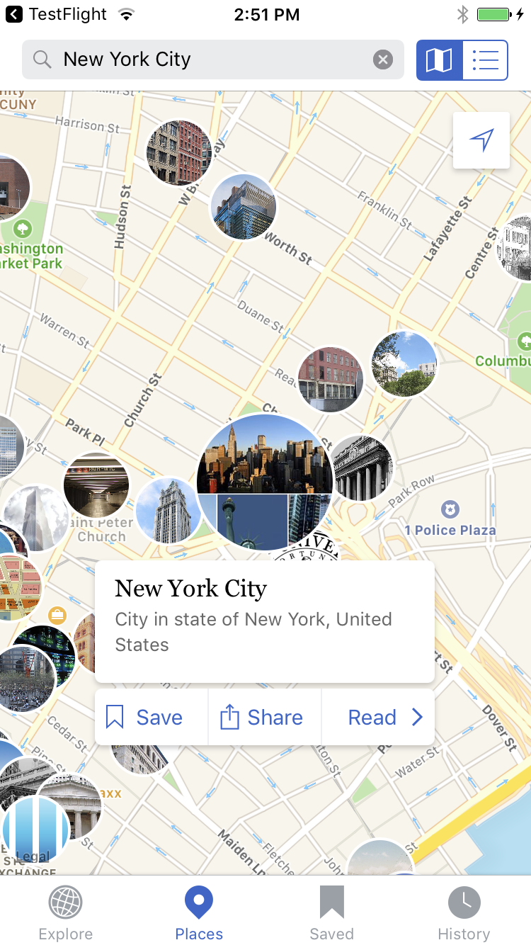
The map view is the default view of the Nearby tab. The purpose of the map view is to provide users with a visual way to explore articles with location information. Users can zoom in and out and pan across the map. The map view utilizes a variety of pin styles (see below) to represent articles. Articles that are visible on the map can also be viewed in a list view (see List view section below).
Redo search in this area
When the user navigates by panning or zooming in or out on the map a ‘redo search in this area’ pill will appear at the bottom of the screen. Navigating around the map does not automatically trigger a new search, only tapping on the ‘redo search in this area’ will trigger a new search of the current screen area.
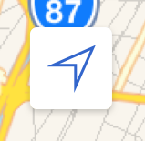
Current location
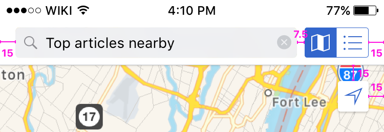
Tapping on the current location icon in the top right of the map will center the map on the user’s current location if they have location services turned on. If the user has not enabled location access they will see the empty state model from this ticket: https://phabricator.wikimedia.org/T123684
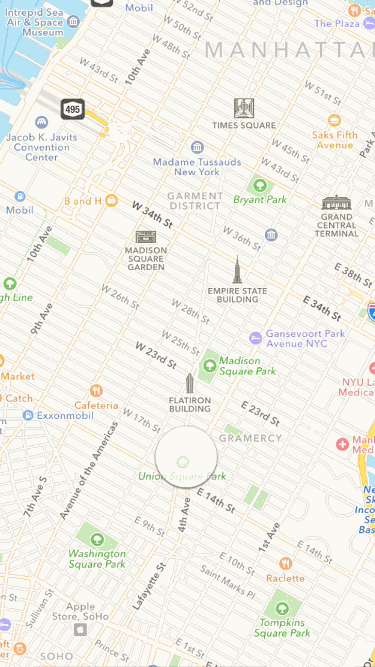
Pin Styles
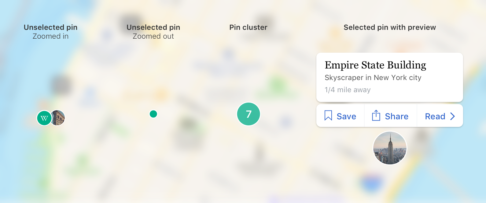 |
| Three pin styles |
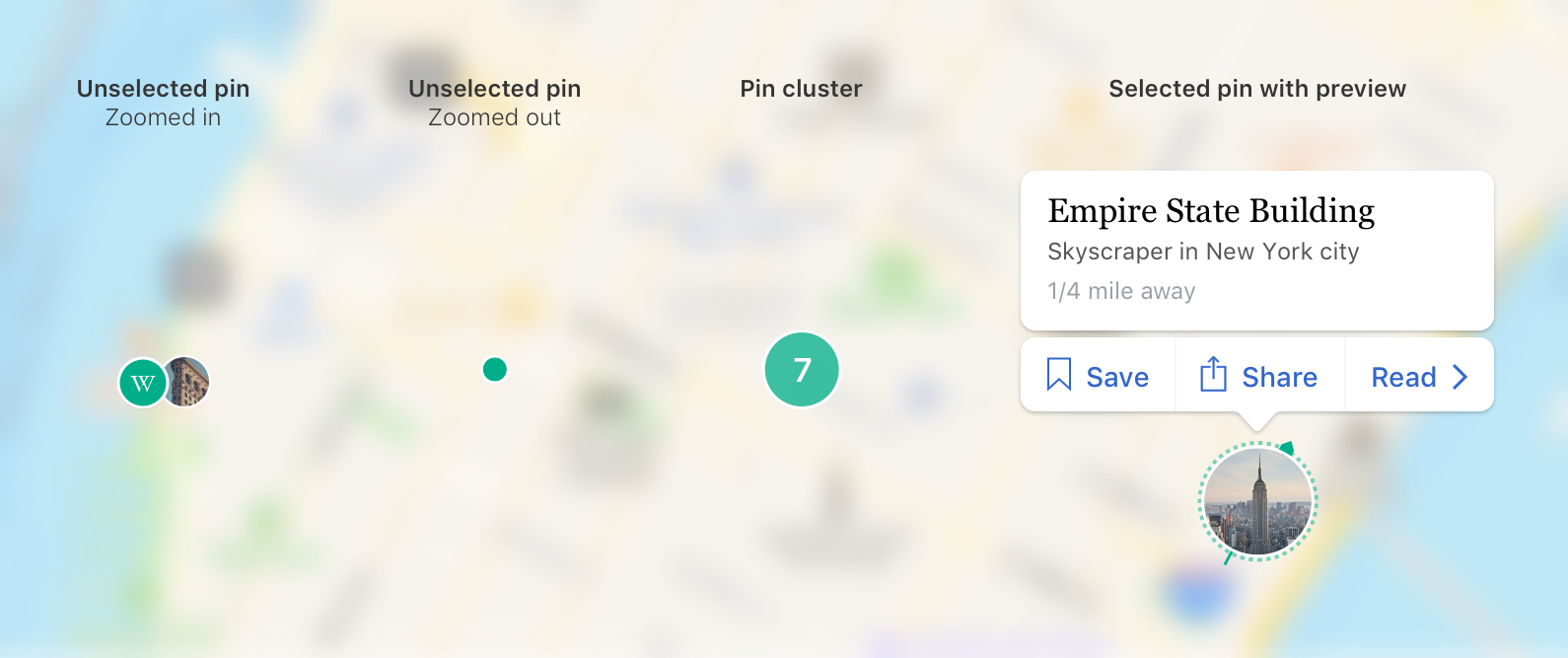
Unselected pins
Only one pin can be selected at a time. All other pins should be presented as an unselected pin (or pin cluster if appropriate). At the default zoom level[1] all unselected pins regardless of their proximity to one-another are presented as unselected pins.
Tapping on an unselected pin makes it the only selected pin and opens the pin preview (see Preview (selected pin) below).
When the user zooms out from the default zoom level, unselected pins (based on density on the screen) may combine to become a pin cluster (see Pin clusters below).
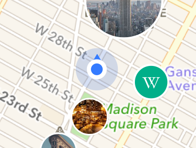
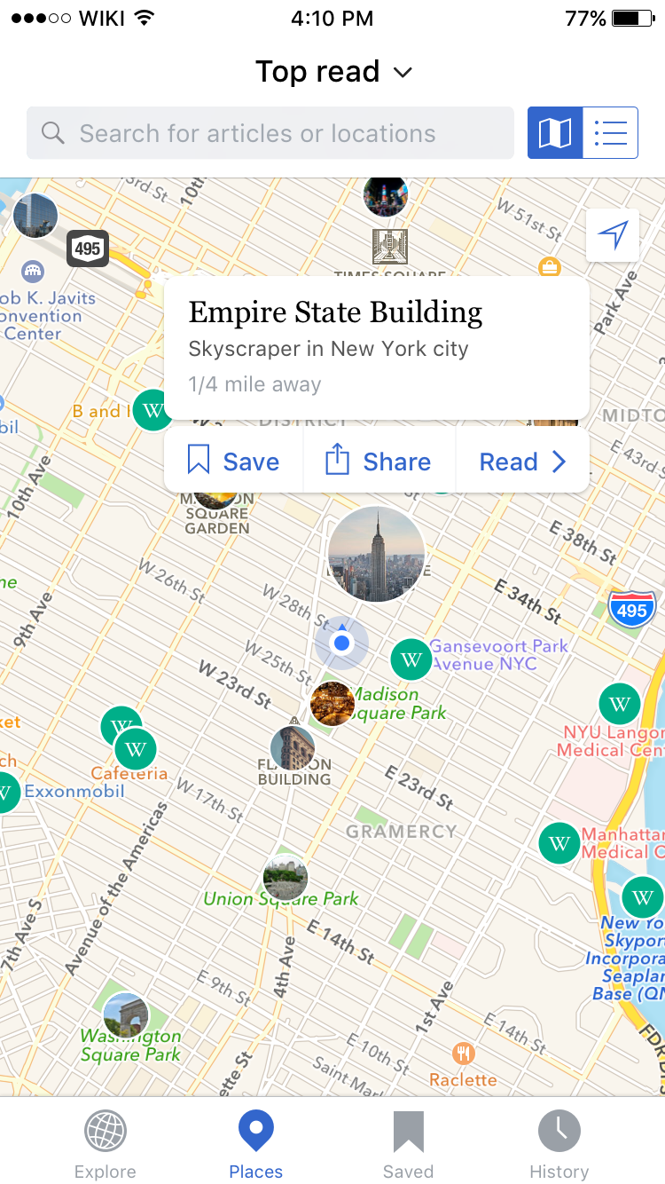
Preview (selected pin)
When a pin has been tapped on it becomes the only selected pin on the map view. The selected pin transforms into a larger thumbnail pin with a preview of the article floating above, below or to the right or left of the thumbnail (based on screen position).
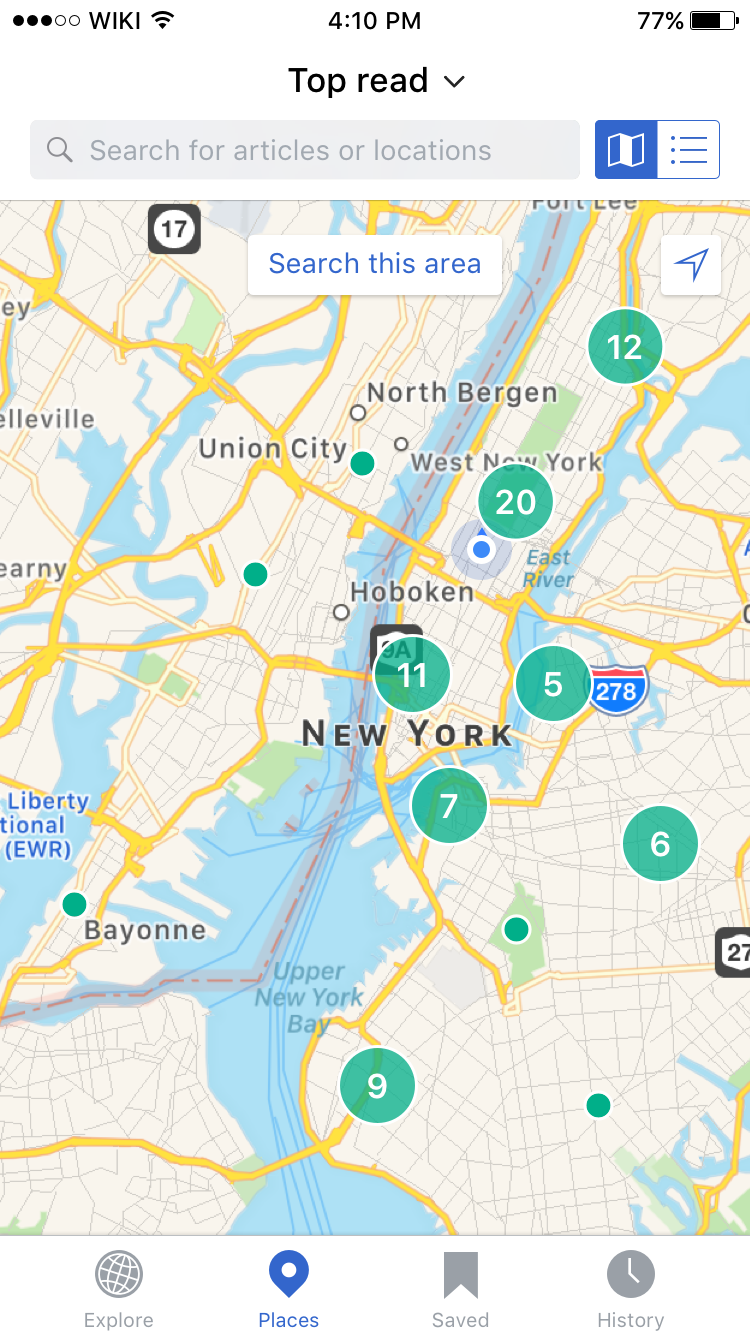
Pin clusters
Chrome around the map has been updated, but the gif has not been updated to reflect these changes
Design inspired by: http://sfbay.craigslist.org/search/apa
 |
| GIF of pin loading and clustering (transitions are a little sped up) |
When a user performs a search zoomed out from the default level, or zooms out from a previous search / position, pins that are within 50 px of each other are combined into a pin cluster. The number on the pin cluster and its size represents the number of pins represented by the cluster.
As the user zooms out, pin clusters that are close to each other (spacing to be defined)[2] or overlapping are condensed into a larger pin cluster. No two pin clusters should ever overlap.
When a user performs a search from a country level, or continent level view depending on the pin density (eg. if all of the pins returned by the search are in England vs. if articles are distributed across the world map), location (eg. user searches for a specific city or town), number of pins (eg. only two articles are returned, one in Africa and one in Canada vs. large densities of pins across multiple continents) the map may display pin clusters, or automatically zoom-in to show individual pins.
Tapping on a pin cluster will zoom the user’s view in to show items clustered within the tapped on pin cluster. If the cluster is very large, tapping on the cluster may display smaller clusters. Tapping on a small cluster of densely located pins will display individual pins.
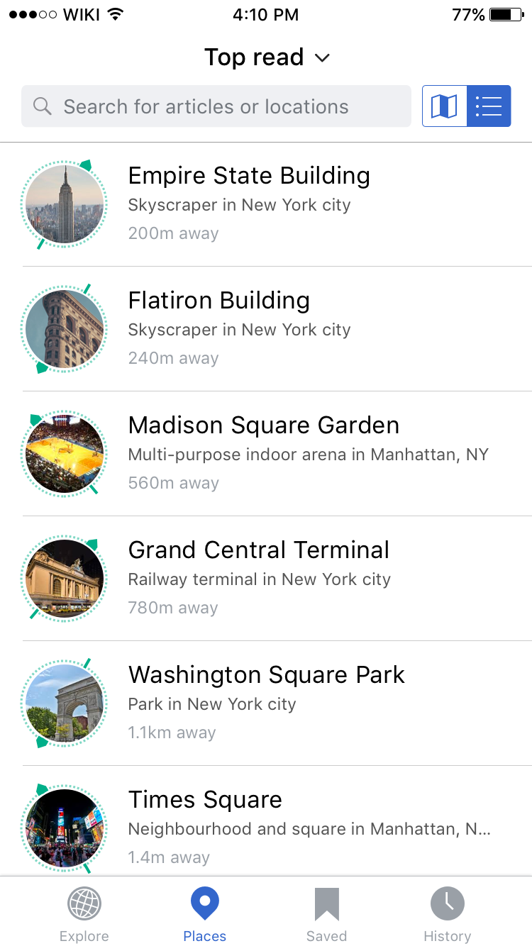
List view
 |  |
| List view | Exposed swipe menu on a list item |
The list view provides a quick way for users to scan and browse across a set of articles.
List items
Each list item includes a thumbnail (or placeholder image) of the article’s feature image with a compass animation around it. If a user has location services turned off the compass animation should not be shown.
If the user taps on any part of the list item this should trigger the opening of the associated article. Swiping on a list item exposes the swipe menu.
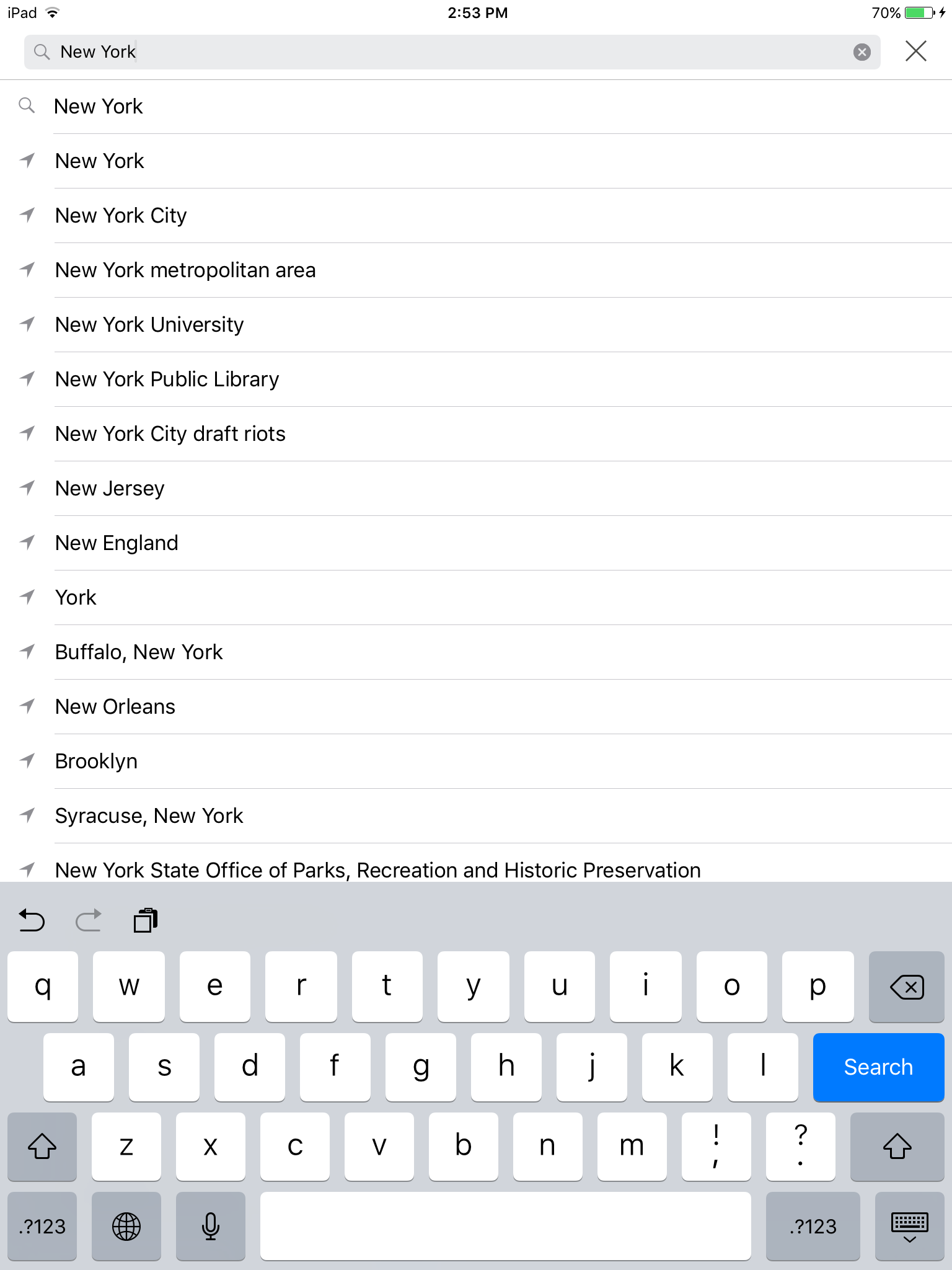
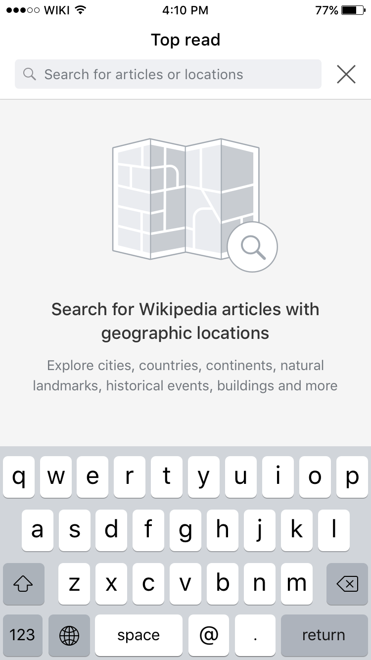
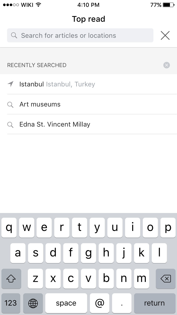
Search, search bar and filters
 |  |  |  |  |  |  |
| Default state | With active search | Search filters drop down, saved articles disabled | Search filters drop down | Search empty state | Search history | Autocomplete / search suggestions |
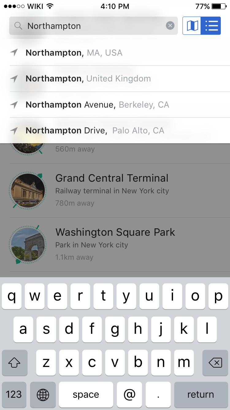
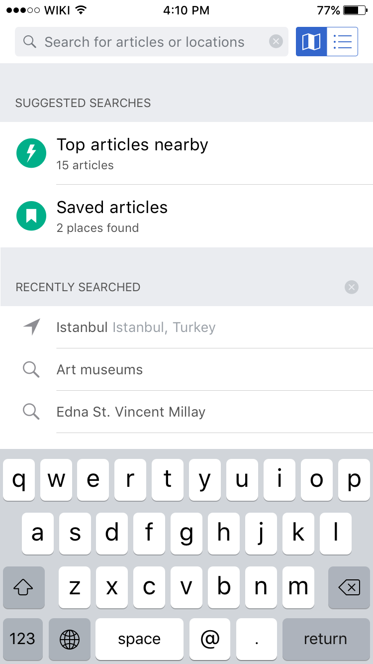
Searching
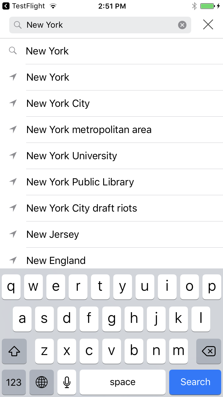
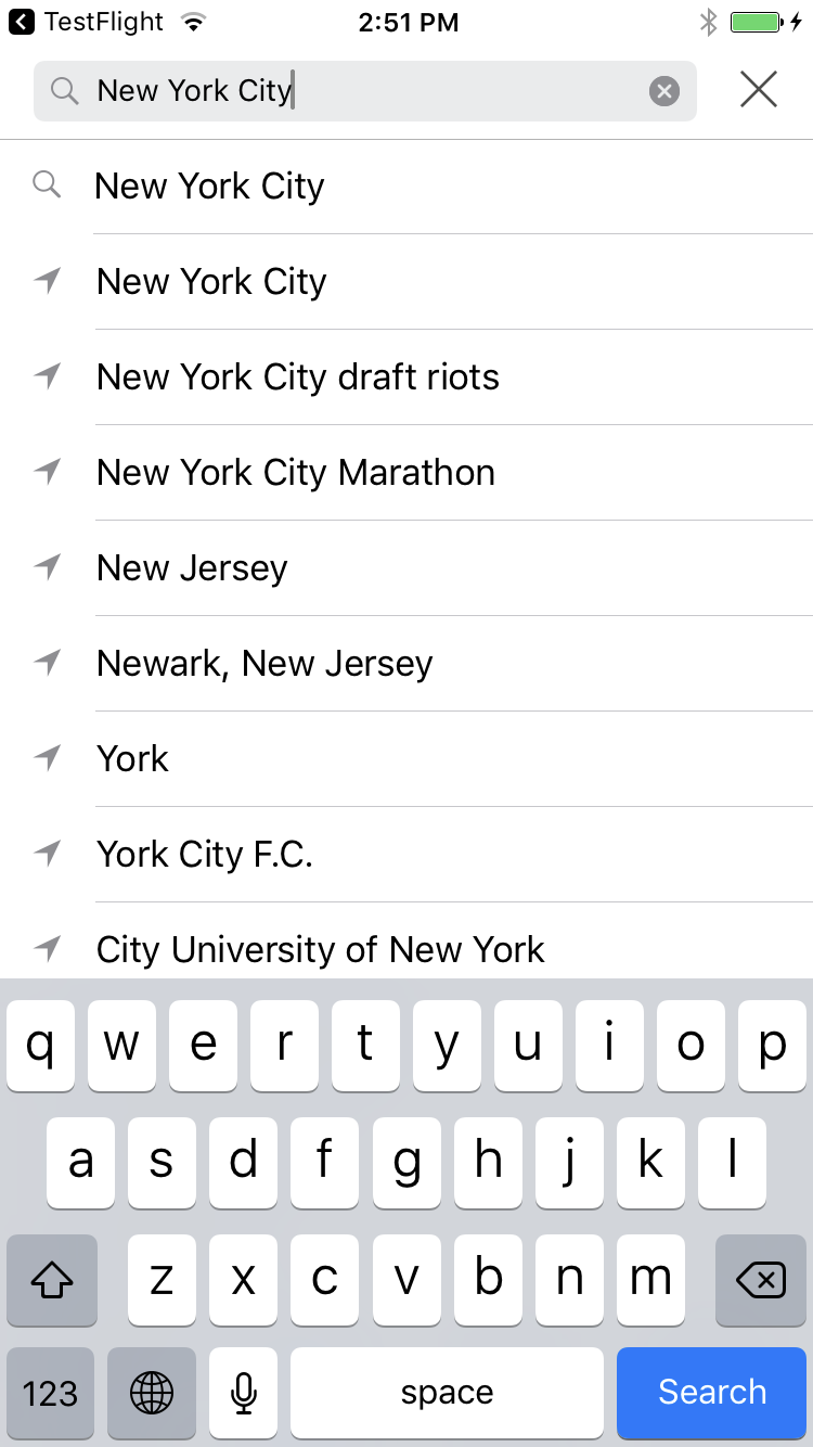
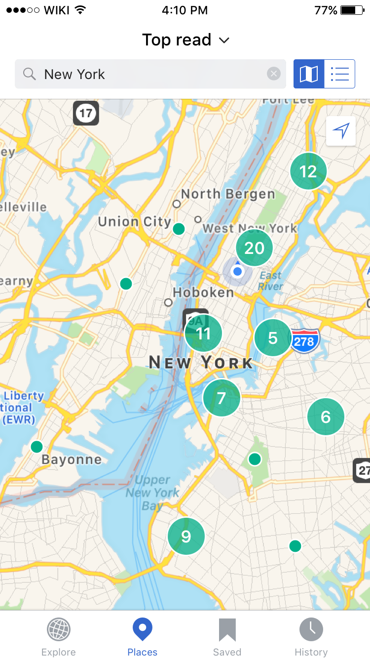
Users can search for geographic locations (eg. cities like Bangalore, India; countries like Monaco; or addresses like 221B Baker Street) as well as articles (eg. Battle of Stalingrad, Empire State Building or Anish Kapoor) or topics (eg. Museums, monuments or mountains).[3]
Search field
When a user activates the search field a set of pre-populated searches as well as their recent search history is displayed. Tapping on the pre-populated searches (Top articles near you and Your saved articles) activates the pre-populated search. If a user has not saved any articles or has location services turned off they will see a standard app error message banner.
Users can remove recent searches by swiping on the list items and tapping on delete (same as on Recent searches for search across Wikipedia).
Toggle between list and map view
Tapping on the toggle in the top right corner of the screen will move the user between map and list view. The view that they are currently on is highlighted in blue. Clicking on the toggle while the search field is active will deactivate the search field as the view is toggled.
Outside of the Nearby tab
Explore feed card
See ticket:
https://phabricator.wikimedia.org/T153119
Empty states / location permissions denied
See ticket:
https://phabricator.wikimedia.org/T123684
Questions and concerns
[1] How should the default zoom level be defined?
[2] What should be the pin cluster consolidation point (by pixels, geographic space?)
Original ticket description
Hypothesis
Nearby currently resides on the Explore feed as another card. Giving this feature more space and different representation (maps) will improve user engagement and expectation.
Ultimate vision
Extend and improve the use of geolocation as a primary method for users to find and explore encyclopaedic content.
Short term goals/needs
Improve user engagement with the Nearby feature by:
- Moving Nearby to its own tab in the tab bar
- Adding an ability for users to view results in a map or list view
- Updating the geolocation in real time when the Nearby tab is active
- Allow searching on map and/or filtering
- Ranking or sorting of search results
- Additional animations, transitions and flash to help drive up engagement
Rationale
Low usage of the Nearby feature, which we hypothesize to be due to a combination of low prominence of the feature (buried as the 4th or lower card on the Explore feed) as well as the lack of map view and associated searching, sorting and filtering capabilities that is usually available on equivalent applications with a map view.
Additionally users have frequently highlighted the Nearby feature as unique and well liked app feature, and requested easier and more complete access to geo based browsing and discovery in comments on OTRS, iTunes and in press reviews.
Initial mocks
Initial mocks on mediawiki