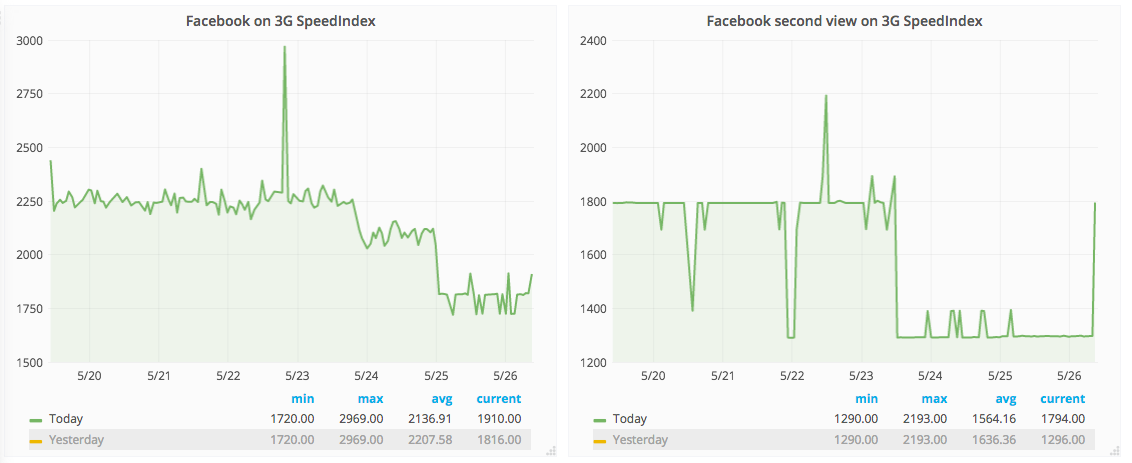
Seen in Mobile Web 3G synthetic testing, where SpeedIndex dropped significantly.
Description
Related Objects
Event Timeline
Yes I've seen it seems to make SpeedIndex better on some larger articles (Obama/Facebook) but nothing on Sweden. I check if I can find a corresponding change later today.
No visible impact in RUM (looking at firstPaint in NavigationTiming). But if it only affects large articles, it's not that surprising, as we saw with the logo preload.
I actually looked at it at the wrong place. For all three articles (Sweden/Facebook and Obama) I could see improvements about that time and also on second view (where we hit the main page and then go to the article). That is good. Also track a really small article but on that one I couldn't see any change at all.
Something that might be noteworthy, looking at the Facebook article.
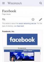
From around this run onwards the infobox is gone:
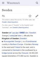
Here's what it was like before:
That's on the 25th, though. It can't be that alone, though, since those 2 runs I've used as examples have the same SpeedIndex scores.
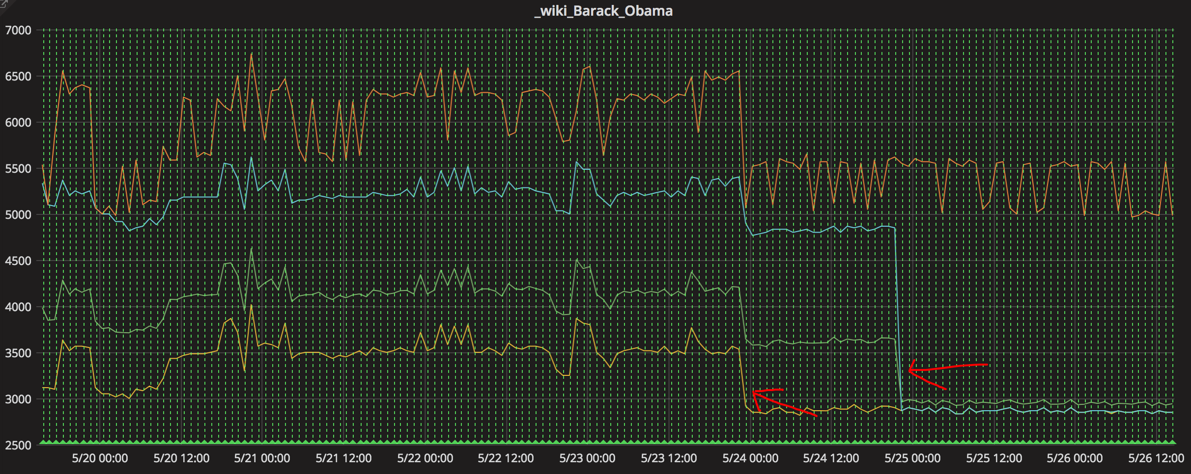
What I find peculiar, though, is that the same is seen for the Obama article. Before:
Regardless of the score of specific runs, it would seem logical that if you don't need to load an image above the fold and only text, you should reach visual completion faster.
Until further confirmation, my hunch would be that this is a "fake" performance improvement due to the infobox not appearing above the fold for mobile web on a screen that size anymore. Whether that's an intentional change or a bug remains to be determined. This might not be the only thing at play here, however, and could mixed with a real performance improvement due to BBR, for example.
Trying it out in my own browser, it does look like a deliberate change, as the first section is (subjectively) nicer to read at the top than the infobox which holds little information on a width-constrained browser. But I might be interpreting something accidental as a deliberate decision...
Found it: T150325: Move first paragraph before infobox on stable deployed in a SWAT window on the 24th.
Unless someone wants to venture in more in-depth investigation, I think we have our explanation. I think it's a real performance improvement, as a small screen is filled with content you can actually consume much faster in that kind of scenario. Instead of staring at a mostly blank infobox whose images are still loading, you get text you can actually read.
As the synthetic tests indicate, this will be a change most dramatic on slow connections.
It won't be reflected in NavigationTiming because firstPaint is content-agnostic and happens earlier, when the page chrome (site header, etc.) is rendered. We unfortunately lack client-side tools to measure this sort of improvement on real users (as in, there are no APIs that would let us measure this). We had the same issue with logo preloading for the desktop site.
Yep but that is two different changes/drops, checkout my test instance:
The first change/drop still has the image/section, click on one of the green lines. The first drop correlates to T147569 right?
Could be, yes. The BBR improvement could be verified by turning it off. Let's discuss that on the BBR task.
Yup this was an intentional change. We didn't expect it to benefit first render but that's great :)
glad to hear this will help users on slower connections. This makes me happy.
This depends on the view port and the size of the first paragraph, seen versions where we got half images in the first section after the change, so it kind of shows also the need for RUM metrics.
ok, I need to check that viewport, we use default in Chrome now for emulated device and it turns out it is different on Windows and Linux, so on Linux for the Obama article we see the top of the first image but in Windows we do not. On my Iphone 6 I don't get the image so I think we should trim/set the viewport for Chrome on Linux.
