NOTE: Supported as a finding from usability testing conducted in T167129
Problem
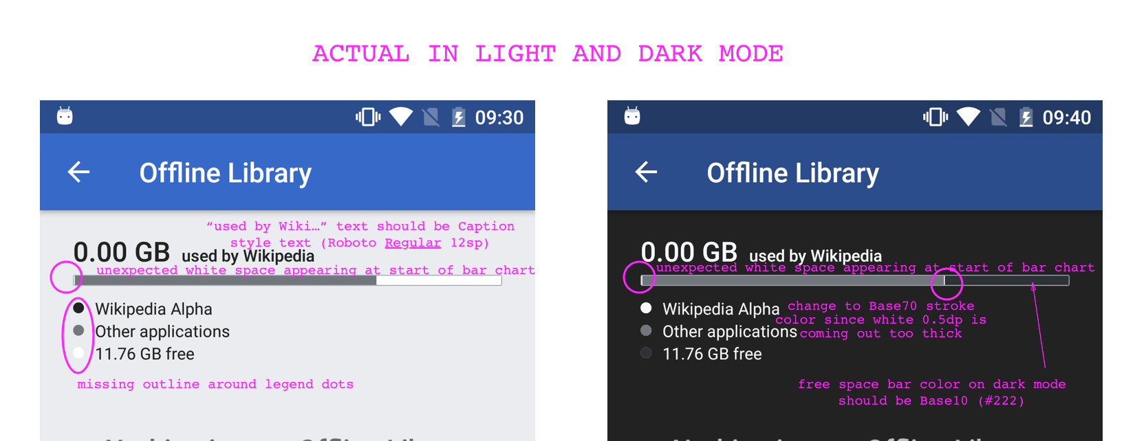
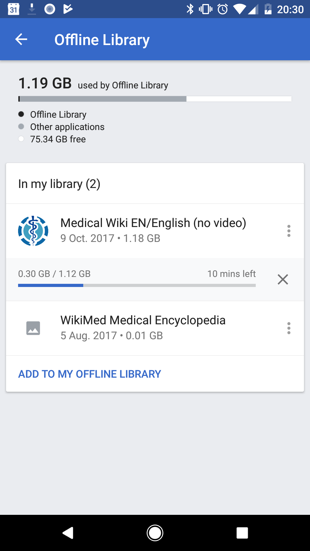
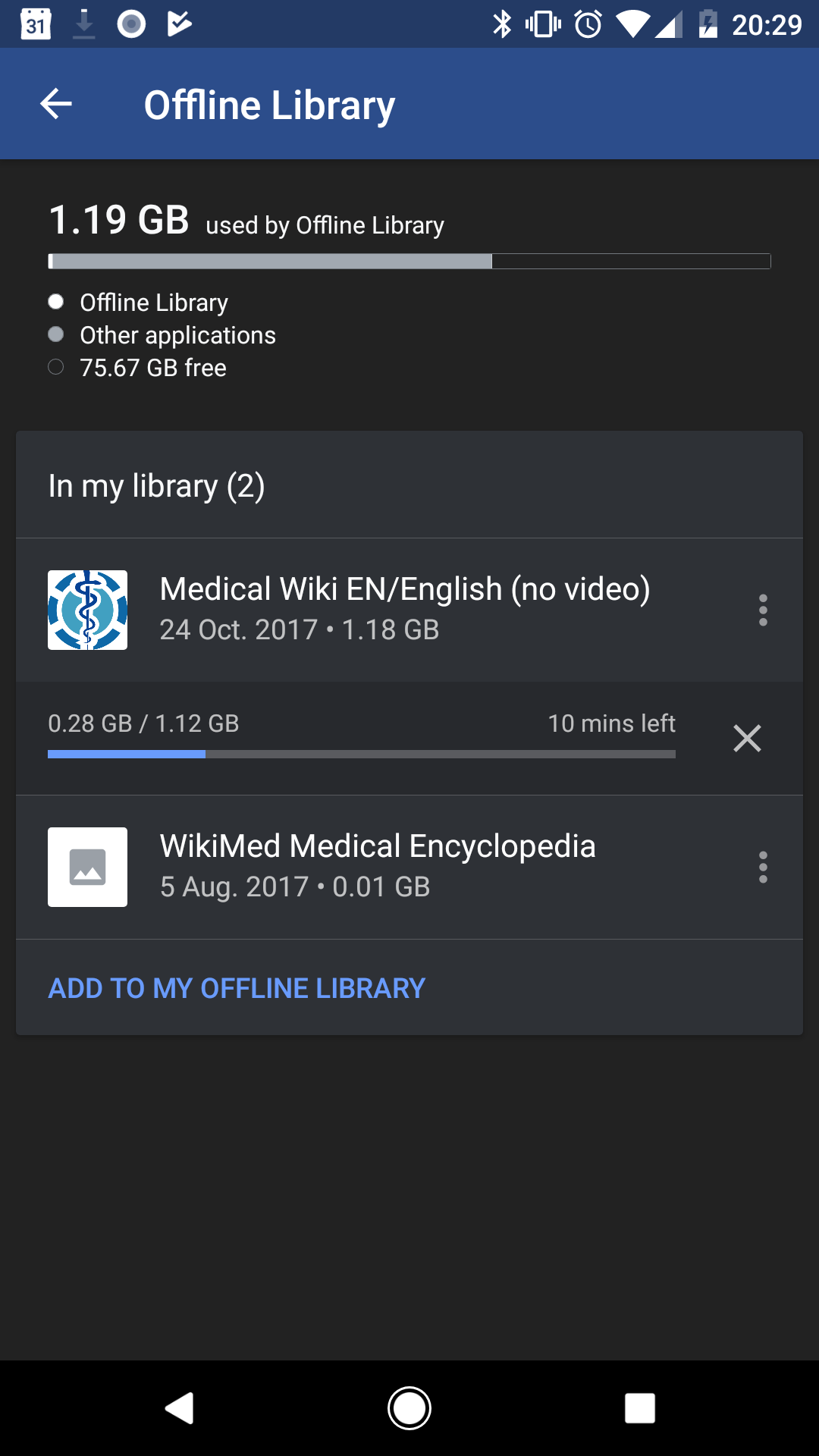
Initial visual design of the storage info was hierarchically confusing since the headline data point (storage used by Wikipedia app) was not the first bar graph element. The bar chart was also not color contrast compliant.
Proposed update
Current: 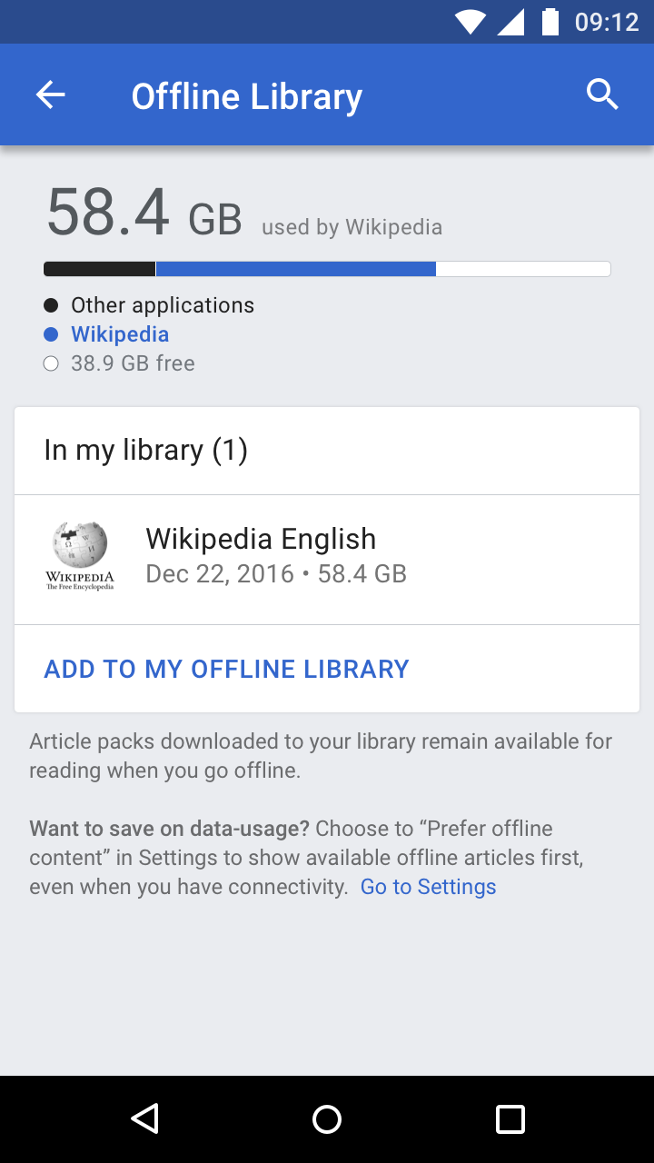 | Proposed: 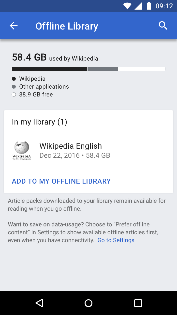 | Proposed in dark theme: 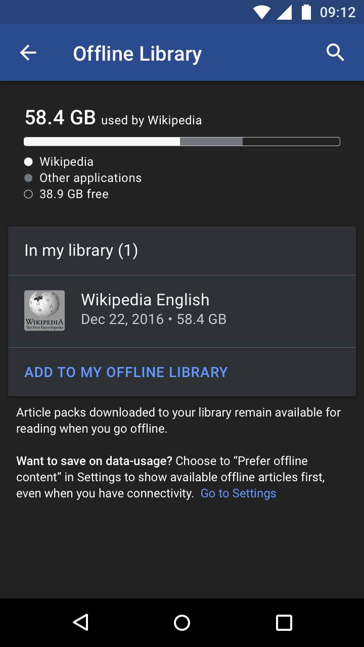 |
Notes on update to design:
- Simplified the file space used text to a single font-size and weight (Material Title style - Roboto Medium 20sp) in color Base10 (Light mode)/Base90 (Dark mode)
- The text-string "used by Wikipedia" is shown in the same color as the file space amount
- Stacked bars order shows amount of space used by the Wikipedia app first
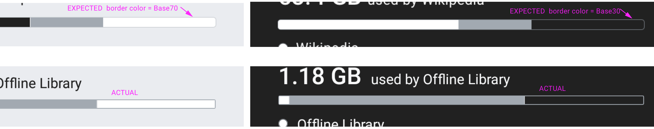
- Add a 0.5dp white right border on each bar to better visually distinguish between each bar
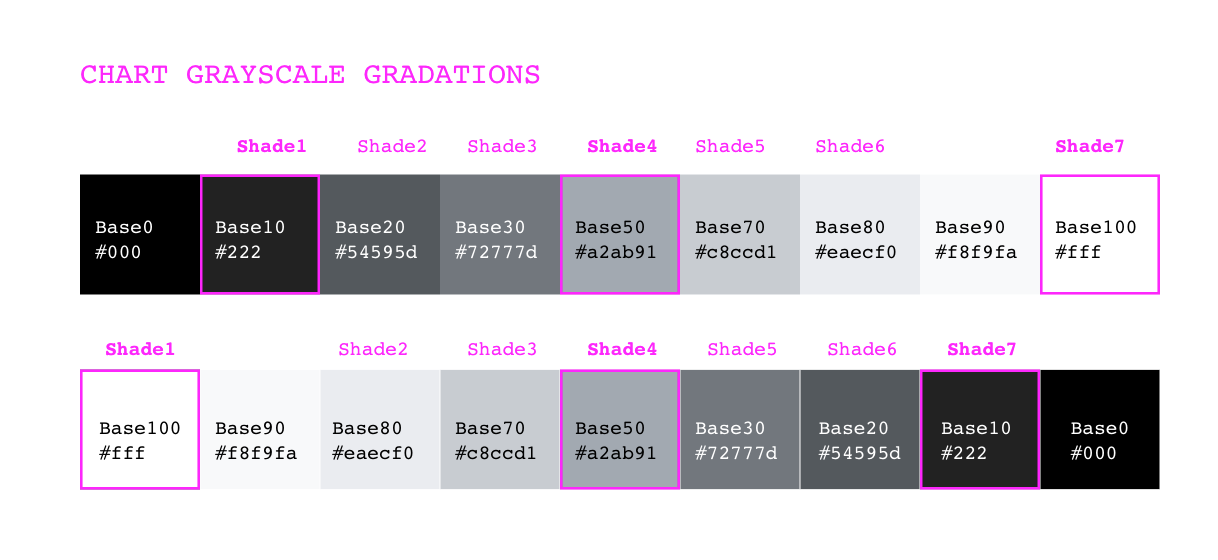
- Bar colors are shown in graduated Base colors (Light: Base10 for Wikipedia --> Base30 --> Base100 / Dark: Base100 for Wikipedia --> Base30 --> Base10)
- Similarly the space used by the Wikipedia app is shown first in the legend, with colors swatches updated accordingly
- Simplified legend text to all use the same Material caption style (Roboto Regular 12sp) in same color (Light mode=Base10, Dark mode=Base90)