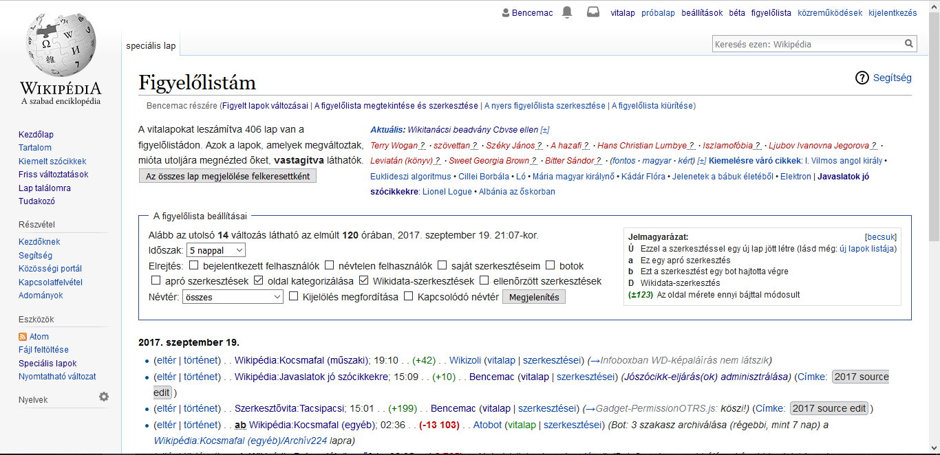
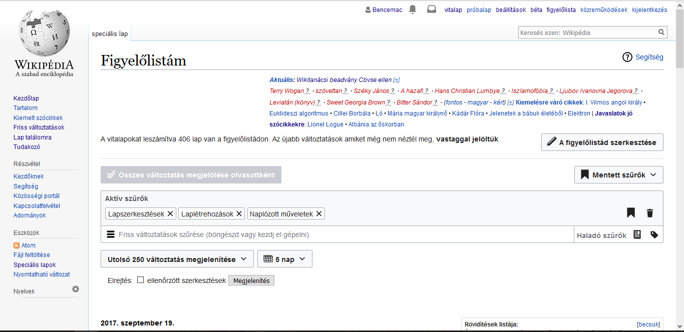
As you can see on the pictures, on the Hungarian Wikipedia the MediaWiki:Watchlist-summary is asymmetrical after the new patch. Is it possible to fix it?
Before
After
| Bencemac | |
| Sep 19 2017, 7:12 PM |
| F9653270: new.PNG | |
| Sep 19 2017, 7:12 PM |
| F9653272: old.PNG | |
| Sep 19 2017, 7:12 PM |
As you can see on the pictures, on the Hungarian Wikipedia the MediaWiki:Watchlist-summary is asymmetrical after the new patch. Is it possible to fix it?
Before
After
@Mooeypoo can you look at this? It appears that something we did on WL undid part of the Hungarians' HTML somehow. Is it easy to fix?
The old watchlist uses a <div> for {{int:watchlist-details}}, while the new (beta) one uses a “table” (<div>s with display:table, display:table-row etc.). The easiest fix is that the watchlist summary (#watchlist-ads) is 100% wide using the new watchlist. It’s quite easy to do by site CSS (the current 70% width is also done by site CSS), but I need some CSS classes to distinguish between the two versions.
The <body> has .mw-rcfilters-disabled in the old version and .mw-rcfilters-enabled in the new version, that's what we've been using to distinguish in gadgets etc.
Thanks! body has so many classes that I haven’t looked through them. I’ll fix it once I have a PC, today evening (CEST) or at latest during the weekend.