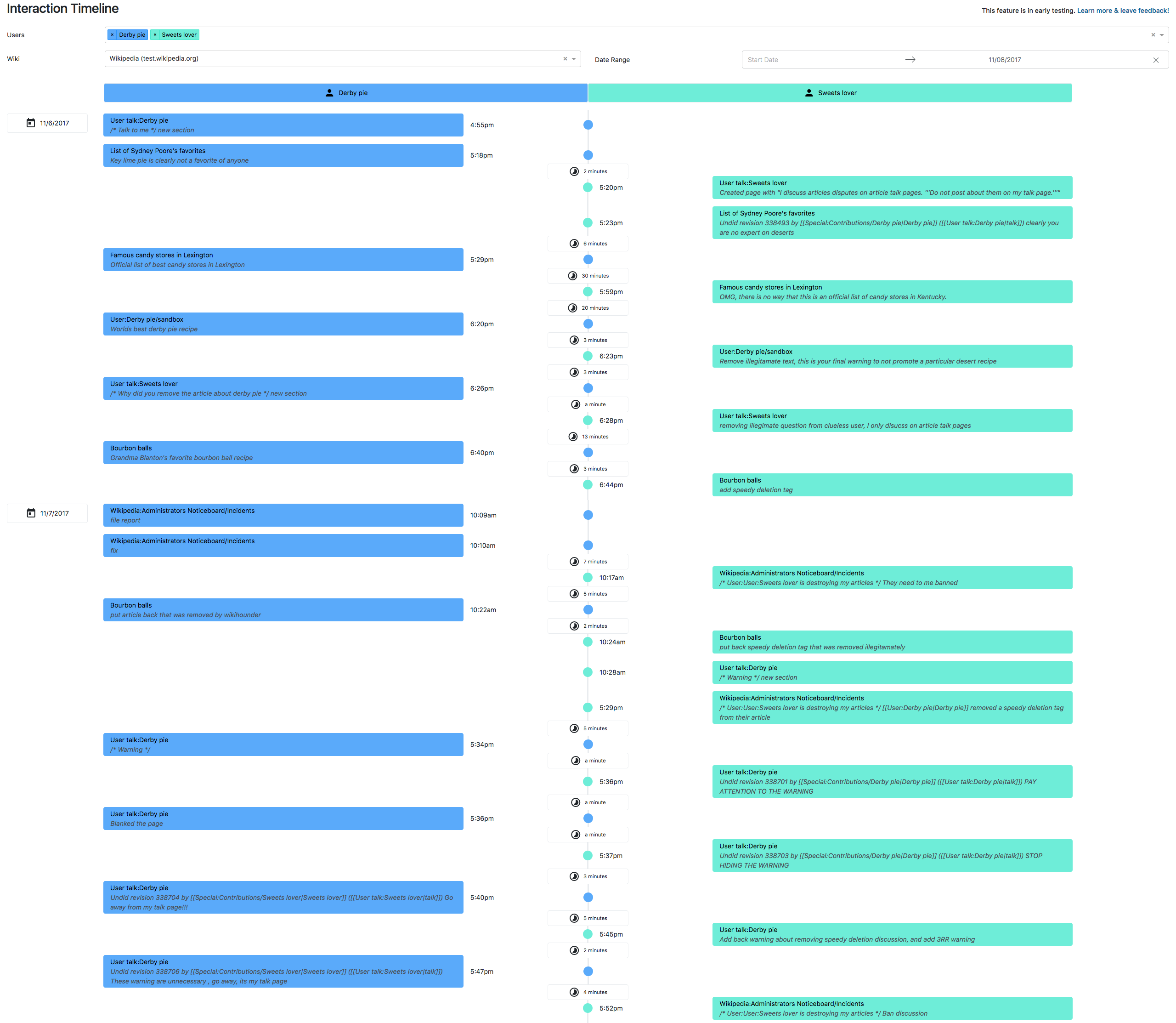
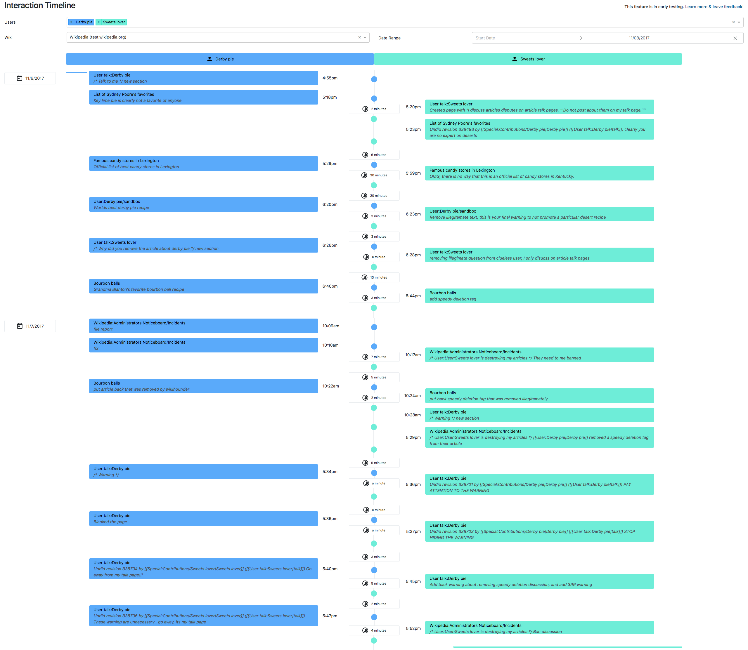
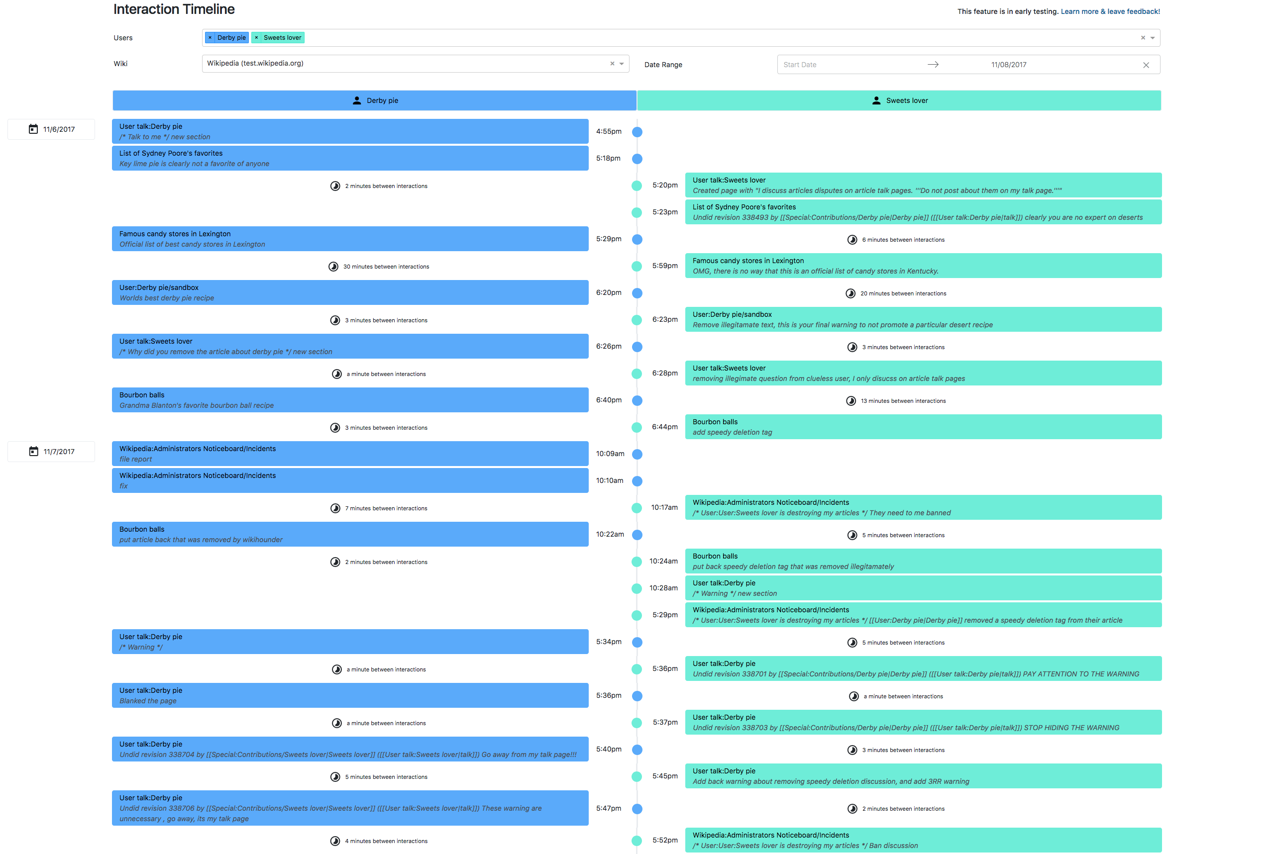
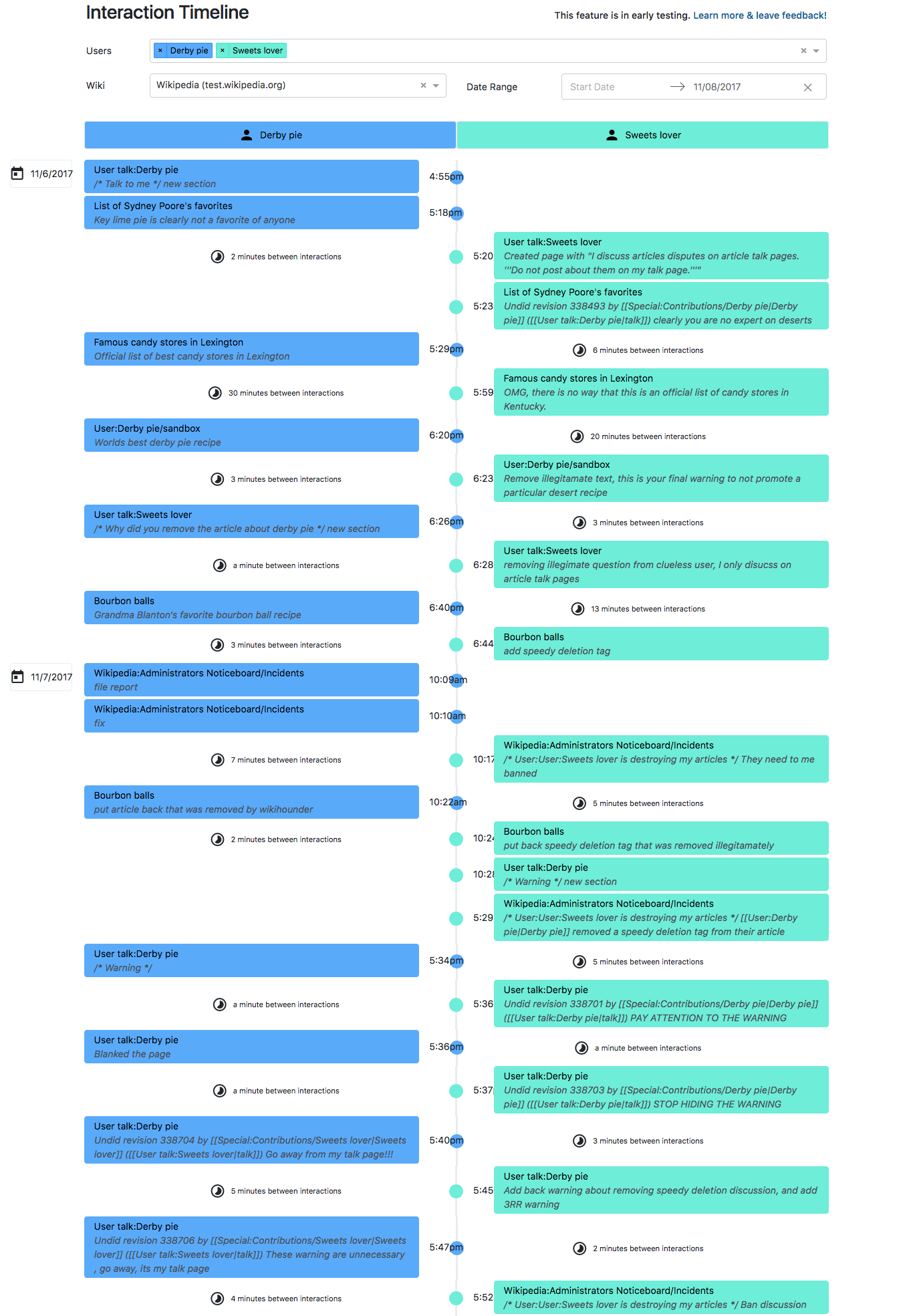
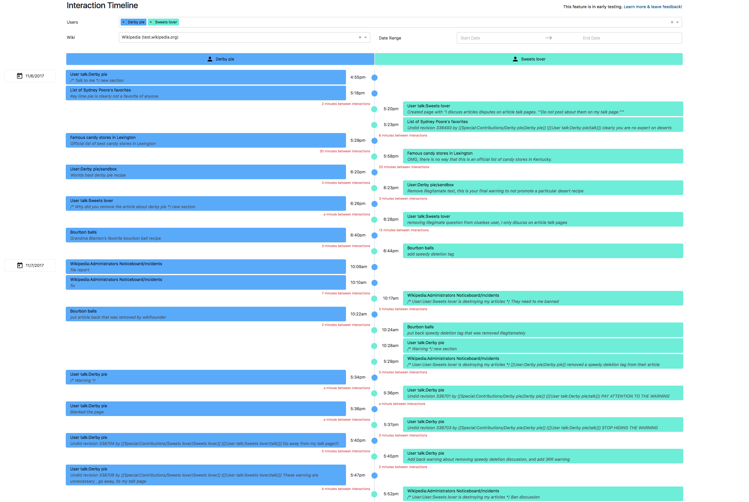
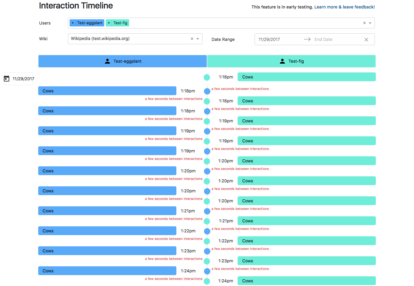
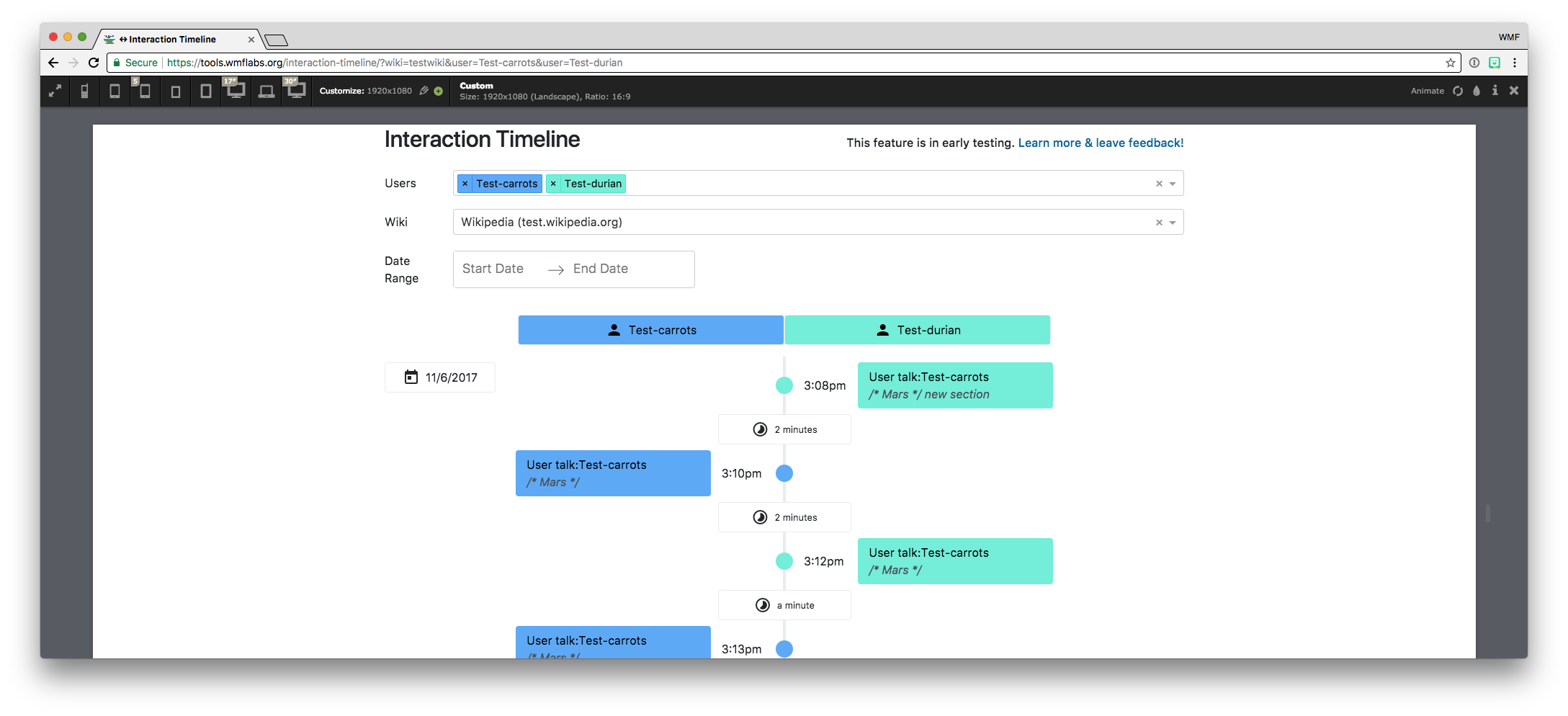
Page MenuHomePhabricator

Interaction Timeline V1: Increase information density, decrease whitespace.
Closed, ResolvedPublic5 Estimated Story Points

Description

Problem to solve

The top complaint/comment from users on both Meta and English Wikipedia is that there is a lot of whitespace and not enough data is shown on the same page at the same time.

The Interaction Timeline is a productivity tool. We should increase the usefulness of it by decreasing excess whitespace and increasing information density.


Acceptance criteria

  • The wiki and DateRange should be on the same horizontal line
  • The text-size and line-height should be akin to what is on a standard wiki page
  • The "time between" boxes should take less space
    • Remove the border of the box
    • Potentially decrease the padding and font size
    • Should say "N time between interactions" with 'time' being seconds, minutes, or hours
    • Should not display when the time is longer than 24 hours
    • Should be located on the opposite of the edit card, aligned to the top of the edit card (e.g. if User:A is editing, then User:B edits, the "time between" should be located on the opposite side of the Timeline of User B's first edit.)
  • The 'Edit cards' should take up less space
    • There should be no whitespace on the sides of the page
    • Should use standard padding and margins for the boxes
    • Should span a larger percentage of the screen (e.g. remove whitespace on the sides)

Notes

  • Optimize for standard laptop displays and large desktop monitors. The two most common sizes:

1366x768

Screen Shot 2017-11-17 at 2.12.25 PM.png (994×1 px, 156 KB)

1920x1080

Screen Shot 2017-11-17 at 2.12.59 PM.png (994×2 px, 169 KB)

(It's probably uncommon for someone to use this tool on a screen this size at fullscreen, but there's still room for improvement!)

Event Timeline

TBolliger renamed this task from Interaction Timeline V1: Use Wikimedia branding & component to Interaction Timeline V1: Use Wikimedia branding & components.Nov 9 2017, 6:36 PM

We'll probably only use the CSS in https://github.com/wikimedia/oojs-ui since the JS performs DOM manipulations (which will get wiped out by React). I'm not sure how well the CSS will jive with Bootstrap (which is what we use now), but might be worth finding out! (we might be able to just include Bootstrap's Grid layout and exclude it's UI components)

It might be wise to open a new OOJS UI repo for React components (and we can just convert the components we want to use).

Sounds good!

The goal of this is for it to be visually cohesive. As it's on toollabs we definitely have some leniency. I think the 80/20 rule should apply to our level of investment on this.

Caroline needs to provide specifics on what needs to be updated.

Hi all, the design team shared this with me!

https://github.com/wikimedia/wikimedia-ui-base

But the https://github.com/wikimedia/oojs-ui is the right one to use.

What exactly is blocked on my end for this?

Replacing 100% of all components with the oojs UI elements may be more work than benefit. We'll need to prioritize which components to replace. Here's a draft:

  • Username input box
  • Wiki dropdown
  • Icons
  • Font and text size
  • Date range selector

I do think it's fair to say that everything new we add should use oojs UI elements, to not further the visual debt.

I agree. Do these UI elements not exist in the above, could we add them in now and see a screenshot from @dbarratt ?

David, I'd like to hear your thoughts about how we should scope/approach this.

yes same! would love feedback on the scope, david.

@TBolliger so.. I think what we should do is create a wrapper library that wraps the existing OOjs UI components in React components. I created T180487 to do just that. Based on the documentation, I don't think it will be too bad. It will probably take more time to setup the repo/library than it will to actually wrap the components.

Also, we should just the ones we need and add to the library as we need them. Probably should start with the simpliest UI compoment

  • Username input box

Replace React Select with ComboBoxInputWidget

  • Wiki dropdown

Replace React Select with LookupElement

  • Icons

Which Icons?

  • Font and text size

Need to include the .less files found here (by updating the Webpack config):
https://github.com/wikimedia/oojs-ui/tree/master/src/themes/wikimediaui
and ensure there are no Bootstrap conflicts (i.e. probably remove the Bootstrap theme and only use Bootstrap's layout).

  • Date range selector

Replace React Dates with... there doesn't seem to be a date selector in OOjs UI. :( What do we use in MediaWiki?

Oh of course.. the DateTime element, which can be seen in the APISandbox, is specific to MediaWiki and not in OOjs
https://github.com/wikimedia/mediawiki/tree/aa12df5134952e8cb90cd8b3e4fe435a85b7abf0/resources/src/mediawiki.widgets.datetime

We should probably make a ticket to move that widget out of MediaWiki and into OOjs if we want to use it.

We can ignore the DateTime element until that ticket is resolved. Everything else seems like a solid plan to me!

TBolliger renamed this task from Interaction Timeline V1: Use Wikimedia branding & components to Interaction Timeline V1: Use Wikimedia UI components.Nov 16 2017, 10:31 PM
TBolliger removed CSindersWMF as the assignee of this task.
TBolliger updated the task description. (Show Details)
TBolliger renamed this task from Interaction Timeline V1: Use Wikimedia UI components to Interaction Timeline V1: Increase information density, decrease whitespace..Nov 17 2017, 10:18 PM
TBolliger updated the task description. (Show Details)

Hi all, I approve the above ticket but I will want to figure out how we go about creating more information density. We still need a workflow decision and that's not reflected here. I can create more pixel perfect wires if that's helpful, or we can go back and forth with screenshots but we need a workflow outlined and I don't see that reflected here.

I vote that we do some pixel perfect wireframes, and then @dbarratt and I go back forth in a day or a worksession via gchat to get the information density more right and then share that updated prototype.

Thoughts?

We're meeting Monday to talk about and decide on a process.

@CSindersWMF We talked the other day about making a wireframe that showed the font size you want, the spacing, the percentages, the margins, etc. I think that would be helpful if you made that before the Monday meeting, so it's clear what you're looking for?

We had a chat with @dbarratt and @CSindersWMF and decided on how to most efficiently move forward with this (without designing pixel perfect mockups.)

@CSindersWMF is going to make annotated wireframes (as mentioned in Danny's comment) and attach them to this ticket by Monday 2/27 (the start of our next sprint). Then, David will make the CSS changes and communicate with Caroline via GChat for rapid feedback.

TBolliger set the point value for this task to 5.Nov 27 2017, 4:44 PM

Oops... let me fix the alignment of the timestamps. :)

Yes, way better!
Mainly, this looks fine as a screen shot but what are the actual sizes?
Additionally, I still think we need a box or some form or marking between dates so editors can easily scan. Uploading a mockup right now of what I mean. But this looks great, it's such an amazing improvement, we just need a few more tweaks.

Still waiting on that mockup, Caroline. :) (Edit: Doh! read the date wrong, thought this comment was from yesterday. I'm not that impatient. 🙂 )

My 2¢: The "time between" boxes still take up too much space. What can we do here?

4¢: The input boxes don't need to span the full width on large monitors. But we can probably address this when we add more filter options.

4¢: The input boxes don't need to span the full width on large monitors. But we can probably address this when we add more filter options.

Maybe they could be the same width as the username boxes? (at the top of the timeline)

Okay so big things to consider.

Text- it's too big, make it smaller.
The only bolded text should be the editors names and that's it. Remove all over bolded text.

We need the lapse between edits on the side. It's a must, it's the best way to make it minimize whitespace, and it was in the wires and our editors seemed to approve of it.

We need boxes around dates to make it more scannable.

Time between edits *has* to be moved to the sides, per the mockup.

When you look at this current mockup, the tool should reflect what I've mocked up. Again, no bold texted. Smaller text, around .7 or .8rem or less. 2-5 pixels between date boxes

Between the boxes, we need somewhere around 5 pixels separating the bigger boxes for dates (pls see wires). We can discuss that over gchat- I'm worried 5pixels is too much and I think you will worry 5 pixels is not enough.

What you see are 2 mockups and 1 is a screenshot. That screenshot is the tool, before you made the above edits, at 75% of it's original size.
A and A1 correlate to these annotations:
A. There’s too much space between each drop down. Lessen the padding or space between each drop down by 2-5 pixels.
A1. The date range box is too big, make it half the size it currently is and have the words ‘date range’ placed next to each other not on top of each other. I changed the font size to 0.7 rem. This just needs to be a lot smaller.

Mockup with annotations:
B. We *need* boxes to separate dates. Between each box, I would recommend 2-5pixels (let’s see what this looks like in the prototype).

B1. Time between interactions has to be moved to the side.

Generally, all the text can be smaller, and the padding with the text inside of the boxes can be less. As you see in the mockup, there's maybe a pixel or two of room between the box and the text inside the boxes. The text is almost the same size of the box that houses it.

@dbarratt phabricator is being weird and not letting me edit the above comments. let me know if you can see the attached pdf, and hit me up on gchat so we can fine tune the above wire/mockup.

@TBolliger Let me know if anything in this task needs to be changed or if it is good to be code reviewed/deployed. :)

hey all, so let's move the edit boxes closer to the timeline, per this image.

Screen_Shot_2017-11-27_at_16.13.59.png (2×2 px, 574 KB)

and less space between boxes like so:

boxes_spcae.png (74×488 px, 24 KB)

I'm thinking about 2-3 pixels between boxes.

1366x768

Screen Shot 2017-11-29 at 12.56.52.png (1×1 px, 347 KB)

Got those timestamps a little too close to the sun.

  • Fix the timestamp in 1366x768
  • Align the timelapse to the timeline
  • Make the timelapse text #ff6c00 and remove the icon

Looks way better! I think we're pretty much there.