Why are we doing this?
Currently there are two section very similar header styles used in the app. To improve consistency and polish we should settle on a single style.
| Article footer | Settings |
|---|---|
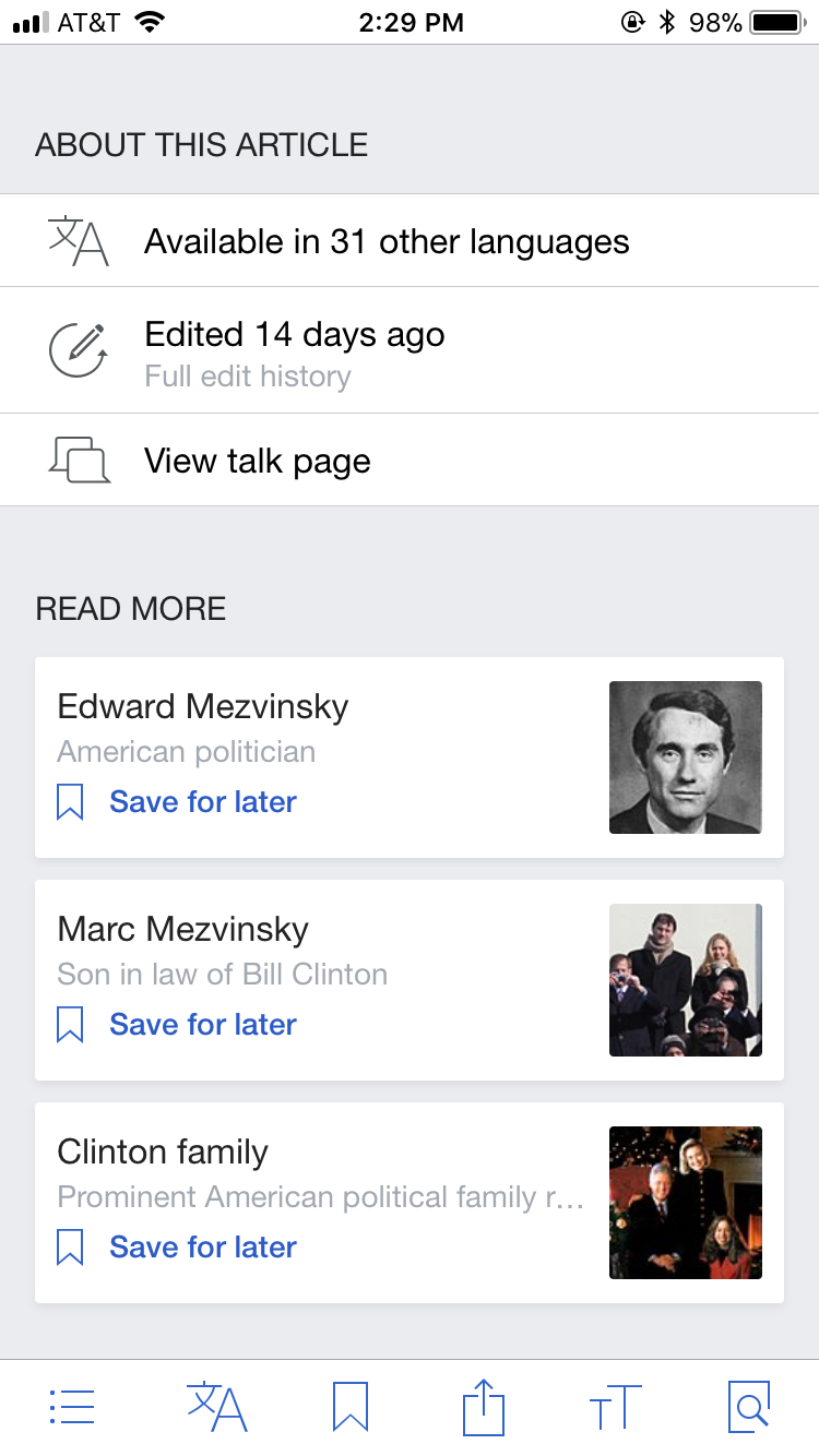 | 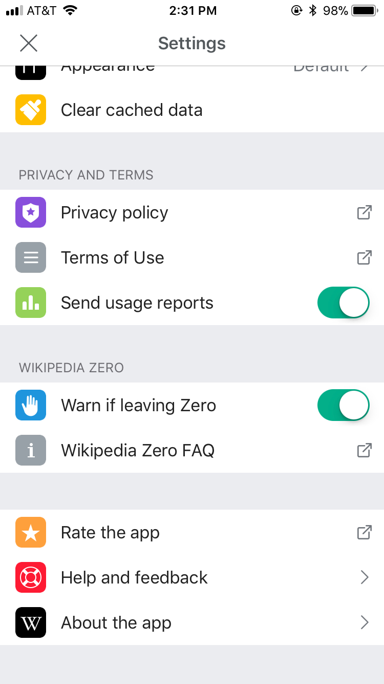 |
Design proposal
Utilize the Settings header design throughout the app, as this design is most closely based on the iOS header style and is used as the subheader style for cards on the Explore feed.
| Wikipedia app settings screen |
|---|
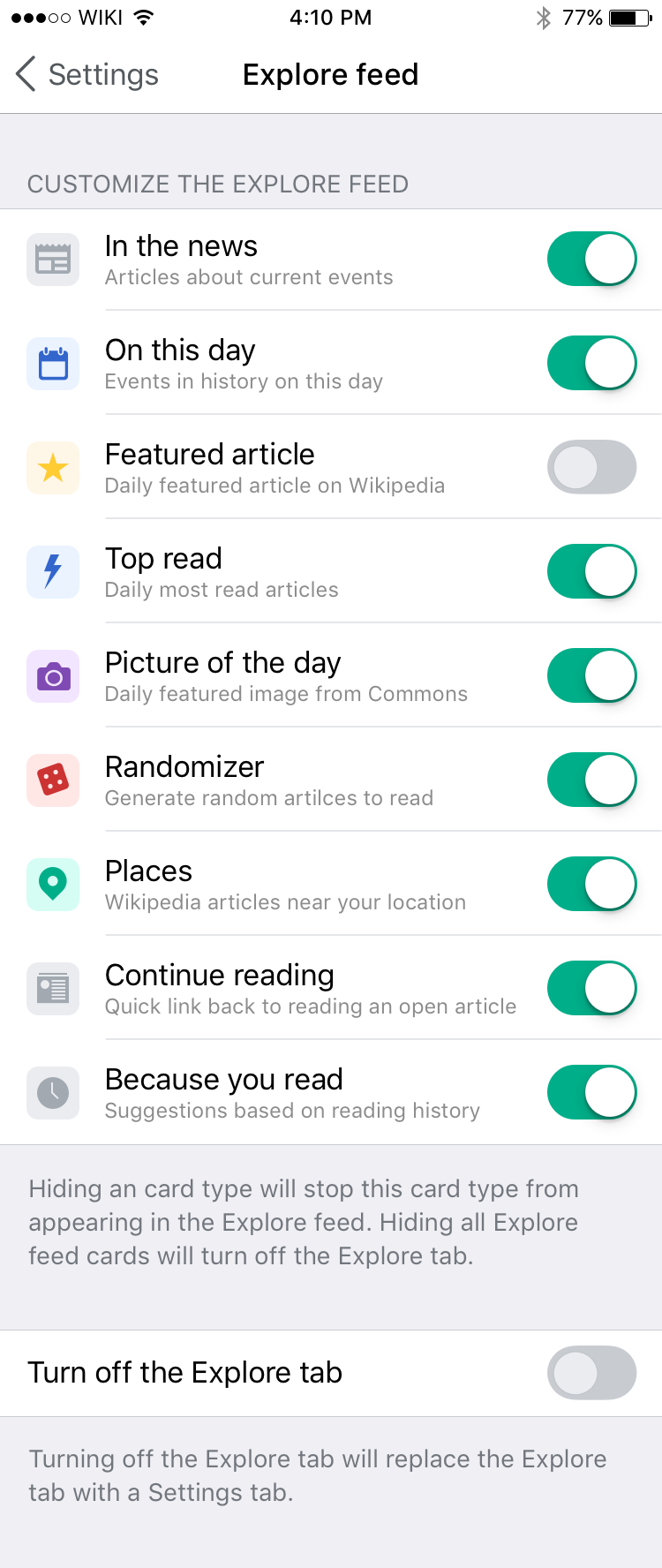 |
| Zeplin: https://zpl.io/bW1BdvK |
Text size: 14pt
Font: SFUIText-Regular
Line Height: 19pt
Color: #72777d
Letter spacing -0.1pt
Left padding 18pt
Top padding: 35pt
Bottom padding: 5pt