Why are we doing this?
Article disambiguation is harder to find than its intended purpose.
Problem
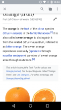
- Currently we show the disambiguation text underneath the lead paragraph which may be quite far into the article that the reader must scan before seeing this notice.
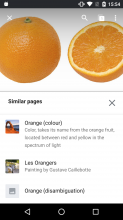
- There is also a second way to show disambiguation articles in a list which is by the user knowing to tap on the article overflow and tapping on the "Similar pages" menu item.
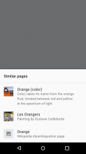
| Example of the current disambiguation below the lead paragraph: | Example "Similar pages" bottom sheet: |
User story to be addressed
As a reader who may have been looking for a similar article the one I've opened, I want to know as as quickly as possible what the other similar article are, so that I may easily navigate to my intended reading target instead.
Proposed solution
- Move the disambiguation text to show above the lead paragraph
- Remove the hidden "Similar pages" menu item in the article overflow
- Add a "Similar pages" menu item as a section in the "About this article" footer menu instead (per iOS). Tapping on the "Similar pages" menu item here will trigger the Similar pages bottom sheet with visual styling updated to use standard bottom sheet and article list-items:


