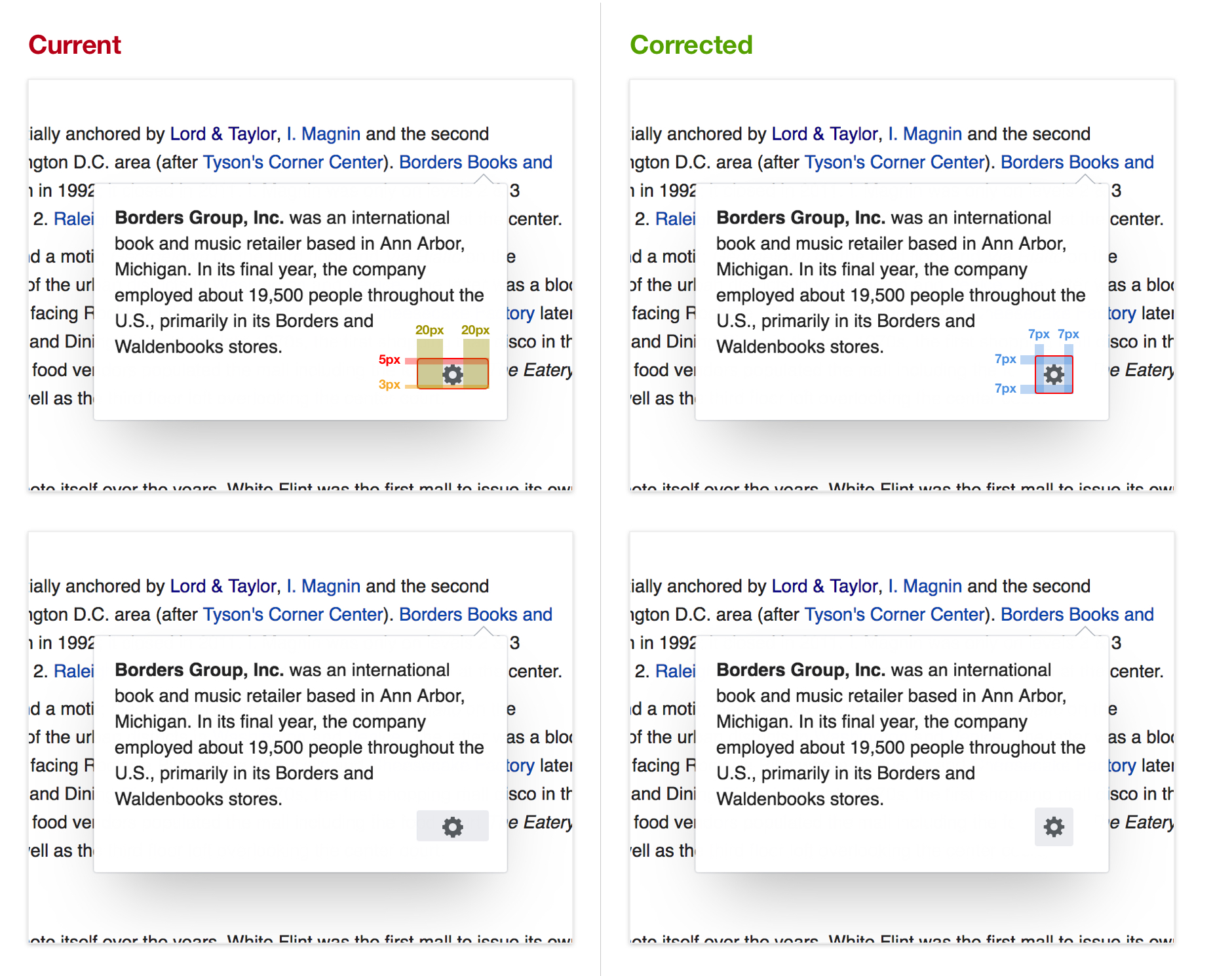
Steps to reproduce
Hover over a settings cog in a page preview panel, look at the gray area that appears
Hover area
The gray area that appears when you hover should be:
-square
-equal 7px around icon on all sides
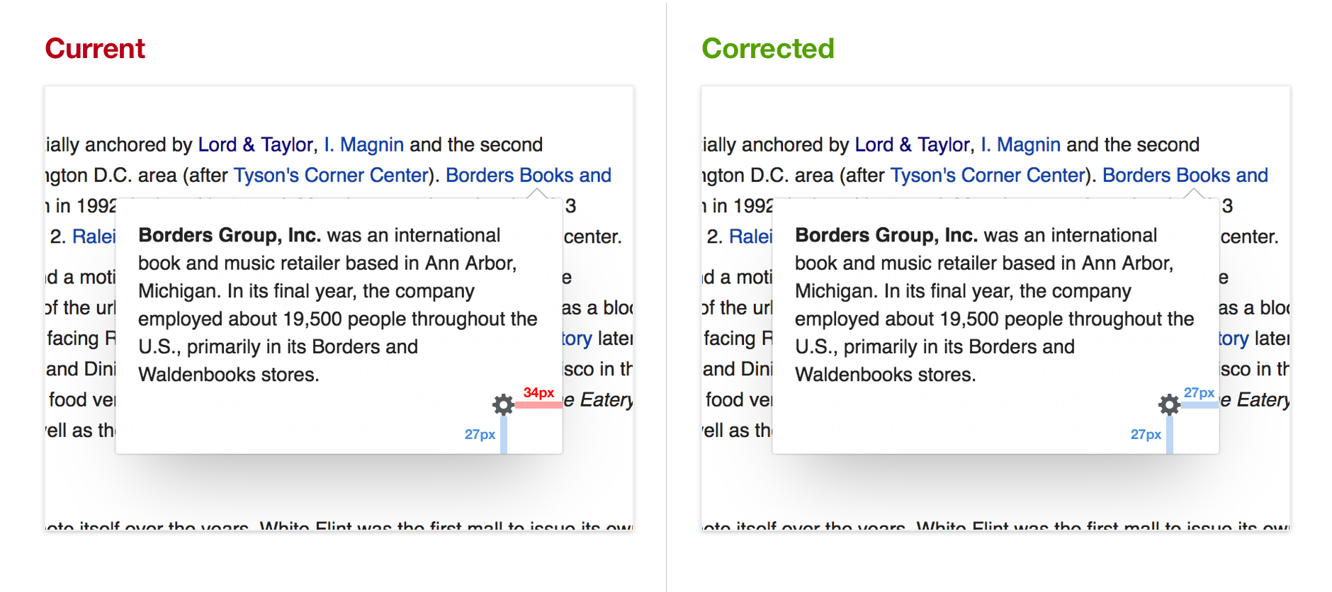
Placement
The settings cog should have equal distance from the right and bottom of the page preview panel
-27px from right
-27px from bottom
Acceptance criteria
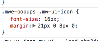
- remove .mwe-popups .icon rule
- use flexbox
- Use appropriate/consistent use of mw-ui-icon (label inside icon)
See https://phabricator.wikimedia.org/T193058#4163023 for more details
- Update icon asset
- Ensure design is happy before merging.
Testing
We should make sure to test on both horizontal and vertical, RTL and LTR


