Page MenuHomePhabricator

Reduce height of mobile page issues banner and offset of learn more
Closed, ResolvedPublic3 Estimated Story Points

Assigned To
Authored By
alexhollender_WMF
Jan 24 2019, 4:05 AM
Referenced Files
F28563315: image.png
Apr 3 2019, 4:26 PM
F28571119: image.png
Apr 3 2019, 4:26 PM
F28563319: image.png
Apr 3 2019, 4:26 PM
F28563333: image.png
Apr 3 2019, 4:26 PM
F28563330: image.png
Apr 3 2019, 4:26 PM
F28571111: image.png
Apr 3 2019, 4:26 PM
F28563325: image.png
Apr 3 2019, 4:26 PM
F28471245: Screen Shot 2019-03-26 at 13.19.33.png
Mar 26 2019, 12:26 PM

Description

There are 2 problems with alignment of page issues and given they impact each other, they will be fixed in tandem.

Description of problem 1

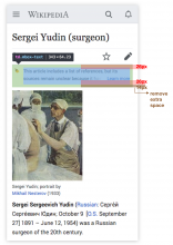
There is ~14px of extra space below the content in the mobile page issues banner. This offsets the content such that it is not vertically centered within the banner. At first I thought this was related to T214548, but after messing around with the positioning of the learn more link a bit I'm not entirely sure. I'm seeing this issue on:

  • Android / Chrome, Firefox
  • iOS / Safari, Chrome, Firefox
  • MacOS / Safari, Chrome, Firefox

Design notes

page issues banner extra space.png (1×984 px, 622 KB)

Description of problem 2

Description

Currently the "Learn more" link is appearing 6px too low in the mobile page issues banner, and is therefore not in line with the rest of the text. I'm seeing this issue on:

  • Android / Chrome, Firefox
  • iOS / Safari, Chrome, Firefox
  • MacOS / Safari, Chrome, Firefox

Documentation

iOS / ChromeAndroid / Chrome
iOS chrome.PNG (1×750 px, 148 KB)
Android chrome.png (2×1 px, 320 KB)

Design notes

learn more offset.png (1×988 px, 199 KB)

Development notes

From an offline conversation with @Jdrewniak:

Should be an easy fix though, just changing bottom: 8px to bottom: 1em

This still seems to be 1px off. I tried bottom: 14px which seemed to align it.

See T214549#4907439

Changes apply to all pages with issues.

QA steps

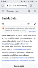
On production, verify that the page-issue banners have equal spacing at the top and bottom, and that the "learn more" link is aligned with the text in the banner.
Event Timeline

Jdlrobson subscribed.
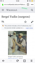
  1. I'm seeing 8px of space at the bottom of https://en.m.wikipedia.org/wiki/Sergei_Yudin_(surgeon) due to the bottom padding (not 14px so not sure if this is what you are referring to).

If I change this to:

.client-js .ambox td {
    position: relative;
    padding: 8px 8px 0 32px;
}

I see:

Screen Shot 2019-01-24 at 1.14.30 PM.png (316×354 px, 71 KB)

  1. Is that what's being asked for?

(If so we just need to change the bottom padding.)

  1. I assume this is a problem for all pages?
Jdlrobson renamed this task from Reduce height of mobile page issues banner to Reduce height of mobile page issues banner and offset of learn more.Jan 24 2019, 9:19 PM
Jdlrobson updated the task description. (Show Details)
Jdlrobson added a subscriber: Jdrewniak.

Problem 2: To clarify would we be making these change for all pages?

@Jdlrobson

  1. Is that what's being asked for?

Yes, that looks super close. I'm still measuring it as 1px off. On my machine this works:

.client-js .ambox td {
    position: relative;
    padding: 8px 8px 1px 32px;
}

in conjunction with changing the bottom positioning on the learn more link from 8px to 7px:

.client-js .ambox .ambox-learn-more {
    css...
    bottom: 7px;
    css...
}
  1. To clarify would we be making these change for all pages?

As far as I can tell this issue is affecting all instances of the page issues banner. Perhaps @Edtadros could help with a more comprehensive verification.

@Jdlrobson are there more design questions here, or can I move this out of the design column?

ovasileva set the point value for this task to 3.Mar 13 2019, 5:23 PM

Change 499179 had a related patch set uploaded (by Jdrewniak; owner: Jdrewniak):
[mediawiki/skins/MinervaNeue@master] Fix alignment of "learn-more" link on page-issues

https://gerrit.wikimedia.org/r/499179

I think the patch above solves the issue for the most part.

Screen Shot 2019-03-26 at 13.18.16.png (820×1 px, 711 KB)

What's weird is that I'm still seeing a pixel different in the baseline alignment in Chrome, but not when I open the devtools with the "responsive" mode. Then it goes away.

Screen Shot 2019-03-26 at 13.19.33.png (552×1 px, 538 KB)

The pixel difference is also not visible on Safari, so I guess it's best to check this on real devices.

Screen Shot 2019-03-26 at 13.21.43.png (600×1 px, 125 KB)

Here's a highlight of the padding just to show that it's even on top and bottom.

Screen Shot 2019-03-26 at 13.25.29.png (262×798 px, 47 KB)

Change 499179 merged by jenkins-bot:
[mediawiki/skins/MinervaNeue@master] Fix alignment of "learn-more" link on page-issues

https://gerrit.wikimedia.org/r/499179

Jdrewniak updated the task description. (Show Details)

@alexhollender it looks like this change is live in production. Do you want to verify this change? ( I ask since it's primarily a design issue).

🙏 @Jdrewniak yea, this probably should've gone through design review earlier. Going to drop it there now, take a peek, then will move it back to QA.

Tested on the beta cluster.

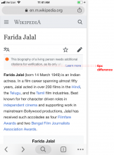
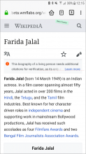
@Jdrewniak well this is annoying, but it seems to be ~¾ of a pixel off on iOS browsers (Safari, Chrome, Firefox). Looks perfect on Android and desktop browsers (Chrome, Firefox, Safari). Unless you have an idea of how to easily fix this I'd say it's we're good to go.

safarichromefirefox
iOS
image.png (1×750 px, 174 KB)
image.png (1×750 px, 176 KB)
image.png (1×750 px, 648 KB)
android
image.png (1×727 px, 247 KB)
image.png (1×722 px, 246 KB)
desktop (mac)
image.png (1×750 px, 565 KB)
image.png (1×750 px, 577 KB)

Spoke with @Jdrewniak offline. We've decided to live with the ~¾ of a pixel discrepancy 😊