Why are we doing this?
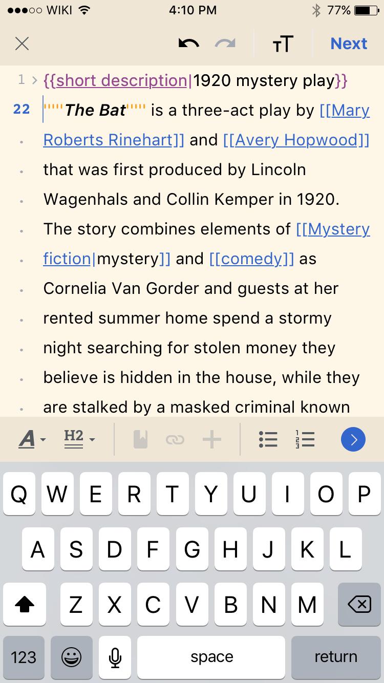
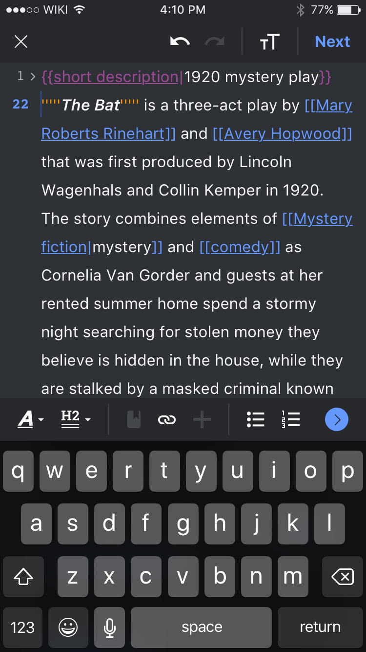
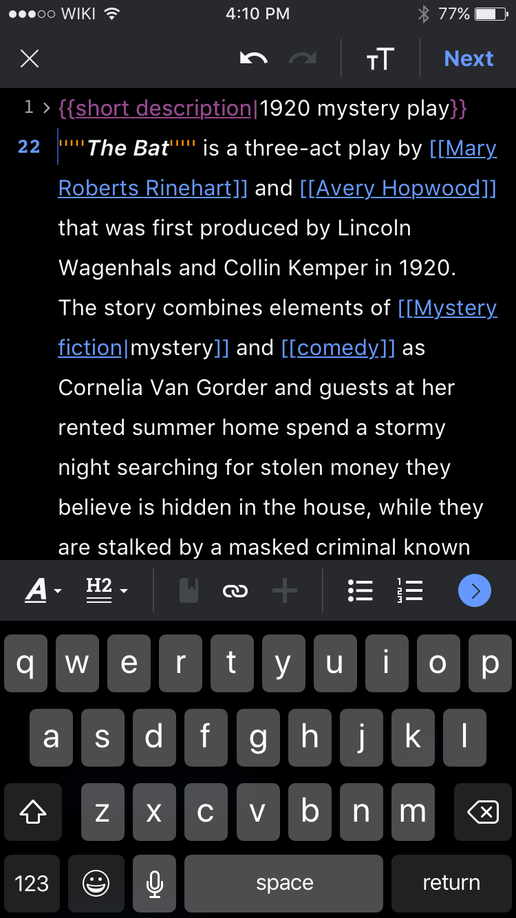
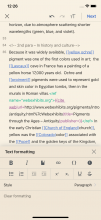
Due to the lower contrast on secondary reading themes with shadows, we have removed shadows from the Explore feed and other parts of the app for these themes. We would like to be consistent and not show a shadow on Dark, Black and Sepia in the editing mode.
User story
As a user of secondary reading themes, I would like my experience to be consistent.
Proposed solution
Remove the shadow from the editing toolbar on Dark, Black and Sepia
Sepia
| Current | Updated |
|---|---|
Dark + Black
| Current | Updated Dark | Updated Black |
|---|---|---|
