User story: N/A
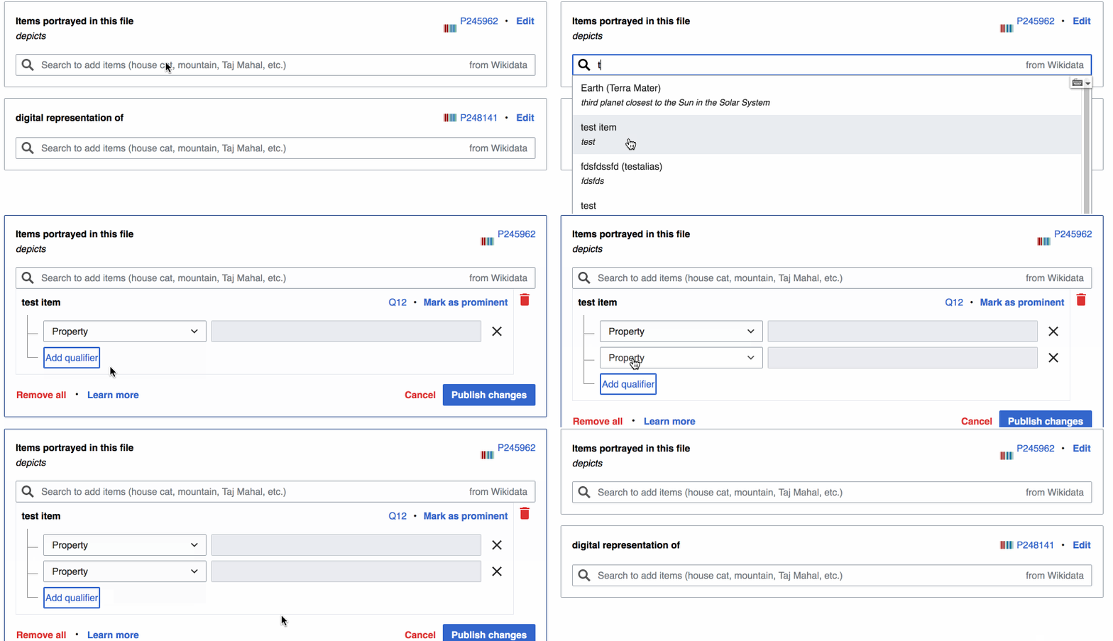
We have this:
Tested on Beta. When I add a qualifier to an item, the "Add qualifier" button is focused. Besides being confusing, this seems like an accessibility issue as well as.
We want this:
For the "Add qualifier" button to not be focused. Instead, automatically focus on the Property dropdown menu so users know what to do next: select a property.
GIF (tap to play):
Url to test on beta: https://commons.wikimedia.beta.wmflabs.org/wiki/File:Title_0.9209196250626945.png
Acceptance Criteria:
- When adding a qualifier, the focus should be on "Property" dropdown, not "Add qualifier" button
QA Results
| AC | Status | Details |
|---|---|---|
| 1 | ✅ | T223916#5293510 |

