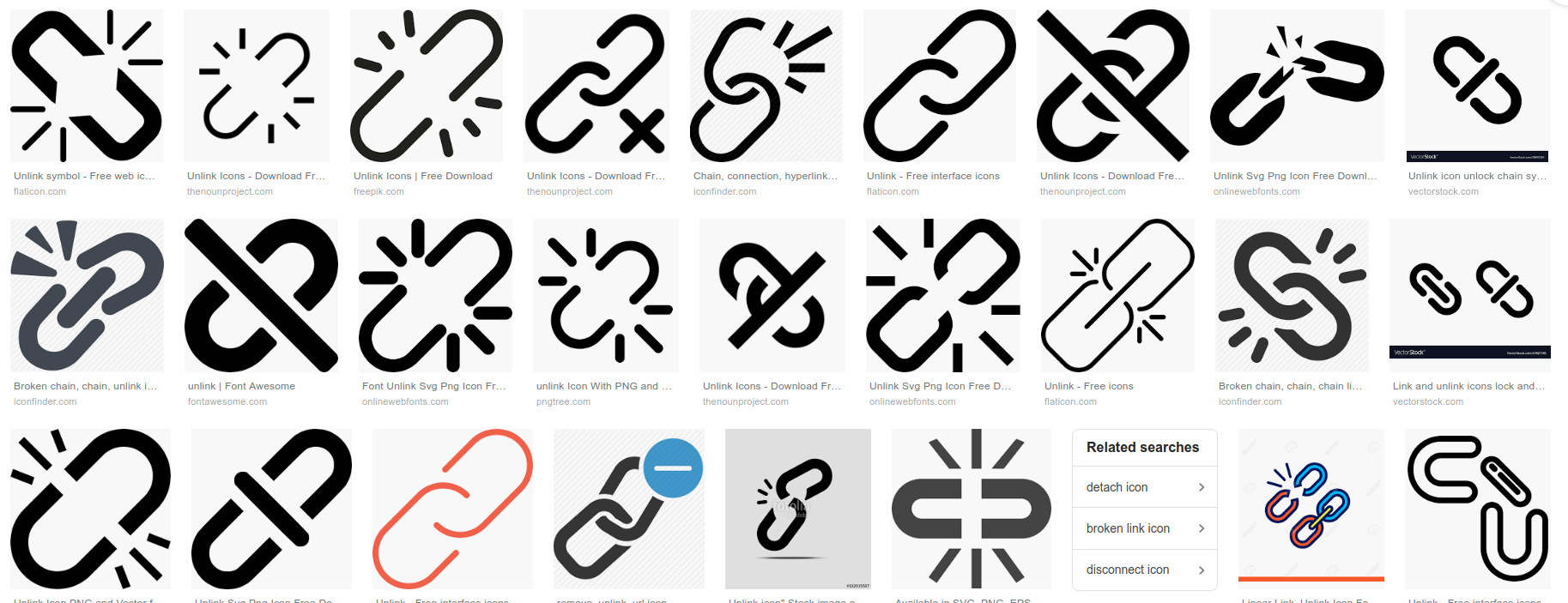
The current version has the strike cutting through the left chain link, leaving a half pixel wedge:

Currently this icon is made up of the link icon and the standard full diagonal strike (used in other "un-" icons)
We need to evaluate the need for consistency vs the visual simplicity of this one icon.