Let's take the opportunity to advertise Tech News in events:
- for developers, so that they can know how to inform the communities about future changes and problems
- for general audience, to know that they can be informed about future changes and problems
- for translators, to tell them that we still need their help
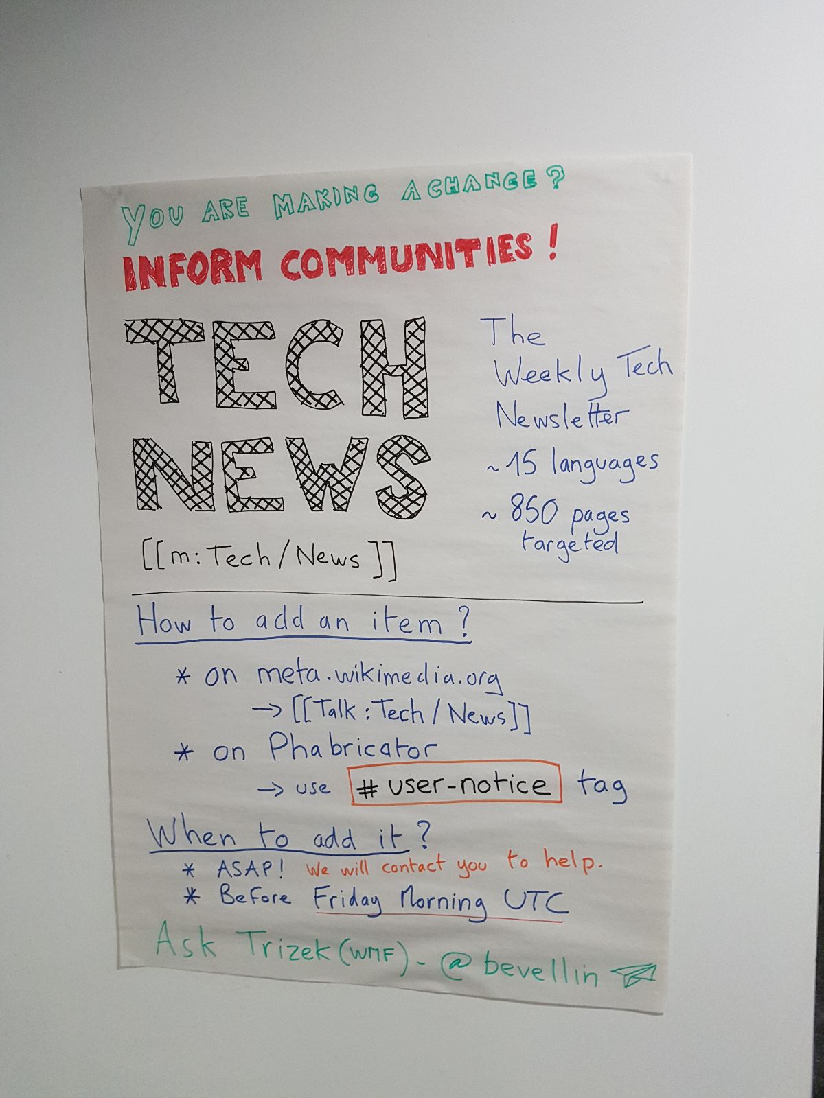
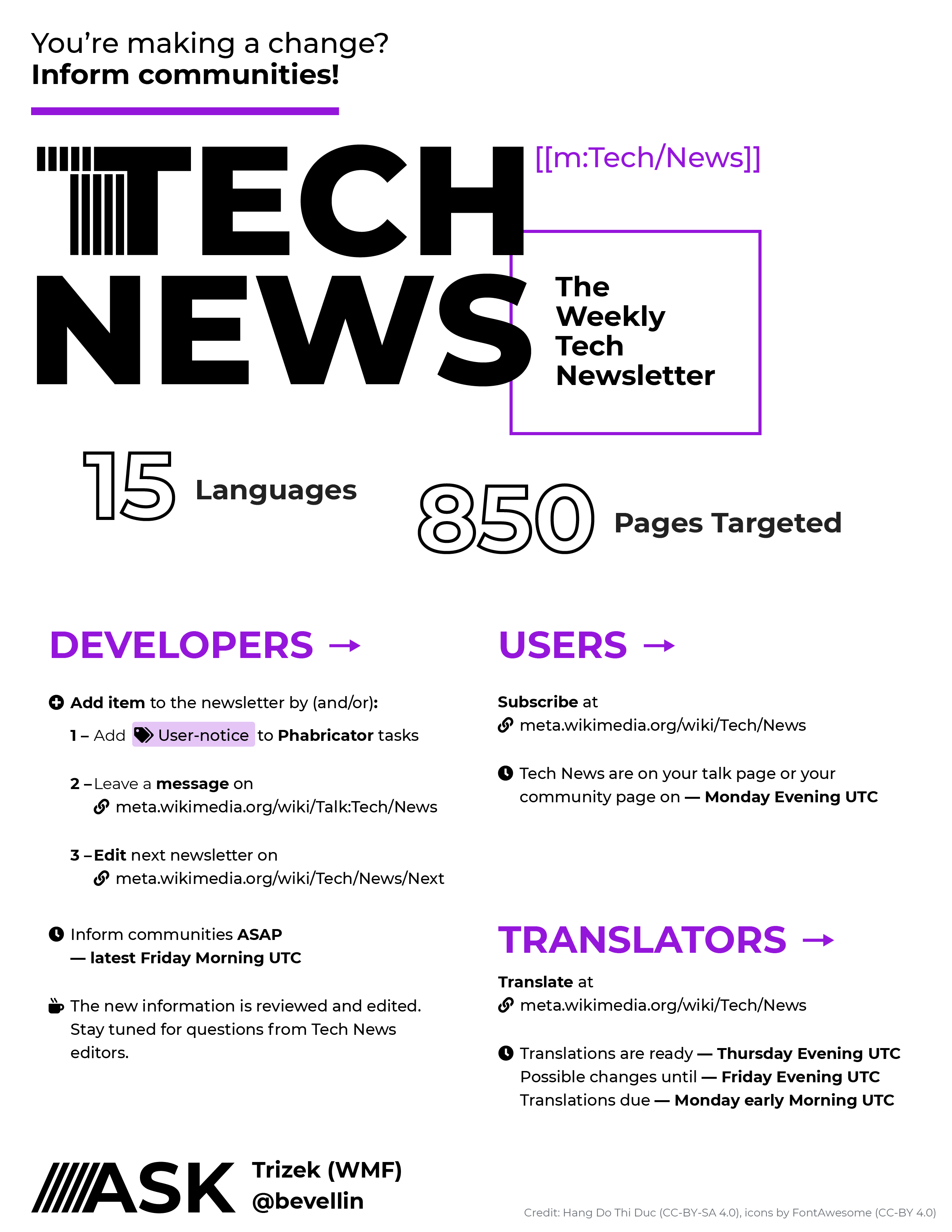
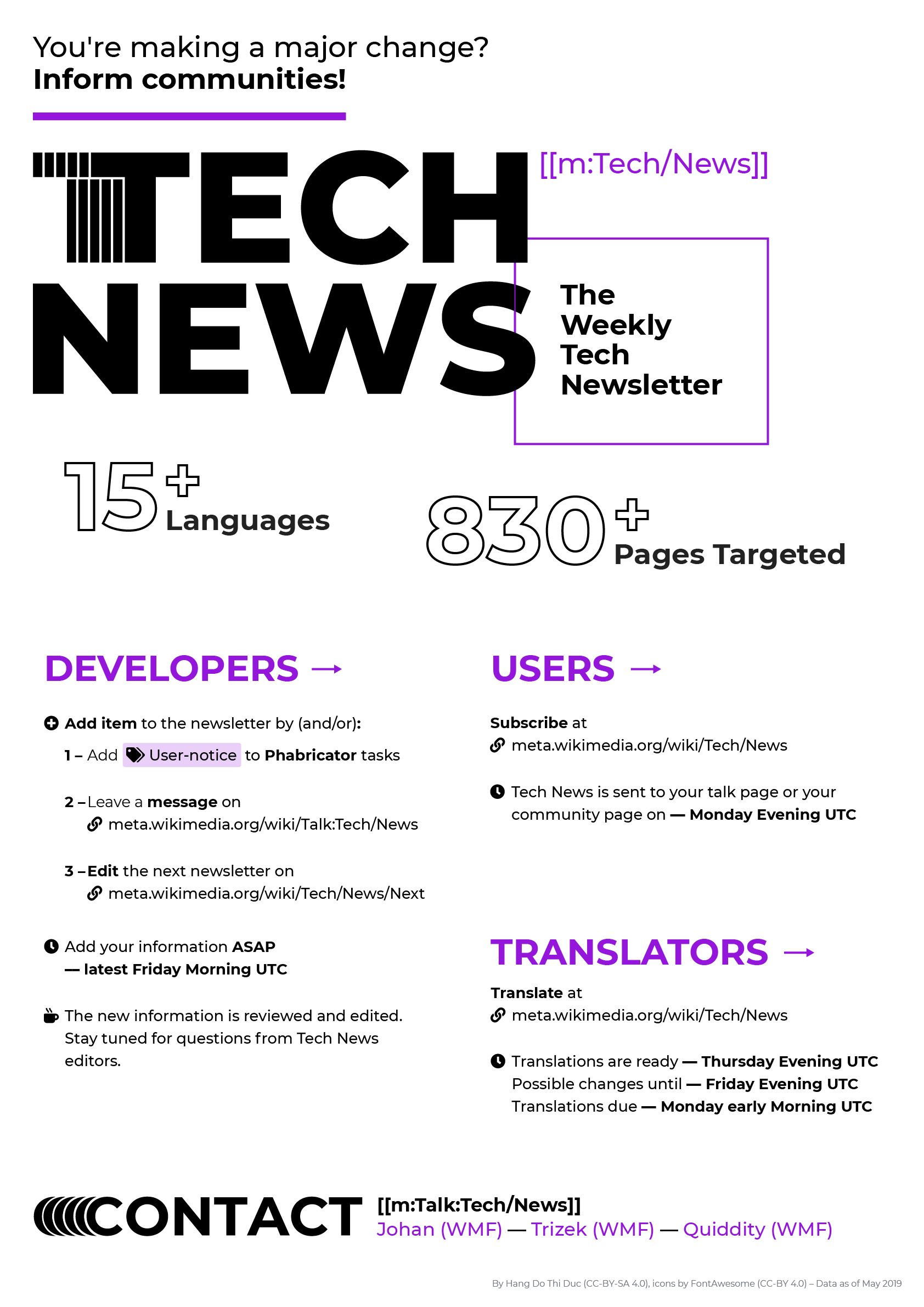
The idea would be to have an easy-to-print poster (no cuts, not too much background color) to put on walls of every event. This is not a formal poster like for Wikimania. Something ideally catchy, that targets each groups of users, and displays the following information for each:
Main information
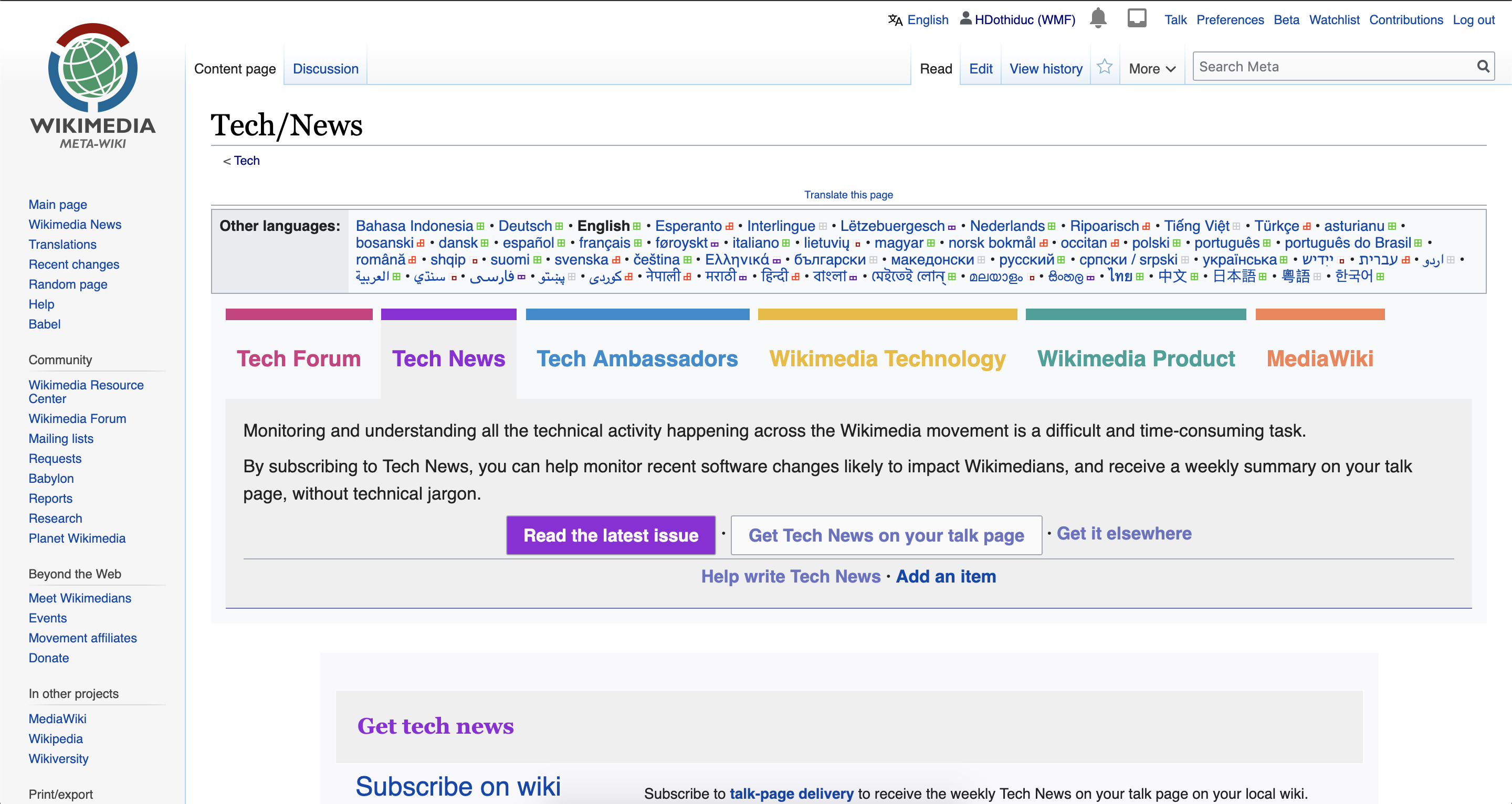
- Tech news is a weekly newsletter distributed on wikis, translated into ~ 15 languages and that targets 850 individual and community pages
- More info at https://meta.wikimedia.org/wiki/Tech/News
Developers
- Goal: inform communities
- How to (and/or)
- Add User-notice to Phabricator tasks
- leave a message on https://meta.wikimedia.org/wiki/Talk:Tech/News
- Edit the next newsletter on https://meta.wikimedia.org/wiki/Tech/News/Next
- When:
- ASAP
- Due date: Friday Morning UTC
- What's happening?
- The new information is reviewed and edited.
- Stay tunes for question from Tech News editors.
Users
- Go to https://meta.wikimedia.org/wiki/Tech/News to subscribe
- Get it on your talk page or your community page on Monday evening UTC
Translators
- Go to https://meta.wikimedia.org/wiki/Tech/News to translate
- Translations are ready on Thursday evening UTC, with possible changes on Friday evening UTC.
- Translations are due on Monday early morning UTC
Draft
The following draft has been created for Prague Hackathon in 2019: