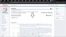
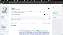
I am not entirely sure why this change was made, but I do not display filters at any given time. With the most recent deployment, now I cannot access the button which says "View new changes since date-time" without displaying all of the filter options.
That's a significant reduction in density of information above the fold, which is an unnecessary hassle for me (after I've gotten through all the changes since I went to bed--I do the 'hit f5 every minute' kind of thing).
Please tweak this change.
Used to appear around the arrow head
(Aside, I do not understand what that whitespace is doing there.)
Now it appears
I'm also not sure about the other stuff that got moved over, but since those are settings-like and probably won't change too often, those seem reasonable there.


