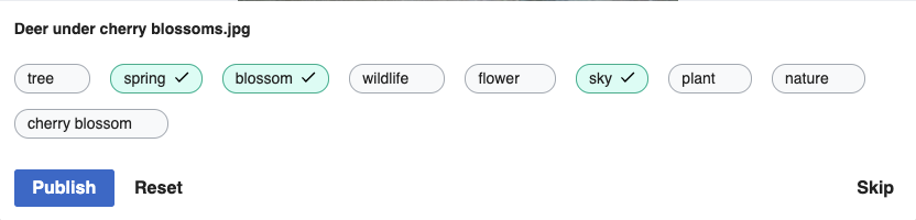
Per design feedback, we need to make some updates to the suggestion widget design:
- Move checkmark to right side
- Avoid changing the widget's width when adding/removing a checkmark. To achieve this, we'll need to add extra horizontal padding initially, then move the text to the left when the checkmark appears. We'll also need a nice CSS transition to make sure this action is smooth and not jarring
We're going for something like this, except with the text centered for unconfirmed suggestions: