Page MenuHomePhabricator

Table styling
Closed, ResolvedPublic

Assigned To
Authored By
AMuigai
Mar 13 2020, 3:29 PM
Referenced Files
F31693703: 12 - Table view@2x.png
Mar 20 2020, 10:16 AM
F31686663: 12 - Table Collapsed@2x.png
Mar 17 2020, 10:05 AM
F31686668: 12 - Table Selected@2x.png
Mar 17 2020, 10:05 AM
F31686666: 12 - Table Highlighted@2x.png
Mar 17 2020, 10:05 AM
F31683704: 12 - Table Collapsed_Highlight@2x.png
Mar 16 2020, 4:16 AM
F31683701: 12 - Table Collapsed@2x.png
Mar 16 2020, 4:16 AM
F31683720: 12 - Table view@2x.png
Mar 16 2020, 4:16 AM

Description

Why are we doing this?
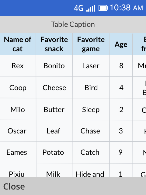
Many Wikipedia articles have tables. It is challenging to show the breadth of different types of tables on KaiOS phones due to the screen size. Users should be able to view content on tables despite this challenge.

For MVP:
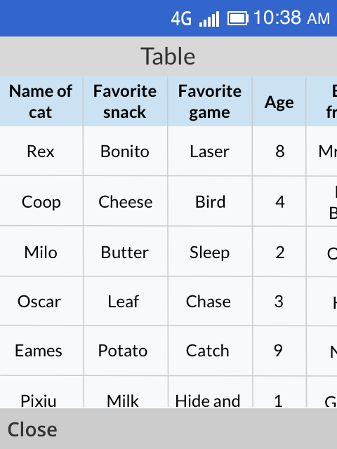
Where there is a table in an article, users will view its content through a popup.
The popup will open up the table on a new page that is full screen. Because tables can have several columns and rows, the dpad will be used to scroll up and down, and left and right to view different parts of the table.

Links in the table will not be clickable.

Tables will have pixel scrolling similar to the way quick facts for KaiOS was implemented.

When a user has completed with the table, they will close the screen with a close action on the LSK.

Event Timeline

AMuigai updated the task description. (Show Details)
SBisson subscribed.

In the article, where there's supposed tot be a table, there should be some sort of icon or placeholder that is selectable like links, references, etc. This needs a little bit of design.

Sharing earlier design of table styling. This is a standard way of treating tables across different operating systems and devices. Text after More Information is the name of table columns. If below designs are difficult to implement then I could think of alternatives to it.

Table in articleHighlighted stateAfter selection
12 - Table Collapsed@2x.png (640×480 px, 63 KB)
12 - Table Collapsed_Highlight@2x.png (640×480 px, 63 KB)
12 - Table view@2x.png (640×480 px, 56 KB)

Going to update it with other design alternatives soon. After discussing it with Angie, I realized caret icon(arrow) could be best suited when table expands within the same window, unlike our case where we are designing it to open up in a popup style.

Updated Design

Removed dropped down icon from the earlier design as we are already using it as a visual indicator when a user lands on the article. Also decided against using other icons like table or window as they are not universally recognized.

  • In the default state, we can show the table in a collapsible form.
  • Change the background color of it when a user brings control over it.
  • If the user presses the Center Soft Key(CSK) then the table gets open in a new window.
  • If a table has a caption then use the Table Caption section to overwrite with it, otherwise, don't show this section.

Interaction Details

  • When the table is opened then D-PAD will be used to scroll up and down and left and right to view different parts of the table. Links in the table will not be clickable.
Table CollapsedTable HighlightedTable Window
12 - Table Collapsed@2x.png (640×480 px, 61 KB)
12 - Table view@2x.png (640×480 px, 61 KB)
12 - Table Selected@2x.png (640×480 px, 57 KB)
https://zpl.io/anR1OYlhttps://zpl.io/VY4WYDLhttps://zpl.io/2j08mwm

In the article, where there's supposed tot be a table, there should be some sort of icon or placeholder that is selectable like links, references, etc. This needs a little bit of design.

Are images also not going to be clickable in tables?

That's the plan to keep things simple; nothing in the table will be clickable.

That's the plan to keep things simple; nothing in the table will be clickable.

Thanks for clarity.

SBisson added a subscriber: Jpita.

@Jpita the next step after QA is "design sign off"

Table styling looks fine on Jio & banana phones.