Page MenuHomePhabricator

Design spec for moving search box to header
Closed, ResolvedPublic

Description

Description

The purpose of this task is to investigate the implications of moving the location of the search bar earlier than originally planned, for both logged-in and logged-out users.

Prototypes

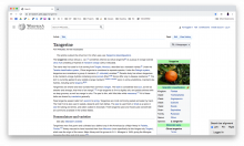
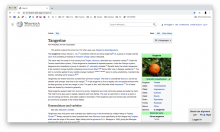
https://di-search.web.app/Tangerine

Early prototype by Demian: patch 585851

Event Timeline

alexhollender_WMF renamed this task from Design spec for improved search experience to Design spec for moving search box to header.Apr 13 2020, 5:10 PM

initial prototype: https://di-search.web.app/Tangerine

Considerations:

  • Currently in Vector user links wrap once the screen gets below a certain width. The point at which the wrapping begins depends on how many links are present. In this first prototype the user links wrap in a similar way, though the wrapping begins sooner because the search bar is taking up a bunch of space.
  • Does search seem awkward in the header? How can we play with sizing, alignment, etc. of the header elements to make things feel like they fit better?
  • How should elements in the site header align, if at all, with other elements on the page? This is difficult since they have different max-width containers
  • Positive tradeoff: the space we get back in the article toolbar. This is really only relevant for users with lots of gadgets.
  • How long are we willing to live with this state? We could consider moving condensed user menu work up if people complain.

@alexhollender Take a look at this DEMO, I find the SearchBox more natural on the left side. That demo also has 3 breakpoints for a good balance between useful space and whitespace at all resolutions (CSS in patch).

Take a look at the DOM: only one level of flexbox is needed. A margin-left: auto rule on the first element from the right side separates the two sides. This makes it possible to move the SearchBox from the left to right or vice versa with only CSS change, no DOM change necessary.

In T249641#6056243, @alexhollender wrote:

Considerations:

  • Currently in Vector user links wrap once the screen gets below a certain width. The point at which the wrapping begins depends on how many links are present. In this first prototype the user links wrap in a similar way, though the wrapping begins sooner because the search bar is taking up a bunch of space.

This won't be an issue after the user menu becomes a drop-down.

  • Does search seem awkward in the header? How can we play with sizing, alignment, etc. of the header elements to make things feel like they fit better?

Imo, that's the best, most common place for it.

  • How should elements in the site header align, if at all, with other elements on the page? This is difficult since they have different max-width containers

The Logo is wider than the Sidebar, it can't align with that. I don't know about another candidates.

  • Positive tradeoff: the space we get back in the article toolbar. This is really only relevant for users with lots of gadgets.

Imo (with not many gadgets) the SearchBox was still out of place there. I like this more airy toolbar.

  • How long are we willing to live with this state? We could consider moving condensed user menu work up if people complain.

I've made a POC for the "condensed" drop-down usermenu a month ago. It would take a few hours to do it again on the current master branch. Of course, that does not matter. With the current practices it can be done in a week or two.

ovasileva triaged this task as Medium priority.Apr 15 2020, 5:19 PM

After receiving feedback from the design team, @Demian (thanks), and others I've created another version of the prototype that explores three different positions for the search bar in the header.
Link: https://di-search.web.app/Tangerine

Screenshotsleftcenter/fillright
logged-in
L LI.png (1×1 px, 545 KB)
F LI.png (1×1 px, 545 KB)
R LI.png (1×1 px, 545 KB)
logged-out
L LO.png (1×1 px, 540 KB)
F LO.png (1×1 px, 540 KB)
R LO.png (1×1 px, 540 KB)

Thus far people have expressed a preference for left-aligned or center/fill. Perhaps doing left-aligned with a larger max-width (e.g. 650px) on the search box would be ideal, so it can fill the space without eventually getting too large that it looks weird.

In T249641#6089561, @alexhollender wrote:

Thus far people have expressed a preference for left-aligned or center/fill.

Regarding fill: Timeless has such searchbox. The first request I've received while making my custom theme was to reduce its size 😄 Personally, I also find that too much, especially on wide screens.

Perhaps doing left-aligned with a larger max-width (e.g. 650px) on the search box would be ideal, so it can fill the space without eventually getting too large that it looks weird.

On the demos I've linked the max-width is 390px (30em*13px/em, my preference), this is similar to Youtube's. Pinterest is an example for "fill", but that only works imo with the subtle styling, that wouldn't fit the Wikimedia styles. And there's plenty of examples with shorter searchboxes, eg. Twitter. Whether left-aligned or center will be an arbitrary choice, I think both are good. Right-aligned only works for me if it's on the far right, which requires that the user menu is in a dropdown.

@ovasileva We had an edit conflict, I've restored yours.