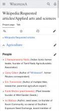
In Mobile mode the Requested Articles page is not usable. The most obvious problem is that the titles of most of the sections lead to Wikipedia articles about each subject category rather than to the requested articles list. Compare the Desktop and Mobile versions of the page to see the problem(s).
Description
Related Objects
Event Timeline
Hi @Dough34, thanks for taking the time to report this! Unfortunately this Wikimedia Phabricator task lacks some information.
If you have time and can still reproduce the situation: Please add a more complete description to this task. That should be
- a clear list of exact steps to reproduce the situation, step by step, so that nobody needs to guess or interpret how you performed each step,
- what happens after performing these steps to reproduce,
- what you expected to happen instead,
- a full link to a web address where the issue can be seen.
You can edit the task description by clicking . Ideally, a good description should allow any other person to follow these steps (without having to interpret steps) and see the same results. Problems that others can reproduce can get fixed faster. Thanks again!
On Apple mobile devices, including iPad, iPhone and iPod Touch, all running the newest available software and using Safari as the browser.
Wikipedia:Requested_articles/Applied arts and sciences
Most of the links here (e.g. Agriculture, Architecture, ...) are colored blue and are links to articles in the main body of Wikipedia rather than being lists of requested articles. A few of the links work right: Education, "Flags, coat of arms, logos and trademarks", Technology and tools, Transportation and References.
Same problem happens in Wikipedia:Requested_articles/Mathematics.
Aha! I've figured out the problem. This is just an user interface weirdity. There are actually two "links" on each line, the down-arrow at the left and the title to the right of it. The down-arrow opens the requested articles and the title opens the existing article about that subject heading, if it exists.
To me the down-arrow and title look like one thing, not two and since the title is a bigger target I clicked it and didn't get what I have learned to expect. Especially since in the cases where the title is not a link to a page, it instead behaves just like the down-arrow and gives you the requested articles list. I think the user interface needs some more thought/experimentation as the current one is confusing.
Hi @Dough34, please provide full links. I assume this is about https://en.wikipedia.org/wiki/Wikipedia:Requested_articles/Applied_arts_and_sciences and https://en.wikipedia.org/wiki/Wikipedia:Requested_articles/Mathematics
It is still unclear to me 1) which steps you perform (step by step), 2) what you expect, and 3) what happens instead. Again, please follow https://www.mediawiki.org/wiki/How_to_report_a_bug and provide clearer information, in three explicit sections. Thanks.
Also, adding a screenshot would be very welcome: https://www.mediawiki.org/wiki/Phabricator/Help#Uploading_file_attachments
Sorry, but I've provided a detailed explanation. The formula you offer for entering problem reports is fine for bugs, but this is a confusing user interface, not a bug. I think I've described it pretty well.
I still have no idea where to see what and how. The formula is not only for bugs but also for confusing behavior.
And I have no "Apple mobile device" handy which would allow to understand what you see or expect.
So it would appear that the report is that where section headings are linked, on mobile, the expand link (i.e, the down arrow) and the linked section heading are separated enough, and that it is quite hard to expand a section without knowing specifically to avoid the linked section header text and either hit the arrow (or, I presume the rest of the element - although I don't use the mobile interface, so I'm not sure if that's the behaviour). Obviously, not all device screens are built equally...
Edit: So, having tested this a bit, yes, anything but the text in the element will expand the section, and with careless or big thumbs and/or poor touch detection, you could quite easily accidentally click the link when going for the down arrow. The solution to this is something for someone far smarter than me.
I can't find a bug but this has been a longstanding issue for some time. The recommendation is to avoid links in headings wherever possible. We don't have a design which supports both using the heading as the expand control and the link and we're unlikely to have one for some time.
I agree with the previous comments, this seems like the expected behavior (or rather: it's the best we can do, given a link in a heading).
This problem shouldn't affect normal articles, as links in headings should not be used there, per e.g. https://en.wikipedia.org/wiki/MOS:NOSECTIONLINKS.
