EBSCO Discovery Service comes with a default interface out-of-the-box. It has a handful of configuration ('branding') settings to change basic elements of the design, such as adding a logo, customising the colour scheme, and adjusting which links are present in the toolbar. We can also add any amount of Javascript and CSS to different types of pages through the 'bottom branding'.
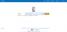
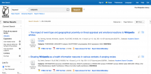
Our interface currently look like this:
Basic search
Search results
We would like to further adjust configuration settings (T269932) and then update the overall design of this page to ensure we strike the right balance between a simple, accessible, interface and the range of research tools editors are looking for. The resulting design should be consistent with that of the new Library Card homepage (T268342), such that users aren't confused by a totally new design scheme.
We have created a document collating some research on design principles for library search results at https://docs.google.com/document/d/1gHMDDNWoNodjJGtXz3A-yZpLxZpi4mjAEBlKVdCJWtQ/edit.

