Description
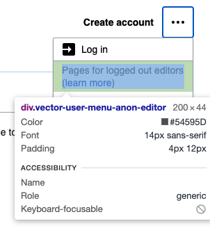
Currently there is 12px of padding above & below the element
To do
Change it to only 4px of padding above & below the element
| • alexhollender_WMF | |
| Jul 27 2021, 9:55 PM |
| F34574979: Screen Shot 2021-08-03 at 1.11.52 PM.png | |
| Aug 3 2021, 5:14 PM |
| F34567373: image.png | |
| Jul 27 2021, 11:54 PM |
| F34567306: Screen Shot 2021-07-27 at 5.53.03 PM.png | |
| Jul 27 2021, 9:55 PM |
| F34567308: image.png | |
| Jul 27 2021, 9:55 PM |
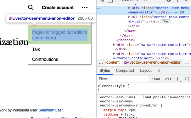
Currently there is 12px of padding above & below the element
Change it to only 4px of padding above & below the element
| Subject | Repo | Branch | Lines +/- | |
|---|---|---|---|---|
| Fix user menu "learn more" link spacing | mediawiki/skins/Vector | master | +1 -2 |
| Status | Subtype | Assigned | Task | ||
|---|---|---|---|---|---|
| Resolved | ovasileva | T266536 [EPIC] Consolidate user links into a single menu | |||
| Resolved | ovasileva | T285786 [User links] Design fixes | |||
| Resolved | • nray | T287637 [GOAL] Deploy the new user links feature to all wikis | |||
| Resolved | ovasileva | T287523 Remove extra padding above & below "learn more" in user menu |
Change 708375 had a related patch set uploaded (by Nray; author: Nray):
[mediawiki/skins/Vector@master] Fix user menu \"learn more\" link spacing
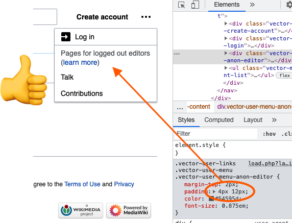
@alexhollender I think I messed up the top spacing on this as well as for some reason there is 12px of top padding + 2px of top margin when T285786 clearly advises only 8px. It should only have 8px of top padding, correct?
8px would be great as we're approaching generalized & unified spacing land with 4px multipliers whenever possible.
ah good catch, yes sounds good! and re: @Volker_E's point, might as well go with 4px top & bottom. description updated
Change 708375 merged by jenkins-bot:
[mediawiki/skins/Vector@master] Fix user menu \"learn more\" link spacing