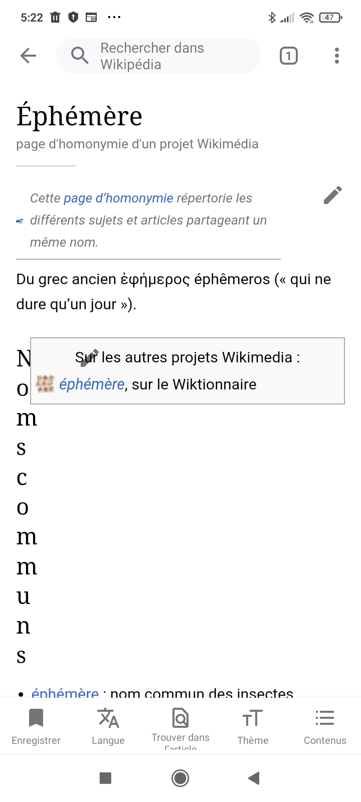
I think the box should fully be above the header: https://fr.wikipedia.org/api/rest_v1/page/mobile-html/%C3%89ph%C3%A9m%C3%A8re
Reported via email
| • MattCleinman | |
| Apr 15 2022, 11:30 PM |
| F35175584: template-style.png | |
| May 25 2022, 10:05 AM |
| F35053515: Screenshot_2022-04-09-05-22-00-384_org.wikipedia.jpg | |
| Apr 15 2022, 11:30 PM |
I think the box should fully be above the header: https://fr.wikipedia.org/api/rest_v1/page/mobile-html/%C3%89ph%C3%A9m%C3%A8re
Reported via email
Styles of the template Autres_projets break layout in this particular article. I suggest refactoring template styles or re-editing the article. I've checked other articles with this template on mobile-html (see the list of them here - https://fr.wikipedia.org/wiki/Sp%C3%A9cial:Pages_li%C3%A9es/Mod%C3%A8le:Autres_projets). Though most of them don't look quite well on mobile viewport, no similar issues have been found.
This layout bug in the image above is replicable in a web browser if you make the width of the window fairly small: https://fr.wikipedia.org/api/rest_v1/page/mobile-html/%C3%89ph%C3%A9m%C3%A8re
I believe this is happening because the template is at the same level as the header. This doesn't happen on web (https://fr.wikipedia.org/wiki/%C3%89ph%C3%A9m%C3%A8re) or mobile web (https://fr.m.wikipedia.org/wiki/%C3%89ph%C3%A9m%C3%A8re).
This bug isn't widespread, and so seems like there might be something that we could adjust with the template to fix this.
These cc rules affect the output of mobile devices. I disabled them to quickly check if it helps.
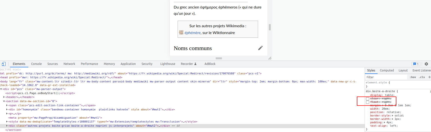
I've added a rule in the TemplateStyle of this specific template. For a more general solution, I have some noob questions :
You can test the mobile version on a desktop computer simply by using the fr.m.wikipedia.org domain. Although not on a smartphone, it's sufficient when writing local CSS etc.
About the current issue, it's just because this template uses a local class boite-a-droite, which lacks CSS on the mobile version.
Some time ago I had made an attempt at fixing this class, but it made me put the hands into a deeper-and-deeper nest of classes, templates and direct uses, so I had postponed it…
@Od1n : Mobile version (viewed on a navigator) is not the same as mobile app ( for android : https://play.google.com/store/apps/details?id=org.wikipedia&hl=fr). The latter seams to use MediaWiki:Common.css, whereas the former only uses MediaWiki:Mobile.css.
The version that mobile apps use is available here: https://fr.wikipedia.org/api/rest_v1/page/mobile-html/%C3%89ph%C3%A9m%C3%A8re
You can test on a phone-sized device by making your browser window's width very small. It looks fixed to me! Thank you very much.
Thanks @MattCleinman, this will be usefull to test pages and templates. I've bookmarked it.