Page MenuHomePhabricator

UX Improvements: More details dialog for mobile web
Closed, ResolvedPublic

Description

Acceptance Criteria

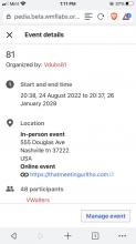
  • The modal should have a single column. The content should be arranged in the following order: Title, organizers, Date and time, location and participants.
  • In-person and Online events headings look like normal text. It should look like the header text as on desktop.
  • The meeting URL should have the link icon before it.

Visual examples of things to fix:

Screenshot 2022-08-18 at 12.01.22.png (938Γ—756 px, 182 KB)

Event Timeline

ifried renamed this task from UX Improvements: More details dialog to UX Improvements: More details dialog for mobile web.Aug 18 2022, 12:27 PM

Change 824570 had a related patch set uploaded (by Daimona Eaytoy; author: Daimona Eaytoy):

[mediawiki/extensions/CampaignEvents@master] UX improvements for the event details dialog on event page

https://gerrit.wikimedia.org/r/824570

@Daimona for this AC:

The modal should have a single column. The content should be arranged in the following order: Title, organizers, Date and time, location and participants.

Between 591px and 699px it uses the mobile modal view, but is in two columns instead of the one column that occurs on smaller breakpoints.

Screen Shot 2022-08-23 at 11.23.50 AM.png (1Γ—1 px, 145 KB)

@Daimona for this AC:

The modal should have a single column. The content should be arranged in the following order: Title, organizers, Date and time, location and participants.

I made it so that the columns should always have equal width, and the width of a column should always be at least 20em. This effectively means that you still get the 2-column layout if your screen is wide enough; the actual breakpoint widths change depending on the content. I hope that is OK, but pinging @gonyeahialam to let him weigh in on that.

Change 824570 merged by jenkins-bot:

[mediawiki/extensions/CampaignEvents@master] UX improvements for the event details dialog on event page

https://gerrit.wikimedia.org/r/824570

βœ… The modal should have a single column (it currently does, except for between 591px-699px, see explanation below)
βœ…The content should be arranged in the following order: Title, organizers, Date and time, location and participants.
βœ… In-person and Online events headings look like normal text. It should look like the header text as on desktop.
βœ…The meeting URL should have the link icon before it.

Screenshot 2022-08-26 at 1.11.23 PM.png (1Γ—750 px, 117 KB)


@gonyeahialam this differs from the AC slightly because between 591px and 699px it is two column. T315544#8178842. See below for @Daimona's explanation. I think it looks good but let me know if you have feedback.

@Daimona for this AC:

The modal should have a single column. The content should be arranged in the following order: Title, organizers, Date and time, location and participants.

I made it so that the columns should always have equal width, and the width of a column should always be at least 20em. This effectively means that you still get the 2-column layout if your screen is wide enough; the actual breakpoint widths change depending on the content. I hope that is OK, but pinging @gonyeahialam to let him weigh in on that.

@vaughnwalters This is good.

I have also tested this on beta, and it looks good (see screenshot example below). I'm marking this as Done.

Screen Shot 2022-08-29 at 4.29.42 PM.png (1Γ—1 px, 140 KB)