Page MenuHomePhabricator

Visible keyboard focus indicator for Phonos template
Closed, ResolvedPublic1 Estimated Story PointsBUG REPORT

Description

What is the problem?

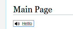
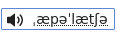
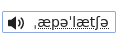
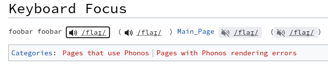
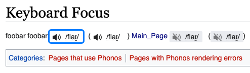
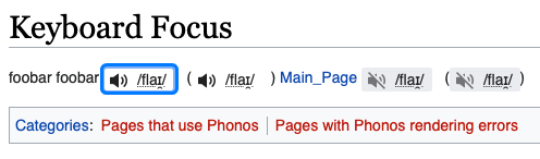
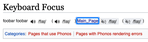
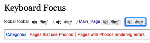
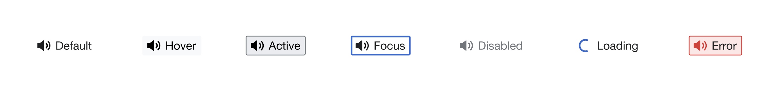
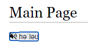
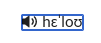
When the output of the <phonos> parser tag (the Phonos button) has keyboard focus, there is no indicator of this fact.

We should do this in order to conform to WCAG21 requirement 2.4.7 (https://www.w3.org/WAI/WCAG21/quickref/#focus-visible).

Environment

Browser: Firefox 91.
Wiki(s): local docker Phonos 0.1.0 (bd10234) 02:35, 2 September 2022.

Event Timeline

There are a very large number of changes, so older changes are hidden. Show Older Changes

Change 832995 had a related patch set uploaded (by Samtar; author: Samtar):

[mediawiki/extensions/Phonos@master] PhonosButton.less: Remove override for :focus

https://gerrit.wikimedia.org/r/832995

Just noting that this behaviour was overridden (I think by @Samwilson?) β€” I can certainly understand why, as it does now show the focus highlight "box" on click. I forget if focus-visible (or some other focus pseudo-class) would be more appropriate and only show this on tab selection of the element?

Yes, the OOUI blue outline was intentionally removed. I do wonder if it's a bit odd to have the focus outline on click, because there's also the colour and icon change to indicate click activity. That doesn't help for focus of course, as you point out. I wonder if we should get some design input here?

RE: your comment on the patch @Samwilson, I agree this looks a little nicer :)

image.png (99Γ—251 px, 4 KB)

Change 832995 merged by jenkins-bot:

[mediawiki/extensions/Phonos@master] PhonosButton.less: Remove border-color override for :focus

https://gerrit.wikimedia.org/r/832995

@TheresNoTime Should Phonos templates with errors be keyboard focusable? I notice they have tabindex=-1. I guess you might want use the keyboard to see what the error is.

@JFernandez-WMF The focus highlighting for Phonos templates is consistent across browsers. However, it is not necessarily consistent with how focus highlighting appears on the same browser for other links on the wiki.

For example, the blue border is thinner when compared to Firefox 102 and Chrome.

See below comparing how focus highlighting appears on different browsers for the Phonos template vs. a regular link on the wiki.

BrowserPhonosLink
Firefox 91
focus_phonos_ff91.png (34Γ—117 px, 1 KB)
focus_link_ff91.png (35Γ—112 px, 1 KB)
Firefox 102
focus_phonos_ff102.png (37Γ—120 px, 1 KB)
focus_link_ff102.png (39Γ—116 px, 1 KB)
Chromium 87
focus_phonos_chr87.png (38Γ—139 px, 1 KB)
focus_link_chr87.png (35Γ—142 px, 1 KB)

Just wondering if this was OK or if we should make the blue border thicker?

(Note: I tested this on Debian Bullseye running the Awesome window manager. It is possible that it might appear differently on different operating systems, desktop environments, etc. I haven't been able to test this on Edge, IE, etc.)

@TheresNoTime Should Phonos templates with errors be keyboard focusable? I notice they have tabindex=-1. I guess you might want use the keyboard to see what the error is.

I'd say so β€” I'll do a patch as part of this task to resolve that


Currently, the phonos button is not activating with the enter key when the button is in focus...

Hi @dom_walden! I don't think this would matter from a user's point of viewβ€”however, and aiming for design consistency, I'd say that it would be great to keep the same pattern with how focus highlighting displays on the wiki for other items. I'd suggest making the blue border thicker if that's okay!

Change 839036 had a related patch set uploaded (by Samwilson; author: Samwilson):

[mediawiki/extensions/Phonos@master] Use outline instead of border for focus highlighting

https://gerrit.wikimedia.org/r/839036

I think we can steal the same focus style as links: https://stackoverflow.com/questions/50621472/how-is-the-default-focus-outline-implemented-in-browsers

I've made a patch; see what you think. (Sorry to jump in here! I know this is assigned to you @TheresNoTime. But by the time I'd looked into it I had a functioning patch.)

No worries! +2'd, looks good to me :)

Change 839036 merged by jenkins-bot:

[mediawiki/extensions/Phonos@master] Use outline instead of border for focus highlighting

https://gerrit.wikimedia.org/r/839036

@Samwilson @TheresNoTime For some reason, the border appears as black on Chrome and Edge (tested Chrome 106, Edge 105 and Chromium 87):

chrome_black_border.png (141Γ—668 px, 16 KB)

I also notice on Safari that the keyboard focus was visible before the change in T317036#8279549. After the change in T317036#8289812, it has a sort of double-border. This is similar to what happens for regular links, except for regular links the fainter border is on the outside.

BrowserBefore (2bb84a9)After (a768954)Regular link
Safari 15
before_safari_border.png (145Γ—494 px, 28 KB)
after_safari_border.png (146Γ—496 px, 28 KB)
regular_safari_border.png (142Γ—497 px, 28 KB)

@TheresNoTime Should Phonos templates with errors be keyboard focusable? I notice they have tabindex=-1. I guess you might want use the keyboard to see what the error is.

I'd say so β€” I'll do a patch as part of this task to resolve that

Interestingly, error templates were actually focusable on Safari before:

error_safari_border.png (145Γ—500 px, 28 KB)

Thanks @dom_walden, the joys of different web rendering engines...

@Samwilson @TheresNoTime For some reason, the border appears as black on Chrome and Edge (tested Chrome 106, Edge 105 and Chromium 87):

Further to Sam's suggestion in the RTL, I tested Chrome on Vector (2010 and 2022), Minerva, Monobook and Timeless:

  • On Vector, almost all the links I tried had a blue border on focus (some links on Vector 2022 had a black border, including the ULS and user menu link)
  • On Minerva, most of the links have a black border (some links like the "Watch", "History", "More" links have a blue border)
  • On Monobook and Timeless, all the links I tried had a black border.

On Firefox, all the links on all the skins had a blue border on focus.

A question for @NRodriguez and/or @JSengupta-WMF β€” a visual indicator does appear for Firefox/Chrome/Safari/Edge, however on some browsers the colour is different (see above screenshots). The primary difference is a blue outline for most, and a black outline for Chrome.

Is this okay?

Had a chat with Nico on this and he thinks that it will be best if the color is consistent across the browsers. Here are the designs for reference again:

Screen Shot 2023-02-22 at 10.41.39.png (338Γ—2 px, 45 KB)

Is it a significant effort to investigate this before we settle for black outline on Chrome?

@JSengupta-WMF Thanks. And just to confirm: we are aiming to match the skins' default link focus styles, and not the OOUI button focus style?

Also, it looks like we need to revisit the loading and active styles β€” at the moment it's striped animation followed by blue text on white, but it should be white for loading and then grey for active.

We are actually aiming to match the OOUI button styles. The phono icons are all buttons. Here is the library for reference
https://www.figma.com/file/2Jb1lVkhEMDFxO20I5xwyA/%E2%9D%96-OOUI-components?node-id=1891%3A4593&t=tpDHQvj643WYDWyl-1

Change 901177 had a related patch set uploaded (by Samtar; author: Samtar):

[mediawiki/extensions/Phonos@master] PhonosButton.less: Override focus colour with `wmui-color-accent50`

https://gerrit.wikimedia.org/r/901177

FYI, the bug reported in T332076 also affects this on Vector, but only on Chrome/Edge:

image.png (94Γ—174 px, 4 KB)

We are actually aiming to match the OOUI button styles. The phono icons are all buttons.

This makes sense. We were at some point trying to emulate the existing template look (dotted underline etc.) and that's why we added the custom focus styles. It's much simpler to keep the OOUI ones.

Change 901177 merged by jenkins-bot:

[mediawiki/extensions/Phonos@master] PhonosButton.less: Remove focus rule

https://gerrit.wikimedia.org/r/901177

The focus indicator looks more-or-less identical on all browsers I tested.

Vector 2010Vector 2022MinervaMonoBookTimeless
focus_indicator_vector2010.png (47Γ—87 px, 985 B)
focus_indicator_vector2022.png (35Γ—82 px, 1 KB)
focus_indicator_minerva.png (39Γ—99 px, 1 KB)
focus_indicator_monobook.png (35Γ—79 px, 1 KB)
focus_indicator_timeless.png (43Γ—101 px, 1 KB)

(Screenshots taken on Firefox 102)

I tested these two URLs on every combination of skins and an LTR (English) and RTL (Arabic) language:

Test browsers:

  • Firefox 102 (Debian Bullseye)
  • Chromium 111 (Debian Bullseye)
  • Chrome 111 (Mac Monterey; emulated on Browserstack)
  • Safari 16 (Mac Ventura; emulated on Browserstack)
  • Safari 14 (Mac Big Sur; emulated on Browserstack)

Test environments: