Page MenuHomePhabricator

Lexeme header overlaps page toolbar in Minerva skin
Closed, ResolvedPublic2 Estimated Story PointsBUG REPORT

Description

Steps to replicate the issue (include links if applicable):

What happens?:

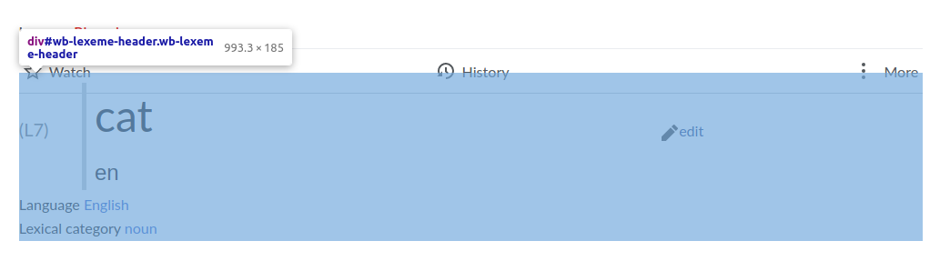
The header with the lemma ("cat") overlaps the toolbar with the "Watch", "History" and "More" buttons, preventing the bottom half of the buttons from being clicked.

What should have happened instead?:

The header should not overlap with the toolbar.

Software version (skip for WMF-hosted wikis like Wikipedia):

Other information (browser name/version, screenshots, etc.):

Screenshot with the dev tools highlighting #wb-lexeme-header

Bildschirmfoto_2022-09-29_22-12-51.png (298×1 px, 19 KB)

This is caused by the negative top margin in

#wb-lexeme-header-lemmas {
	font-size: 100%;
	margin: -1.428em 0 0.25em 0;
	display: flex;
	align-items: center;
}

(file: https://github.com/wikimedia/mediawiki-extensions-WikibaseLexeme/blob/master/resources/lexeme.less#L13)

Note

The wikidata.org no longer shows the issue because Nikki had added some CSS to https://www.wikidata.org/wiki/MediaWiki:Minerva.css to remove the negative margin. That should be removed again once this is fixed.

Event Timeline

Note: The example no longer shows the issue because I've added some CSS to https://www.wikidata.org/wiki/MediaWiki:Minerva.css to remove the negative margin. That should be removed again once this is fixed.

It's still visible on test.wikidata.org: https://test.wikidata.org/wiki/Lexeme:L1?useskin=minerva

I looked into this a bit and I'm thoroughly confused.

  1. Why are we not loading the Lexeme styles on mobile? Has it always been that on mobile (that is, https://m.wikidata.org/w/index.php?title=Lexeme:L1&safemode=1) the Lexeme header is basic unstyled?
    • Senses and Forms too
    • Statements have the Wikibase mobile styles
  2. In figuring out what to do about that negative margin, I'm trying to understand why it is there in the first place. In the legacy vector skin, directly above #bodyContent.vector-body there is a vertical "gap" that I can't explain. It is not a padding, not a margin, not whitespace/linebreak, not something in :before or :after, not a positioning , not a border, not a flexbox/grid gap, ... I feel like I'm missing something obvious here.
    • this issue does not exist on vector-2022, there they have a splutter of other elements that take up space, so that the negative margin still looks good there

I looked into this a bit and I'm thoroughly confused.

[...]

  1. In figuring out what to do about that negative margin, I'm trying to understand why it is there in the first place. In the legacy vector skin, directly above #bodyContent.vector-body there is a vertical "gap" that I can't explain. It is not a padding, not a margin, not whitespace/linebreak, not something in :before or :after, not a positioning , not a border, not a flexbox/grid gap, ... I feel like I'm missing something obvious here.
    • this issue does not exist on vector-2022, there they have a splutter of other elements that take up space, so that the negative margin still looks good there

@Jakob_WMDE cleared that up for me. Thanks! Margin collapse is going on and the margin-bottom: 1.4em of #contentSub2 is the cause.

Change 949043 had a related patch set uploaded (by Michael Große; author: Michael Große):

[mediawiki/extensions/WikibaseLexeme@master] Fix Minvera style issue by extracting Vector-specific styles

https://gerrit.wikimedia.org/r/949043

Change 949043 merged by jenkins-bot:

[mediawiki/extensions/WikibaseLexeme@master] Fix Minvera style issue by extracting Vector-specific styles

https://gerrit.wikimedia.org/r/949043