Steps to replicate the issue (include links if applicable):
- Go to https://meta.wikimedia.org/wiki/Special:Translate?group=%21additions&language=en&filter=%21translated&action=translate
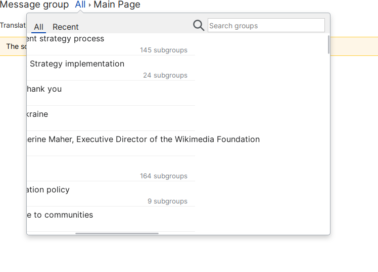
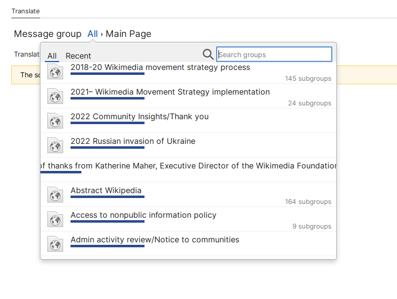
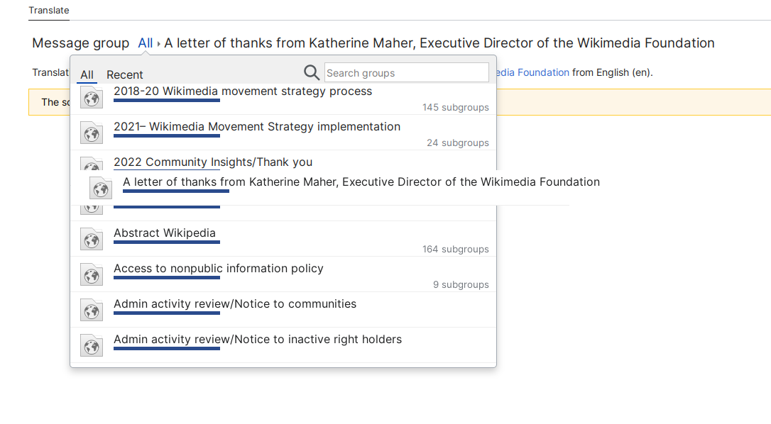
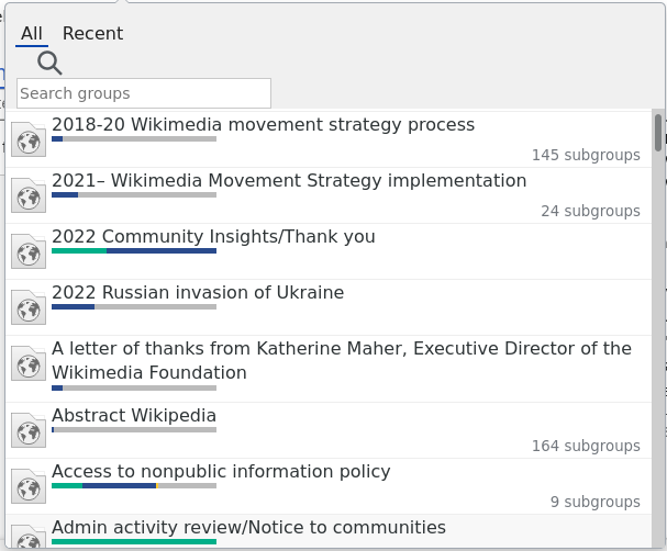
- Click the "all" link in the message groups to open the drop-down
- Type "Wikilearn" in the drop-down
What happens?: the drop-down does not allow differentiating between long names that exceed the drop-down dimensions, and there's no horizontal scrolling.
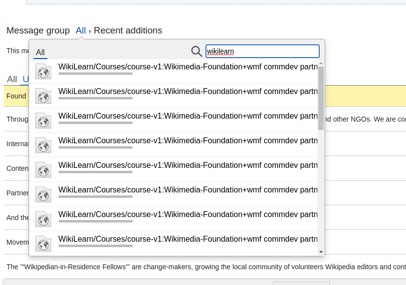
What should have happened instead?: there should be *some* way to tell apart the options, despite the long page name.