Page MenuHomePhabricator

Reorder demo control buttons and increase the padding in the Codex demo box
Closed, ResolvedPublic

Description

Background/Goal

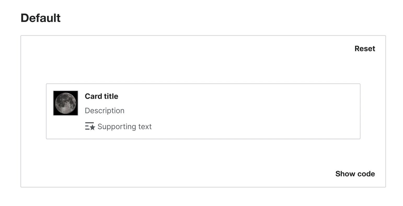
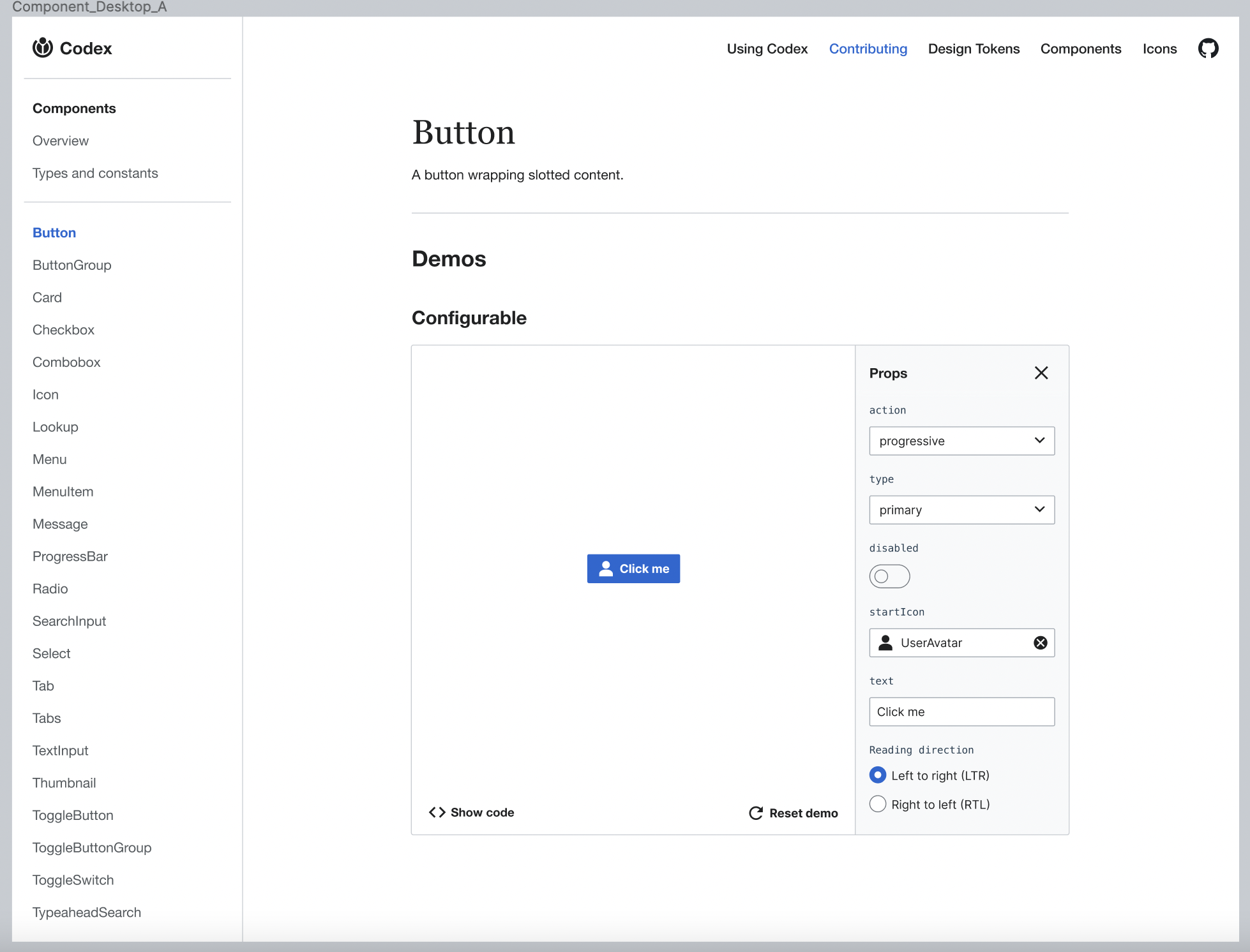
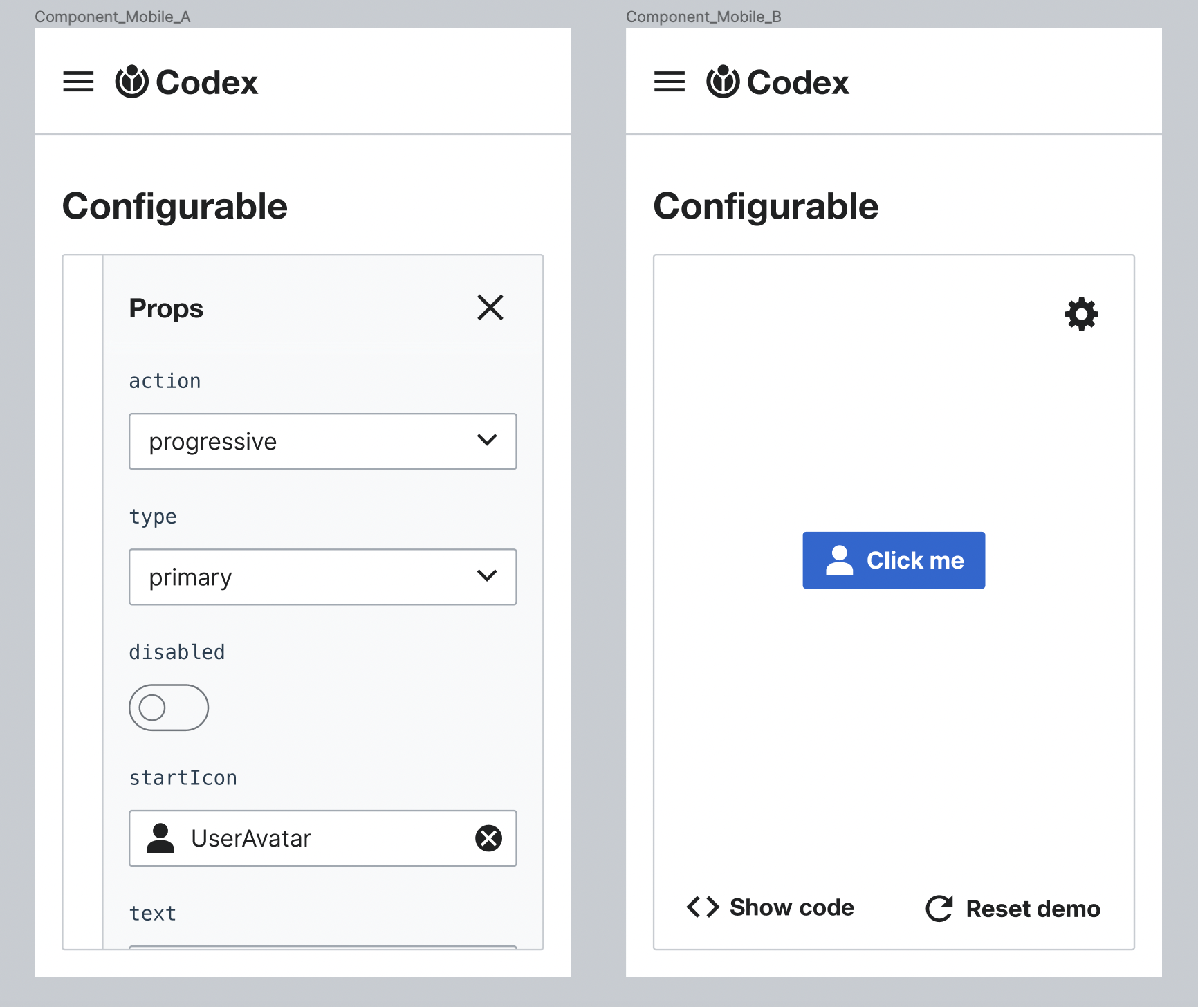
At the moment, the padding in the Codex demo boxes is too small so the "Reset" and the "Show code" buttons are too closed to the component, specially when we are checking the RTL view.

Captura de Pantalla 2022-11-23 a las 10.54.27.png (960×1 px, 89 KB)

User stories

  • As a user I need to test the component in the demo without being distracted by the buttons in the demo box.

Proposal

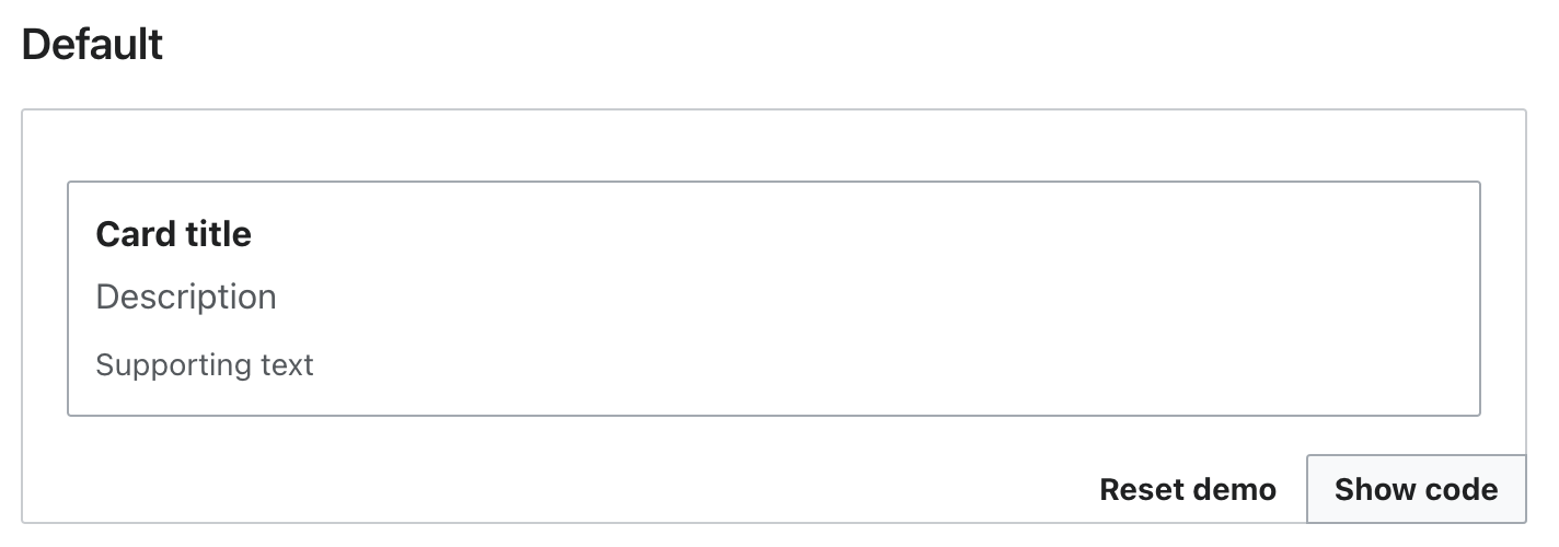
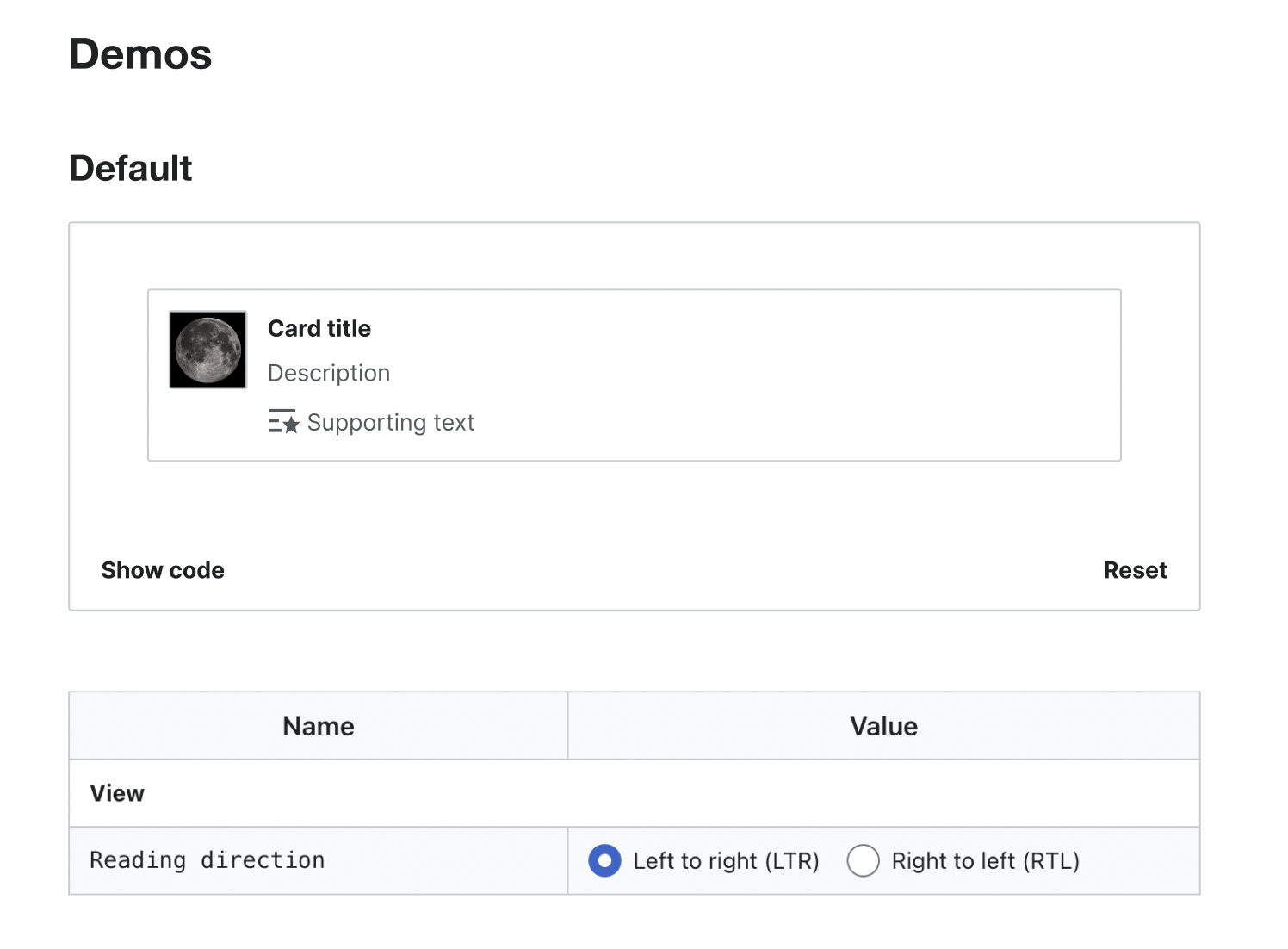
Increase at least 32px the separation between the component demo and the newly reordered "Show code" and “Reset” buttons at bottom. The idea is to make the buttons further away from the component so the user is focused in testing the component and not in the buttons.

Captura de Pantalla 2022-11-23 a las 11.02.51.png (858×1 px, 299 KB)

Acceptance criteria (or Done)

  • Put all demo control buttons at bottom. The “Show code”/“Copy code” bottom start and “Reset” bottom end
  • Increase to 32px the separation buttons and component in demo box

Event Timeline

How would you relate this to T322459? We could add padding now and revert if we're going for a quiet ToggleButton later.

I also don't like that the Reset button, even though it's end-aligned, comes first. It should come after the showcased component, not before.

How would you relate this to T322459? We could add padding now and revert if we're going for a quiet ToggleButton later.

@Volker_E as specified in T322459 we could use a quiet toggle button for the "Show code" button. Also we could use a quiet toggle button for the reset button in order to reduce the importance of these buttons in the interface.

Captura de Pantalla 2022-12-09 a las 13.05.14.png (788×1 px, 305 KB)

I also don't like that the Reset button, even though it's end-aligned, comes first. It should come after the showcased component, not before.

Regarding Reset button I think it should be part of the configurable properties box. If we finally move the properties in a box on left on the component, we could include the reset button at the end of the configurable properties.

Captura de Pantalla 2022-12-09 a las 13.06.44.png (1×1 px, 477 KB)

Change 866658 had a related patch set uploaded (by VolkerE; author: VolkerE):

[design/codex@main] docs: Put “Reset demo” button at bottom

https://gerrit.wikimedia.org/r/866658

How would you relate this to T322459? We could add padding now and revert if we're going for a quiet ToggleButton later.

@Volker_E as specified in T322459 we could use a quiet toggle button for the "Show code" button. Also we could use a quiet toggle button for the reset button in order to reduce the importance of these buttons in the interface.

Captura de Pantalla 2022-12-09 a las 13.05.14.png (788×1 px, 305 KB)

I also don't like that the Reset button, even though it's end-aligned, comes first. It should come after the showcased component, not before.

Regarding Reset button I think it should be part of the configurable properties box. If we finally move the properties in a box on left on the component, we could include the reset button at the end of the configurable properties.

Captura de Pantalla 2022-12-09 a las 13.06.44.png (1×1 px, 477 KB)

All of that makes sense in a second-next step. But it would also need more design work as the demo controls as proposed would only work in an desktop environment. And we should ensure from the beginning equal interaction on mobile and desktop.

What I've had in mind, is an instant improvement:
Putting the Reset button at bottom, to have one place for controlling the demo and its code instead of two places on top and at bottom of the component demo itself. This would make it simpler to focus on component demo itself.

image.png (500×1 px, 42 KB)

See also the Netlify demo.

With that the 48px margin seems too imbalanced for me (also thinking about mobile representation again). It would work with current 32px IMO.

What I've had in mind, is an instant improvement:
Putting the Reset button at bottom, to have one place for controlling the demo and its code instead of two places on top and at bottom of the component demo itself. This would make it simpler to focus on component demo itself.

image.png (500×1 px, 42 KB)

I think "Reset demo" and "Show code" buttons should not be next to each other since they do different functions. Also the "Show code" button is related with the component while the "Reset" one is related with the configurable demo box. I recommend to separate them by moving the "Show code" button to the left and leave the "Reset demo" one on the right.

Captura de Pantalla 2022-12-12 a las 11.08.05.png (1×1 px, 666 KB)

See also the Netlify demo.

With that the 48px margin seems too imbalanced for me (also thinking about mobile representation again). It would work with current 32px IMO.

Maybe 48px is too much but I think at least we should use 32px separation between the component and the buttons.

How would you relate this to T322459? We could add padding now and revert if we're going for a quiet ToggleButton later.

@Volker_E as specified in T322459 we could use a quiet toggle button for the "Show code" button. Also we could use a quiet toggle button for the reset button in order to reduce the importance of these buttons in the interface.

Captura de Pantalla 2022-12-09 a las 13.05.14.png (788×1 px, 305 KB)

I also don't like that the Reset button, even though it's end-aligned, comes first. It should come after the showcased component, not before.

Regarding Reset button I think it should be part of the configurable properties box. If we finally move the properties in a box on left on the component, we could include the reset button at the end of the configurable properties.

Captura de Pantalla 2022-12-09 a las 13.06.44.png (1×1 px, 477 KB)

All of that makes sense in a second-next step. But it would also need more design work as the demo controls as proposed would only work in an desktop environment. And we should ensure from the beginning equal interaction on mobile and desktop.

@Volker_E regarding the properties panel it would work on both desktop and mobile devices as specified in T295505:

Configurable properties will be added in a gray panel inside the demo box. This panel will be collapsable and the user will be able to show/hide it according to the need of each case. Also in mobile it will be collapsable so the user can easily hide the properties panel to view the component.

In this case, "Reset" button could be in both the properties panel or next to the properties panel.

Okay, having show code start and Reset end makes sense! The new order also does away with the weird jumpiness of the copy code button, as the icon change when toggled is happening on the end.

Please see the updated Netlify demo and provide feedback/a +1 on patch.

Okay, having show code start and Reset end makes sense! The new order also does away with the weird jumpiness of the copy code button, as the icon change when toggled is happening on the end.

Please see the updated Netlify demo and provide feedback/a +1 on patch.

@Volker_E provided +1 in last patch. The Reset button looks good to me.

Regarding "Show code" button, could we create another patch to replace it with a quiet ToggleButton?

{F35861464}

Change 866658 merged by jenkins-bot:

[design/codex@main] docs: Put “Reset demo” button at bottom

https://gerrit.wikimedia.org/r/866658

Volker_E renamed this task from Increase the padding in the Codex demo box to Reorder demo control buttons and increase the padding in the Codex demo box.Dec 13 2022, 10:27 PM
Volker_E updated the task description. (Show Details)
Volker_E removed a project: Patch-For-Review.
Volker_E updated the task description. (Show Details)

Change 867727 had a related patch set uploaded (by Anne Tomasevich; author: Anne Tomasevich):

[mediawiki/core@master] Update Codex from v0.4.0 to v0.4.1

https://gerrit.wikimedia.org/r/867727

Test wiki created on Patch demo by ATomasevich (WMF) using patch(es) linked to this task:
https://patchdemo.wmflabs.org/wikis/cb9ffaffec/w

Change 867727 merged by jenkins-bot:

[mediawiki/core@master] Update Codex from v0.4.0 to v0.4.2

https://gerrit.wikimedia.org/r/867727

I've created this other task to improve the "Show code" button using a quiet toggle button instead T325140.

Test wiki on Patch demo by ATomasevich (WMF) using patch(es) linked to this task was deleted:

https://patchdemo.wmflabs.org/wikis/cb9ffaffec/w/

Aklapper added a subscriber: EUdoh-WMF.

(Removing inactive assignee)