Page MenuHomePhabricator

improve responsiveness of header when logged out
Closed, ResolvedPublic

Assigned To
Authored By
Charlie_WMDE
Apr 6 2023, 2:35 PM
Referenced Files
F37626243: grafik.png
Aug 24 2023, 12:07 PM
F37625445: grafik.png
Aug 24 2023, 7:51 AM
Restricted File
Aug 24 2023, 7:46 AM
F37625421: grafik.png
Aug 24 2023, 7:43 AM
F37625409: grafik.png
Aug 24 2023, 7:43 AM
F37622805: Screenshot from 2023-08-23 17-41-01.png
Aug 23 2023, 3:41 PM
F37622001: grafik.png
Aug 23 2023, 11:58 AM
F37158440: Screenshot from 2023-08-01 14-15-08.png
Aug 1 2023, 12:16 PM

Description

As a wikibase cloud user I want to log in to my wikibase cloud account when using a small screen
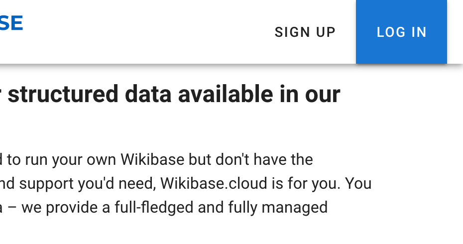
Problem:
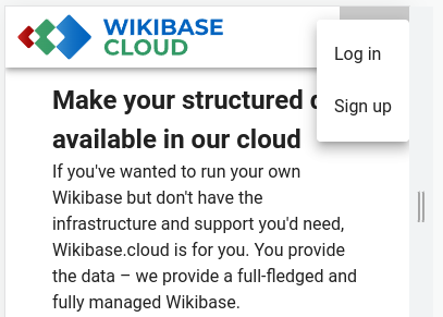
Currently the buttons in the header get cut off after a certain screen size and makes it impossible to log in or sign up. we want to support the usability of our website up to sreen width of 320px.

Example:

image.png (809×387 px, 34 KB)

mockups

Acceptance criteria:

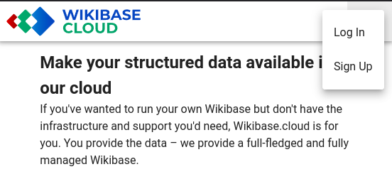
  • if the width of the view port allows it, the two buttons "sign up" and "log in" are visible and accessible
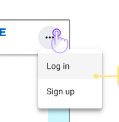
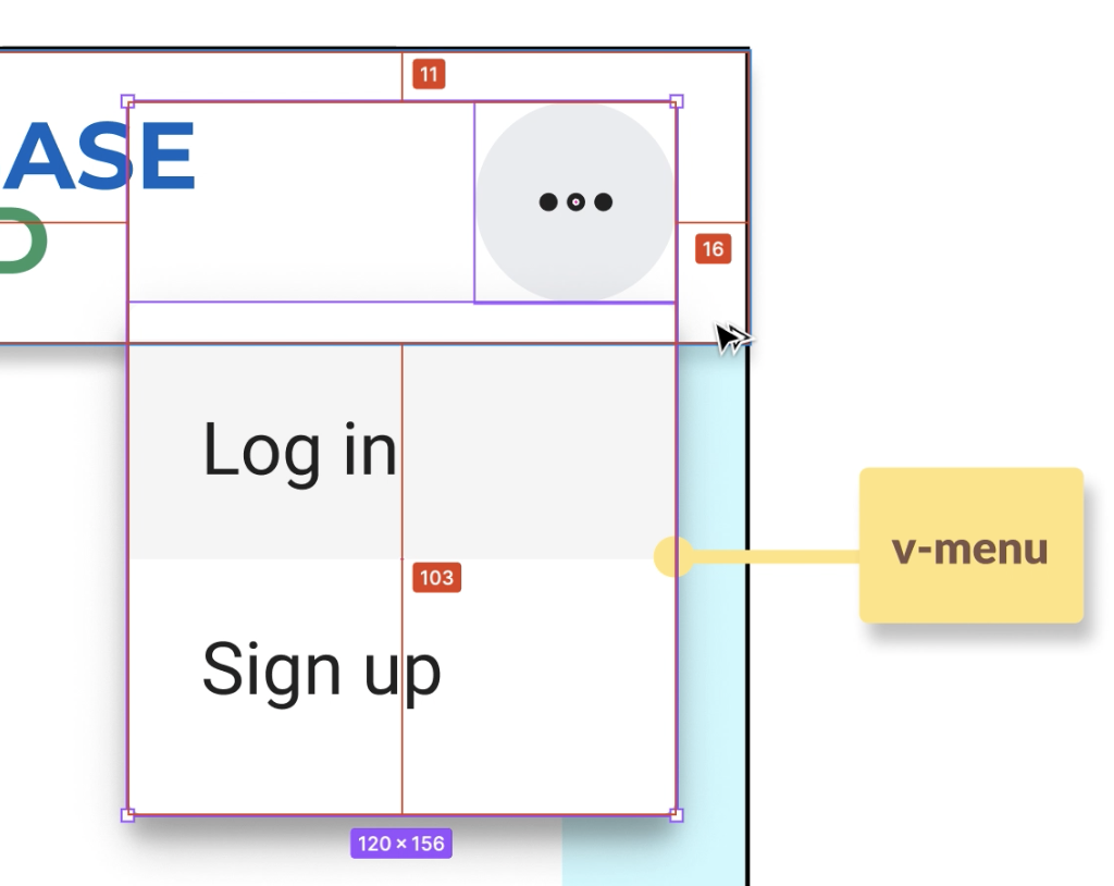
  • if the width does not allow for both buttons, we instead display an icon button
  • on click or via keyboard navigation, the icon button opens a menu, which include a link to the sign up page and a link to the log in page.

Open questions:

Event Timeline

There are a very large number of changes, so older changes are hidden. Show Older Changes
Tarrow updated Other Assignee, removed: Rosalie_WMDE.
dang removed dang as the assignee of this task.Jun 13 2023, 1:49 PM
dang moved this task from Doing to In Review on the Wikibase Cloud (Kanban board Q2 2023) board.
dang subscribed.
Tarrow changed the task status from Open to Stalled.Jun 19 2023, 9:22 AM
Tarrow added a subscriber: Sarai-WMDE.

Moved into stalled because we believe there is a discussion; that may or may not have yet happened between @dang and @Sarai-WMDE

Hey @Tarrow! The discussion between @dang and I took place. My recommendation was to follow the specs provided in order to unblock the task and to avoid any disruption (I assume that the same breakpoint must have been applied to other layout designs). I also encouraged Dat to share his recommendation here, so it could be considered by Charlie.

Tarrow changed the task status from Stalled to Open.Jun 20 2023, 9:19 AM

Cool! thanks! So whoever reviews this should look at ensuring that it is in agreement with the designs from Charlie :)

The current state of the PR does not seem to match the designs provided. I left a review here https://github.com/wbstack/ui/pull/660#pullrequestreview-1490237720

Fring removed Fring as the assignee of this task.Jun 21 2023, 9:11 AM
Fring moved this task from In Review to To do on the Wikibase Cloud (Kanban board Q2 2023) board.

I changed the list item styles accordingly. As for the sizing of the menu itself I am not sure how to proceed as it's simply impossible to meet the spec given in the Figma source: it does not respect screen borders. We could add some extra padding, but I'm not sure.

Fring removed Fring as the assignee of this task.Jun 21 2023, 10:12 AM
Fring moved this task from Doing to In Review on the Wikibase Cloud (Kanban board Q2 2023) board.

@Sarai-WMDE Hey! In Charlie's absence can you help us with how to handle the placement of this dropdown menu?

In the current version of the patch it looks like this:

image.png (291×407 px, 32 KB)

However on figma it looks like this:

image.png (172×168 px, 6 KB)

Exactly repeating what is on figma seems very hard to do and probably not what was intended (more than half the menu would be outside the view port). Is the current state in the in patch we have "acceptable"?

Exactly repeating what is on figma seems very hard to do and probably not what was intended (more than half the menu would be outside the view port). Is the current state in the in patch we have "acceptable"?

I'm sure the intention was for the menu to be displayed within the viewport. Thanks for the catch. To your question, we'll need Charlie to decide if the current state is acceptable: I noticed a couple of differences (simply judging from those screenshots) in the designs that should be considered in case we wanted to get the current implementation closer to the specs.

  • Menu's width: Looks like the menu's width is set to fit its content at the moment. Nevertheless, in Figma the menu seems to have a min width of 120px. To be confirmed by @Charlie_WMDE if this should be reflected in the implementation. I guess that width has to do with optimizing for touch.
  • Menu's placement: As seen in the specs, the button's icon should remain visible when the menu is displayed. In the specs, the menu is positioned right below the button (there's 0 margin between the two elements).
  • Margins: Charlie should confirm if the menu should "touch" the viewport's limit or if a margin is needed. In the designs, the three-dot menu in the header also has an end margin of 16px (which is currently missing, judging from the screenshot again). If that 16px margin was added after the button, then it could make sense to apply the same spacing to the menu to achieve alignment.

Screenshot 2023-06-23 at 16.17.30.png (814×1 px, 217 KB)

Tarrow changed the task status from Open to Stalled.Jun 27 2023, 8:41 AM
Tarrow removed Tarrow as the assignee of this task.
Tarrow moved this task from In Review to To do on the Wikibase Cloud (Kanban board Q2 2023) board.

Moving back to todo to await Charlie's return

Fring changed the task status from Stalled to In Progress.Jul 11 2023, 9:19 AM
Fring assigned this task to dang.
Fring moved this task from To do to Doing on the Wikibase Cloud (Kanban board Q3 2023) board.
  1. At the moment, the dropdown menu overlaps the 3-dots-icon and it's default by Vuetify v2, which is the version we are using. In Vuetify you can't use style or class to set custom style for <v-menu> so the dropdown menu stuck at that position.

To move it to the desired position as @Charlie_WMDE designed, we need to use content-class to customize v-menu because scoped level class doesn't work with content-class. But it adds too much complexity for such a small problem (which include creating a file such as styles.scss and import it). I think we should compromise and accept that it can't be perfect.

Screenshot from 2023-07-27 00-35-30.png (252×552 px, 37 KB)

Note: Update from Vuetify v2 to v3 will magically solve the problem
Dropdown in v2: https://v2.vuetifyjs.com/en/components/menus/#popover-menu:~:text=%23-,Use%20In%20components,-Menus%20can%20be
Dropdown in v3: https://vuetifyjs.com/en/components/menus/#use-in-components:~:text=Menus%20can%20be%20placed%20within%20almost%20any%20component.

  1. I had a chat with Charlie and we agreed to set to mobile breakpoint (the point which Log In and Sign up buttons collapsed into 3-dots-button) to 600px, which is the default breakpoint of vuejs.
dang removed dang as the assignee of this task.Jul 26 2023, 11:01 PM
dang moved this task from Doing to In Review on the Wikibase Cloud (Kanban board Q3 2023) board.
dang unsubscribed.
dang subscribed.
  1. At the moment, the dropdown menu overlaps the 3-dots-icon and it's default by Vuetify v2, which is the version we are using. In Vuetify you can't use style or class to set custom style for <v-menu> so the dropdown menu stuck at that position.

We should be able to position the menu below the button by passing offset-y to v-menu:

<v-menu offset-y transition="scale-transition" v-if="($vuetify.breakpoint.width < 600) && !isLoggedIn">
  <template v-slot:activator="{ on, attrs }">
...

We can also override any inline CSS styling added by v-menu using this hacky approach:

<v-menu content-class="menu" transition="scale-transition" v-if="($vuetify.breakpoint.width < 600) && !isLoggedIn">
  <template v-slot:activator="{ on, attrs }">
...
.menu {
  top: 56px !important;
}

We should be able to position the menu below the button by passing offset-y to v-menu:

Cheers! For those following along the docs and demo for this can be seen at https://v2.vuetifyjs.com/en/components/menus/#offset-y

I've also added a nudge-x since with the offset-y the menu was then drifting off the screen.

In addition to this issue I had a chat with @Charlie_WMDE and we agreed that we still saw the following issues:

  • the 600px breakpoint vs collapsing only when the content will no-longer fit. We agreed we would take another look at this but if definitely it's a lot of effort we will abandon it
  • keyboard navigation: currently it's not possible to tab navigate the links in the v-menu. *It does appear to be possible to navigate to them with the arrow keys*. We probably need to investigate how to properly use the attach prop (see: https://v2.vuetifyjs.com/en/components/menus/#accessibility)
  • the expanded (not three-dot) buttons in the header are larger than then figma spec. They should be only 44px high rather than stretching across the entire height of the toolbar
  • the 16px padding appears to be missing from the right of the three-dots button
Tarrow changed the task status from In Progress to Stalled.Jul 31 2023, 9:09 AM
Tarrow removed Tarrow as the assignee of this task.

Awaiting the return of @Charlie_WMDE to verify the work

@Tarrow That's 2 weeks, can you check with Sarai?

Some conversation about this from the daily:

check with Sarai?

I asked Charlie about this last week and I believe due to under-capacity in the UX team there isn't someone to take over while she's off.

also @dang claims he would also like to take a look at this and see if he can make it look a little better

I took a look at Tom's patches. Using internal-activator and offset-y isn't an optimal way to move the menu card because it also affects the button design.

Screenshot from 2023-08-01 14-08-52.png (75×302 px, 3 KB)

After hacking the <v-menu>

Screenshot from 2023-08-01 14-15-08.png (135×237 px, 3 KB)

How it's supposed to look like

In T334221#<v-menu offset-y transition="scale-transition" v-if="($vuetify.breakpoint.width < 600) && !isLoggedIn">
<template v-slot:activator="{ on, attrs }">9047215, @Andrew-WMDE wrote:
  1. At the moment, the dropdown menu overlaps the 3-dots-icon and it's default by Vuetify v2, which is the version we are using. In Vuetify you can't use style or class to set custom style for <v-menu> so the dropdown menu stuck at that position.

We should be able to position the menu below the button by passing offset-y to v-menu:

<v-menu offset-y transition="scale-transition" v-if="($vuetify.breakpoint.width < 600) && !isLoggedIn">
  <template v-slot:activator="{ on, attrs }">
...

We can also override any inline CSS styling added by v-menu using this hacky approach:

<v-menu content-class="menu" transition="scale-transition" v-if="($vuetify.breakpoint.width < 600) && !isLoggedIn">
  <template v-slot:activator="{ on, attrs }">
...
.menu {
  top: 56px !important;
}

Sadly scoped level CSS will not work with with content-class on <v-menu>. It required a separate CSS file

dang removed dang as the assignee of this task.Aug 1 2023, 3:01 PM
dang moved this task from Doing to In Review on the Wikibase Cloud (Kanban board Q3 2023) board.

Sadly scoped level CSS will not work with with content-class on <v-menu>. It required a separate CSS file

I don't know if I'm missing something but here's a patch with some nonsense styling demoing this concept: wbstack/ui/pull/708 | (POC) Using scoped CSS to style v-menu

Sadly scoped level CSS will not work with with content-class on <v-menu>. It required a separate CSS file

I don't know if I'm missing something but here's a patch with some nonsense styling demoing this concept: wbstack/ui/pull/708 | (POC) Using scoped CSS to style v-menu

oh nice I tested it wrong. Thanks for your suggestion, I came up with an idea without it messing with the original design

I fixed 2 things:

  1. The menu is now back to the original design. Dropdown menu is now fixed to a position under the dots-button
  2. Removed Log In and Sign Up when logged in

I took a look at Tom's patches. Using internal-activator and offset-y isn't an optimal way to move the menu card because it also affects the button design.

Screenshot from 2023-08-01 14-08-52.png (75×302 px, 3 KB)

After hacking the <v-menu>

Screenshot from 2023-08-01 14-15-08.png (135×237 px, 3 KB)

How it's supposed to look like

I think this is something that we're going back and forwards with but isn't the button supposed to look like a "real" button rather than the material design style full size thing? Looking at figma it's clearly a button with rounded corners

Tarrow changed the task status from Stalled to In Progress.Aug 16 2023, 9:21 AM

Charlie is home!

Honey I'm hooooome!

Here's what I have to say about the status:

YAYs

  • keyboard navigation works
  • menu alignment looks great
  • menu look matches the figma specs
  • spacing on the right of the log in button

NAYs

  • no spacing between sign up and log in button
  • no spacing to the left of the sign in button (no effect currently since we have a set breakpoint but should we adjust the header to be dyamically responsive or we include internationalisation, it will become relevant so for completeness/accuracy I would like to see the spacing there)
  • buttons are still full header size unlike figma specs where "regular" buttons are specified.

Let me know whether you'd like to have a chat about any of my comments @dang @Tarrow

am i looking at the right thing? @dang to me it still looks like this :(

grafik.png (490×930 px, 54 KB)

This is what I see locally... That's weird...

Screenshot from 2023-08-23 17-41-01.png (93×365 px, 3 KB)

@Charlie_WMDE Chould you check again? The Netlify preview didn't run because there are some conflicts with main branch. I resolved the conflict and now you can see the latest change in the mock UI.

@dang hey dat, thanks for fixing the issue! I think we're almost there! The two buttons looks great!

The last thing i noticed is that the icon button (the three dots) also has a rectangular shape? Looking at the vuetify component that would mean that tile style is being applied?

grafik.png (132×254 px, 3 KB)

My understanding was that the default icon button is round like so

grafik.png (156×200 px, 4 KB)

this was the style i also used in my specs. Can you have a look to see what's going on there? Thanks!

Edit: Sorry Dat, i just noticed one more thing. On hover, the buttons in your version are underlined. I don't see this behavior when looking at the vuetify components. Can you have a look here as well to see what's causing it?
{F37625440}

Hey @dang - for the new homepage we want to put more emphasis on signing up as the main CTA, since that's the purpose that page / the wikibase.cloud website serves (getting people to understand what Wikibase is and trying it out i.e. signing up).

Thus, we want to switch the highlight on the header button: Instead of Log in being the blue button and Sign up being just text, we want to blue button to be on Sign up. Basically just switch the styles.

For me it would be fine to just change text, no need to switch the position of the buttons around. Would that be something we can do within this ticket? Otherwise we'd have to touch this again when we do the homepage, also fine, just wanted to make this transparent. Thanks :)

adding this to make sure we mean the same thing :)

grafik.png (172×664 px, 8 KB)

@Charlie_WMDE @Evelien_WMDE I swapped the positions of Login and SignUp buttons. I also changed the dots button to icon so the hover shadow round is and removed the underlines

Hey @dang , looks great, thank you!

Thank you for also agreeing to switching around the buttons <3

Unfortunately this introduced another little inconsistency. The buttons somehow keep their focus state after being clicked. Video of current behavior of buttons. This happens to me on firefox and on chrome.

The normal behavior would be for them to go back to their original state after being clicked. Video of intended behavior of a button
Could you please check what is causing this? Thanks!

I also noticed that the Sign-up button seems to have elevation?

grafik.png (118×252 px, 5 KB)
Could you please remove that according to specs?
I noticed this because the Sign up button was slightly larger than the log in button, and I assume it's the elevation causing this, but if the size difference persists after the removal, we'll have to check again what the cause might be.

Thanks!

@Charlie_WMDE I removed the SignUp's elevation and also remove the focus state after clicking.
The size of a button depends on the length of the text by default. I saw that SignUp and LogIn buttons of your design have different sizes so I thought you want to keep it as default. I think it's better that way to match the length Sign Up and Log In in different language

Hey @dang I wasn't refering to the lenght of the button but the height. sorry for not expessiing myself more clearly. It seems ike the height is still mismatched by about 10 pixels. Could you check why that is?

Regarding the focus state, that is now fixed but instead there is no more hover state. Could you please check why that is and reinstate it? thanks!

dang removed dang as the assignee of this task.Aug 28 2023, 12:54 PM
dang moved this task from Doing to In Review on the Wikibase Cloud (Kanban board Q3 2023) board.
Tarrow changed the task status from In Progress to Open.Sep 1 2023, 9:19 AM
Evelien_WMDE claimed this task.