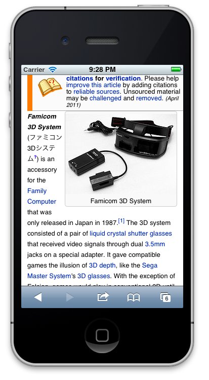
For example http://en.m.wikipedia.org/wiki/Famicom_3D_System#_ tries to fit both the image and text after the warning template making for a poor experience.
Version: unspecified
Severity: normal
| • Tfinc | |
| May 4 2012, 10:26 PM |
| F9357: Nintendo_3d_System.jpg | |
| Nov 22 2014, 12:23 AM |
For example http://en.m.wikipedia.org/wiki/Famicom_3D_System#_ tries to fit both the image and text after the warning template making for a poor experience.
Version: unspecified
Severity: normal
Do you mean there is no gap between the warning box and the article lead text?
if so we should probably add a margin at the bottom of these info boxes... maybe wrapping the entire content in a container with class 'lead'
I meant that were try to fit this tiny text column ("Famicon 3d System") and an image within the width of the browser. Instead lets show either the text or the image first bit not both at the same time.