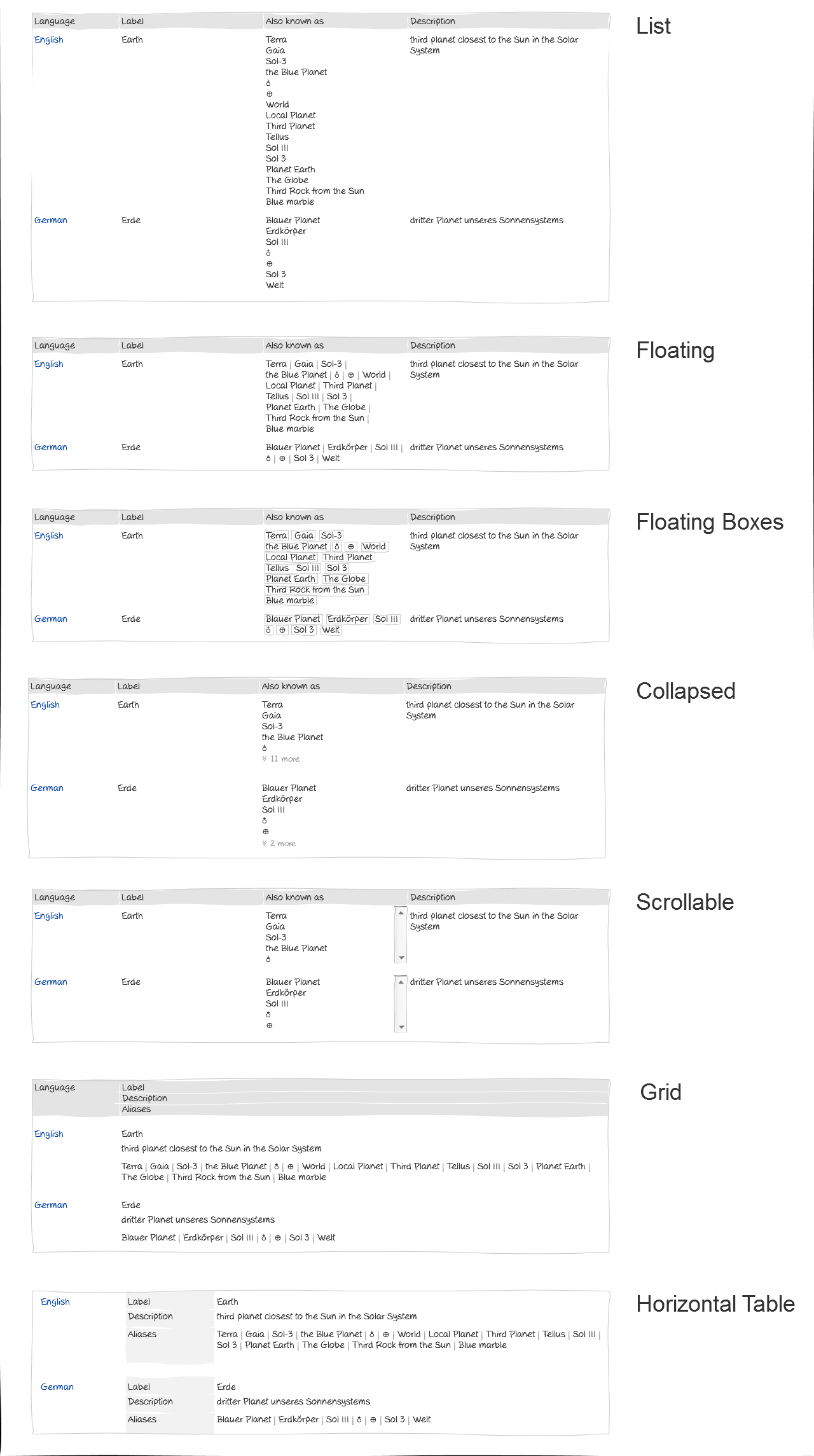
Items with many aliases (Barack Obama in Spanish for example) don't look good when every alias is on a new line. We need to find a solution for them.
Description
Description
| Status | Subtype | Assigned | Task | |
|---|---|---|---|---|
| · · · | ||||
| Invalid | None | T75654 Redesign Wikidata header | ||
| Open | None | T87579 [Story] investigate solutions for items with a large number of aliases | ||
| · · · |
Event Timeline
Comment Actions

Here are some quickly drawn alternatives just to have some options. Might want to have one or two options sketched out in more detail (-> edit mode). I really like the Grid option as it uses space most efficiently and the component is very mobile-friendly. Would be kind of a step back- and sideward but had that in mind at some point already. Might be a bit nasty to implement with proper semantics though.
| + | - | |
| List | easy to scan due to alignment | requires most vertical space and may cause losing orientation when there are many aliases |
| Floating (Boxes) | all aliases are visible within little amount of vertical space | not easy to scan |
| Collapsed | flexible (threshold may be set via some setting) | rather awkward to use |
| Scrollable | flexible (threshold may be set via some setting) | awkward to use |
| Grid | efficient use of space, very mobile-friendly, very flexible in terms of Entity header changes | rather uncommon layout arrangement though very contained in that use-case |
| Horizontal Table | good scan quality, mobile-friendly, very flexible in terms of Entity header changes | information overhead (repetition of labels) |
Comment Actions
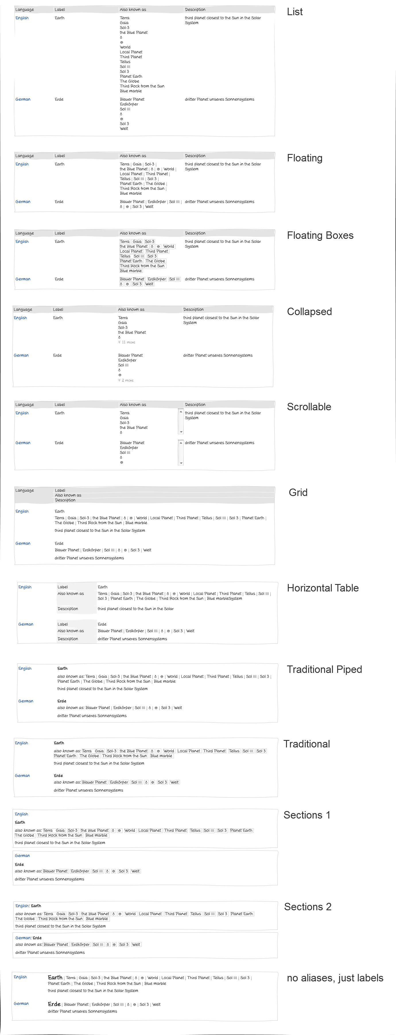
Other ideas:
- Horizontal table with headers in the left column (below language, maybe right-aligned)
- Horizontal table without the headers at all
Why is the description between aliases and label? To me it seems like aliases and labels are of the same kind, just different weight. I can also imagine something like this:
Schöneweide (also known as Schweineöde, Da bei der HTW, Berlin-Schöneweide )
Ein Stadtteil von Berlin
Probably bad for editing, though. Collapsed and Scrollable is not nice for editing, too.
Comment Actions
+1 to what @adrianheine suggested, but I would modify it like that:
Schöneweide
also known as Schweineöde, Da bei der HTW, Berlin-Schöneweide
Ein Stadtteil von Berlin
Comment Actions
Added a few more alternatives. It would be good to have as few redundant information as possible. Consequently, I am not in favour of repeating "also known as" in every section. How aliases are separated visually (boxes, pipes, considerable amount of white-space etc.) should probably not be defined yet although there are some alternatives in there already. The first outcome should be the sole arrangement of language, label, aliases and description.
I kind of like the direction Adrian was heading into and tweaked it even more resulting in the bottommost mock-up. Actually, the term "aliases" in particular is kind of misleading (explained at https://www.mediawiki.org/wiki/User:Henning_(WMDE)/Wikibase/Glossary#Alias). Aliases, in fact, are alternative labels. One could even argue that the implementation of label should be a list rather than having separate aliases. That's another story though.
Comment Actions
Stuff I wanted to write down for quite some time regarding that subject in general: https://www.mediawiki.org/wiki/User:Henning_(WMDE)/Wikibase/Concepts/Aliases
Comment Actions
Thanks for making those!
I think we should narrow it down to:
- floating
- traditional piped
- no aliases, just labels
Potentially also (but not super convinced):
- collapsed
- grid
Comment Actions
I am quite strongly against splitting the label and description by the aliases. The label and description together establish the identity of the item, whereas the aliases (which is indeed a bad term) are used to facilitate finding the item. No further meaning should be associated with these things.
The label and description are a semantic unit, whereas the aliases are outside of those. Aliases are not just more labels for the entity, or alternative labels. Instead, aliases are meant to help with the search, but not for establishing identity. E.g. 'George Bush' might be a decent alias for Q207, and the description could be 'US president', but it would not be a good label because label+description do not establish identity in that case. The alias is only there because we assume that users might search for 'George Bush', and then can select between the relevant items based on their actual label+description.
So, please put the label and description together again. This is also how it works in the entity selector (for good reasons), and this visual unity also sells the concept of the label and description being the identity providers for items.
Comment Actions
I think something like traditional or traditional piped would be good. Such layout would also better on items with lengthy labels, descriptions or aliases.
(e.g. "Krung Thep Mahanakhon Amon Rattanakosin Mahinthara Ayuthaya Mahadilok Phop Noppharat Ratchathani Burirom Udomratchaniwet Mahasathan Amon Piman Awatan Sathit Sakkathattiya Witsanukam Prasit" on the Bangkok item)
imho, it would also be more suitable for responsive design.
I also tend to agree with Denny, regarding position of the aliases (between label and description).
Comment Actions
Since the top line is not directly editable anymore anyway, also an option could be to set the Label in big letters in the top, description next to it (not under it), and the aliases below. This should also be pleasing aesthetically, and keeping the semantic unity of label+description.
Comment Actions
I talked about this with @Snaterlicious some more. His goal is to in the end just have one input field for labels and aliases. The first one could for example be bold/bigger to indicate it is the main name for the entity. From a usability standpoint I think this makes a lot of sense.
Comment Actions
@Lydia_Pintscher, please note that this contradicts the original intention and meaning of labels and aliases. Which is: label + description identify an item. Aliases are for searching only. Aliases are not meant to be some kind of "alternative labels".
Comment Actions
@Lydia_Pintscher curious to see a mockup of "one input field for labels and aliases". otherwise, I don't quite understand and not convinced it's a good idea to combine these like that.
Comment Actions
@Lydia_Pintscher I'm in favor of that approach, too. In practice (i. e., entity suggesters), labels and aliases identify items, not descriptions. Also, as you said, they are of the same kind, while label and description just serve the same purpose, but are different things.
This comment was removed by • adrianheine.
Comment Actions
We will move forward with the "floating" option as a next step. We will keep the order "label, description, alias" as it currently is since label and description is what people should see first to make sense of the entity.
This comment was removed by Epidosis.