opening the hamburger menu shouldn't shift the content left - the menu should come into the available white space
– @Jdlrobson and @KHammerstein
| Jdlrobson | |
| Jun 1 2015, 10:45 PM |
| F182736: Screen Shot 2015-06-23 at 3.11.22 PM.png | |
| Jun 23 2015, 10:09 PM |
| F182738: Screen Shot 2015-06-23 at 3.11.58 PM.png | |
| Jun 23 2015, 10:09 PM |
| F167567: Screen Shot 2015-05-21 at 3.05.28 PM.png | |
| Jun 1 2015, 10:45 PM |
opening the hamburger menu shouldn't shift the content left - the menu should come into the available white space
| Subject | Repo | Branch | Lines +/- | |
|---|---|---|---|---|
| WIP: No whitespace to right of menu | mediawiki/extensions/MobileFrontend | master | +27 -10 |
| Status | Subtype | Assigned | Task | ||
|---|---|---|---|---|---|
| Resolved | • rmoen | T101344 [EPIC] Push max-width and last modified work for mobile on desktop to stable | |||
| Declined | None | T104893 [EPIC]: Simplify navigation on mobile web | |||
| Invalid | Jdlrobson | T101044 Menu should not shift content in desktop mode |
+1 to what Jhernandez said. I'd like to see some mock-ups. What should happen when there is no white space at all? Should the menu cover the content body, or should it shift it to the right (the current behavior)? ping Design, @KHammerstein.
@bmansurov and I talked over hangout about how this could work. We decided to resolve this for now as this wouldn't make sense on tablet sizes. We can come back to this later if we spend more time on fine-tuning the left menu.
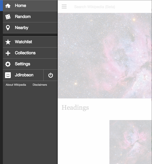
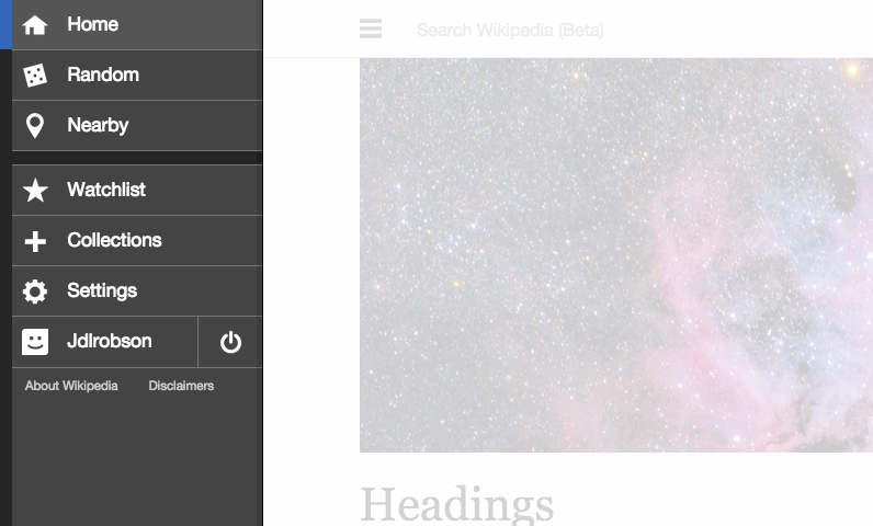
There should be no need for mock ups unless I'm missing something.. it should just snap to the left when max width comes into play:
What kind of tests were you looking for @Jhernandez - since this is visual and solution is likely to be pure css I'm not sure how we'd do that...
@Jdlrobson those images make it a lot clearer. I thought we were going to have the menu floating over the left instead of pushing the content to the right and occupying 100% height.
In such a case testing such visual change is not worth the effort I would say.
Change 222039 had a related patch set uploaded (by Jdlrobson):
WIP: No whitespace to right of menu
I had a go at this... it wasnt' as easy as I thought. Someone should feel free to pick up the patch I am not going to work on for the time being.
Note that the problem appears when someone visits the site in mobile mode in a very wide screen. Tablets or smart phones don't have this problem. When I talked to @KHammerstein about it we came to a conclusion that this bug/feature could wait and doesn't need fixing as urgently as we think.
Playing around with this and talking to @KHammerstein - I think this needs a lot more thought and design input with demos / prototypes. There are far too many cases to think about and I think fundamentally with the max-width the idea of the hamburger menu seems broken (whilst in old design it felt like you were pulling something from the side now that's not the case).
@phuedx @Jhernandez:
Talking with @KHammerstein we think it would make sense to close this task as invalid and fold this work into an epic around the new header designs.
@KHammerstein, @Jhernandez: I'm OK with @Jdlrobson's suggestion. Who's gonna create the epic(s)?
@KHammerstein can you create an epic regarding main menu UX and place it in
Web-Team-Backlog (Needs triage)? We'll prioritize it and backlog it.
When we have a response let's stall this task and link to the epic.