Page MenuHomePhabricator

Give header a max-width so that it is more connected to content on tablet + desktop
Closed, ResolvedPublic2 Estimated Story Points

Description

Minerva on desktop
Also,
T96332 Max width for special pages (watchlist, nearby)
T96327 Max-width for overlays (search, talk)

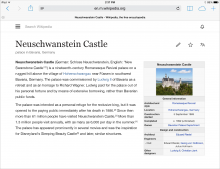
Currently the headers are full width on all devices. They should have a max-width of 893 to match the max-width of content, and to look more intentionally made for desktop.
The line will remain full width of screen

Current:

Screenshot_2015-04-16_16.13.49.png (844×2 px, 511 KB)

Design:

header-04.png (1×2 px, 534 KB)

Event Timeline

KHammerstein raised the priority of this task from to Needs Triage.
KHammerstein updated the task description. (Show Details)
KHammerstein subscribed.

I'll double check the 893 px width. I thought the current max-width of the content was 1000 px.

@phuedx and @kaity will confirm current page width

@KHammerstein, the way our icons are implemented does not allow us to match your design easily. If you look at the first screenshot (current behavior), there is some space around the hamburger icon. In your proposed design though, there is no space on the left of the icon. Is that intentional?

@bmansurov Yes its intended that the hamburger icon left-align with the content below if possible

Change 210200 had a related patch set uploaded (by Bmansurov):
Make the header center-aligned similar to the content

https://gerrit.wikimedia.org/r/210200

Change 210200 merged by jenkins-bot:
Alpha, Beta: Make the header center-aligned on tablet

https://gerrit.wikimedia.org/r/210200

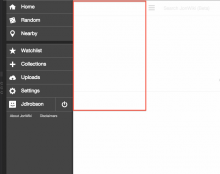
@kaity a few thoughts/feedback on this new design for you to muse over:

  • opening the hamburger menu probably shouldn't shift the content left - the menu should probably come into the available white space?
    Screen Shot 2015-05-21 at 3.05.28 PM.png (599×755 px, 42 KB)
  • Should the border be full screen? it seems like it should be clipped to where the content is

IIRC @KHammerstein signed this off at Wikimania-Hackathon-2015. I think we need to revisit @Jdlrobson's first point though.

@Jdlrobson
I agree, the menu shouldn't shift the content left. Should we create another task for that?