Page MenuHomePhabricator

Using Tab as keyboard shortcut in Flow entry fields: the active "Reply" button and source/VE toggle is almost indistinguishable
Closed, ResolvedPublic

Description

Using tab as a keyboard shortcut to hit reply would be very helpful -- personally, that's my #1 way to save edits on wiki pages.

This does work in Flow entry fields, but the difference between an active Reply button and a non-active button is difficult to see with the naked eye. The same is true of the source/VE toggle in Chrome source view. (Tabbing to the toggle doesn't work at all in Firefox; in Chrome VE it's fine.)

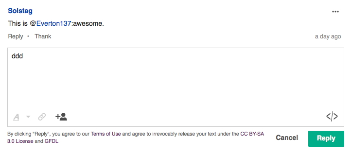
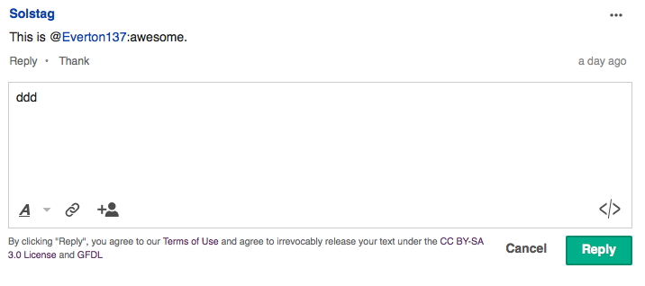
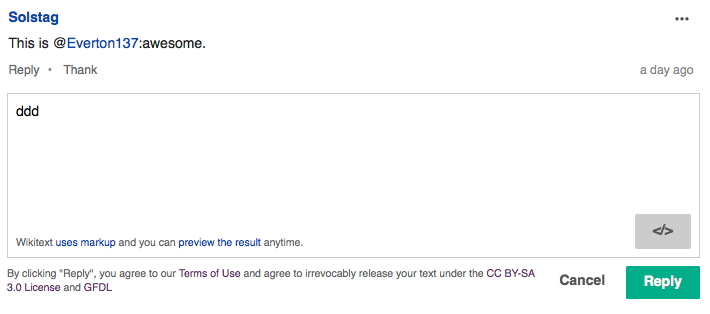
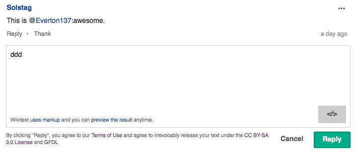
Here are screenshots of the active and non-active Reply and toggle buttons in VE mode and source mode. It's really hard to tell the difference.

@Pginer-WMF, this is probably bigger than Flow because of UI standardization, but is there anything we can do to make the active state easier to see?

ve inactive reply button.jpg (321×724 px, 60 KB)

ve active reply button.jpg (318×716 px, 60 KB)

source inactive reply button.jpg (314×710 px, 70 KB)

source active reply button.jpg (315×718 px, 74 KB)

chrome tab icon inactive.jpg (305×703 px, 71 KB)

chrome tab active icon.jpg (310×705 px, 71 KB)

Event Timeline

DannyH raised the priority of this task from to Medium.
DannyH updated the task description. (Show Details)
DannyH added subscribers: DannyH, Pginer-WMF.
DannyH renamed this task from Using Tab as keyboard shortcut in Flow entry fields: the active "Reply" button is almost indistinguishable to Using Tab as keyboard shortcut in Flow entry fields: the active "Reply" button and source/VE toggle is almost indistinguishable.Jun 2 2015, 10:25 PM
DannyH updated the task description. (Show Details)
DannyH set Security to None.

@Pginer-WMF, this is probably bigger than Flow because of UI standardization, but is there anything we can do to make the active state easier to see?

We should be using the standard buttons for consistency (and compatibility with future changes), but it is a good example for the UI-Standardization experts to evaluate the current status of button active state in practice.
Any thoughts @violetto, @Volker_E, @Prtksxna?

Good news is that @Volker_E is on this for Mediawiki UI. The button specs can be found here. The buttons are already up to spec on OOJS UI.

Keyboard navigation to the "Reply" button is only possible in Chrome, I'm hoping other browsers support keyboard navigation soon.

I've noticed the pattern to submit a form is usually the combination of Command + Enter (on mac) or Ctrl + Enter (on windows). Sometimes in a text field, tabbing adds a tabbed space into the content.

Updating these particular styles was blocked due to a few mixin patches. @Mattflaschen recently merged them, and I have updated the focus state. Here is the Patch-For-Review - https://gerrit.wikimedia.org/r/#/c/226060/.

There must be a tracking bug for these inconsistencies but I couldn't find it. Could someone please add it to the see also of this task? I'll update the commit message on Gerrit accordingly.

Prtksxna added a project: Patch-For-Review.

The patch should make the focus state look like this

Screen Shot 2015-07-21 at 4.46.14 PM.png (327×687 px, 46 KB)

Prtksxna removed a project: Patch-For-Review.
Prtksxna moved this task from Doing… to Done on the UI-Standardization board.