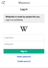
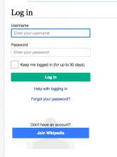
When we use the desktop login page the sign up button is more prominent.
Should this be quiet or blue?
We should standardise on one.
Description
| Status | Subtype | Assigned | Task | ||
|---|---|---|---|---|---|
| Open | None | T158181 Aim for workflow equivalence for MediaWiki on desktop and mobile web | |||
| Resolved | Jdlrobson | T71366 [EPIC] Extract Minerva skin from MobileFrontend to its own repository | |||
| Invalid | Florian | T74909 Login link redirect to default login (with MobileFrontend) | |||
| Resolved | Jdlrobson | T70758 No placeholders on account creation or login forms in Opera Mini | |||
| Resolved | Florian | T65328 MobileFrontend extension does not support LdapAuthentication | |||
| Invalid | Florian | T91636 Perhaps parse Mobile-frontend-generic-login further to avoid raw HTML in login form | |||
| Resolved | Jdlrobson | T74910 Getting rid of own login page (tracking) | |||
| Resolved | Jdlrobson | T108855 Standardise on sign up button |
Event Timeline
From the living style guide point of view, the button should be (if it will be a button and not an anchor like the "Forgot your password" link) a progressive one, because it starts a multi-step workflow. In my point of view, the progressive button looks good.
@Jdlrobson: Isn't this a Design question, too?
@Jdlrobson, the blue button is especially large, why's that the case?
I think the quiet button works better, unless if anyone else thinks differently. This page is about logging in, hence the action moving forward should be louder and clear.
I don't know. It's what's on the desktop login form has.
I suspect research showed it drove more sign ups to the site.
Maybe @MattFlaschen or @stevenwalling knows.
Anyway it should be the same on both mobile and desktop.
A lot of sites make Sign up/Create account very prominent when logged out. E.g. log out of Twitter then go to https://twitter.com/ . There's a 'New to Twitter' that takes up about 1/6 of the screen, plus a Sign up button before Log in.
(Regular users can probably figure out how to log in as long as it's not difficult, so it's not a big deal for them).
As far as research, see https://meta.wikimedia.org/wiki/Research:Account_creation_UX .
Side note:
If we decide it should be quiet rather than progressive, I would like to continue regardless in getting the desktop login form being used by the mobile skin. We can always resolve this afterwards if it needs more discussion and is important.
I'm going to recommend we push ahead and make the switch.
This current desktop login UI didn't come about until after I left WMF actually, and is an unintended result of someone changing the button styles as far as I can tell. I emailed Jared about it being wrong privately when I noticed it.
The original UI (mockup similar to what we shipped: https://commons.wikimedia.org/wiki/File:Screenshot_of_login_redesign_plus_secure_your_account_link.png) had login much larger than the signup call to action. That still seems the right priority to me. Signup as a CTA is a lower priority for users than login here. Making desktop UI match the mobile version seems fine.
@violetto @mattflaschen what say we make this quiet progressive? I do think it's a little bigger than it should be. Let me know what the commit message should say and I'm happy to make that change.
You can't really see hover states on mobile though. What about just a primary neutral button?
I'm not sure what I can do for you here. I don't care much what this link looks like.
It's blue when anonymous and quiet when logged in. I think this makes sense and is consistent on desktop and mobile. Seems correct to me, if not someone should reopen the bug with clear instructions.


