Page MenuHomePhabricator

Style of new anon edit warning
Closed, ResolvedPublic

Description

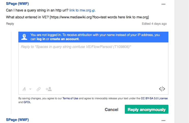
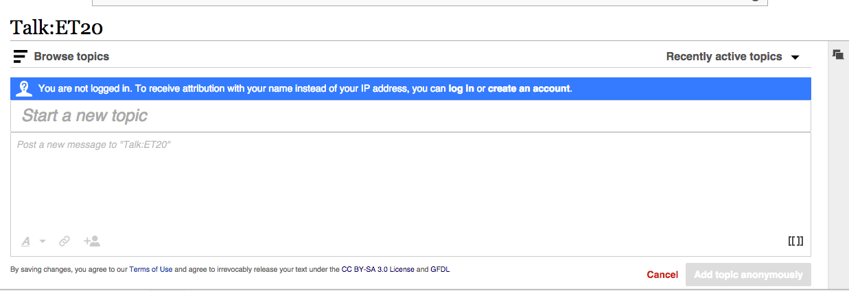
Roan's work on refactoring the editor with ooui (T103572) changed the placement and appearance of the anon edit warning. It was a blue tooltip on the side; now it's a box with text that appears above the entry field.

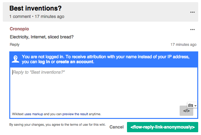
Here's a mockup of what the style should be.

anon-editing.png (482×742 px, 102 KB)

Event Timeline

DannyH assigned this task to Pginer-WMF.
DannyH raised the priority of this task from to Medium.
DannyH updated the task description. (Show Details)
DannyH subscribed.

As I understand this scenario we need to support two different needs:

  • For users that didn't realised they were logged out, we want to clearly communicate they are logged out. This is important since (a) the user may be focused on providing the reply, and (b) the mistake cannot be undone and has important implications: missing notifications, confusing participants and exposing IP addresses. Thus, we want to make it clear at first sight which is the status.
  • For users that want to edit anonymously, we don't want to convey they are doing something wrong if that is their conscious choice. Thus, it make sense to highlight the information in a positive way and don't present the log-in as a mandatory step.
  • For both kinds of users, considering that this is part of a repetitive activity as they participate in several conversations, it makes sense to present the information also in a quick to process way so that they don't have to read the message again.

With the above considerations, I think it makes sense to make the warning to be prominent but using blue (to avoid telling "you are doing wrong") and provide an icon to avoid users to quickly get the information at a glance (facilitating the decision maker as the user finds the situation repeatedly). Although the warning makes sense to be noticed before writing content (since the content is lost when users become logged-in) we can also consider to make the post more specific in this case (i.e., "post anonymously") in order to use it as a low-effort confirmation before your IP gets exposed accidentally.

A mockup below illustrates the idea:

anon-editing.png (482×742 px, 102 KB)

The icon is available here:

A compact alternative

This probably won't fit in the "small fixes we could make to improve the warning's appearance" scope that @DannyH defined for this task, but it may be worth exploring (based on comments from T108836)

If we consider a persistent warning to be too prominent for users that want to post anonymously we can use a more compact version focusing on just highlighting the status (without announcing the benefits of being logged-in).

anon-editing-compact.png (482×742 px, 95 KB)

  • A drop-down will allow the user to select either to log-in or create an account.
  • The placement aligns with the author location above the post content which makes sense.
  • This can be also used in combination with the option above (showing the expanded version with an option to close, or just the first time) and use the compact one later. However, any solution that requires remembering what anonymous users did may be tricky.
  • The specific label when posting will reinforce the action acting as a kind of low-effort confirmation.
DannyH updated the task description. (Show Details)
DannyH set Security to None.

The first mockup works great. I agree that dismissing it isn't necessary; you can dismiss it by logging in. :) Thanks, Pau!

Icon compressed with svgo and with the bounding box corrected to 24x24 (was 24x23).

A mockup below illustrates the idea:

anon-editing.png (482×742 px, 102 KB)

This looks great, thanks Pau! What is the hex value of the color blue you're using as a background there?

A mockup below illustrates the idea:

anon-editing.png (482×742 px, 102 KB)

This looks great, thanks Pau! What is the hex value of the color blue you're using as a background there?

#347BFF (It should be the standard blue for buttons, so there may be a variable in the LESS palette file for it)

Change 235936 had a related patch set uploaded (by Mooeypoo):
Design the anon warning widget

https://gerrit.wikimedia.org/r/235936

@Pginer-WMF designed per spec, including adding a different message for the submit button for anonymous users.

It looks a little different when you add new topic when the window is large-screen, because then the widget is only 1 line.
I don't think the difference in that case is that terrible, but can you go over it and verify?

If there is more room for the text to fit in one line, that is totally fine. I'll take a look to it to check how it finally looks (I'm having some problems with Vagrant right now). In any case I think it will improve the current situation where the warning is hard to spot.

I was able to test the patchset:

Grey border:

logout-flow-grey-border.png (260×1 px, 41 KB)

I noticed a grey border that makes the blue box not to align visually with the text area below and to look disconnected from it when it is active. Would it be possible to remove the border ("1px solid #ccc") form the warning element ( ".flow-ui-anonWarningWidget-active" CSS rule)?

This is how it should look after the change:

Screen Shot 2015-09-04 at 13.55.51.png (436×649 px, 52 KB)

One-line version:

Screen Shot 2015-09-04 at 13.52.54.png (790×969 px, 103 KB)

The one-line version looks good enough. Looking it in isolation I would reduce the icon a bit, but it is probably not worth it to detect both cases.

I also noticed that while the post button shows the "Add topic anonymously" label, the one for replies seems to be missing. Not sure if it is something that will get updated automatically with out localisation infrastructure or some issue we need to do something about.

Change 235936 merged by jenkins-bot:
Design the anon warning widget

https://gerrit.wikimedia.org/r/235936

Change 236998 had a related patch set uploaded (by Mooeypoo):
Set line-height: 0; to empty AnonWarningWidget

https://gerrit.wikimedia.org/r/236998

With collapsed Board:

Screen Shot 2015-09-09 at 3.56.59 PM.png (425×1 px, 61 KB)

With expanded Board:
Screen Shot 2015-09-09 at 3.57.17 PM.png (410×1 px, 88 KB)

Note:

  • "in": it's difficult to see the gap after the dot part of "i" - may look like "l"
  • links, e.g. "create an account" is difficult to differentiate from the text.

Change 236998 merged by jenkins-bot:
Set line-height: 0; to empty AnonWarningWidget

https://gerrit.wikimedia.org/r/236998