Page MenuHomePhabricator

Wikivoyage dropdown menus are hard to read because of opacity
Open, LowestPublic

Description

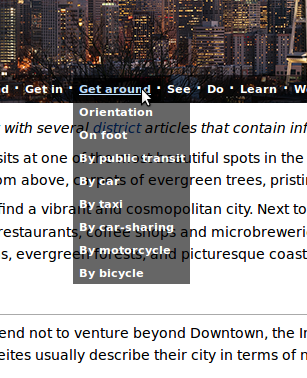
The new dropdown menus in the WikiVoyage ToC are hard to read because of the opacity.

Selection_003.png (378×307 px, 100 KB)

(also, the transition: all 0.5s ease 0s; makes it feel laggy when I scroll over multiple items. - this is Firefox specific though)

Example page: https://en.wikivoyage.org/wiki/Jaipur
Confirmed in: Firefox and Chromium (Ubuntu)

Event Timeline

Quiddity raised the priority of this task from to Needs Triage.
Quiddity updated the task description. (Show Details)
Quiddity added a project: Wikidata-Page-Banner.
Quiddity subscribed.
Restricted Application added a subscriber: Aklapper. · View Herald Transcript

Which browser? Platform? (Should I assume all?)

Is someone working on this bug?
I am interested in fixing this bug.

@Adishaporwal I'm not sure this bug is actionable in current form. It would be useful to have some input from a designer before going ahead and working on it.

Ok @Jdlrobson and please let me know if any help that I can provide.

Jdlrobson triaged this task as Lowest priority.Sep 23 2015, 6:11 PM

@Jdlrobson, can we get design feedback, as this is an ideal first-task for a beginner GCI contributor, in terms of difficulty?

Which browser? Platform? (Should I assume all?)

Sorry, details now added to description. (It looks identical in Firefox and Chromium, on Ubuntu. The subjective laggy feeling is only a problem in Firefox, so you can probably ignore/redact that part)

transition: all can be very expensive rendering-wise, it's always a good idea to limit transition to only affected/wanted properties.

Got just the one reply on the travellers pub pointing to a proposed redesign: https://en.wikivoyage.org/wiki/Wikivoyage_talk:Banner_Expedition#Alt_pagebanner_layout.3F

I think it's safe to say this is not a high priority right now. Moving to tracking until that changes.