Page MenuHomePhabricator

Clarify link and revert icons on notifications
Closed, ResolvedPublic

Description

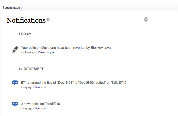
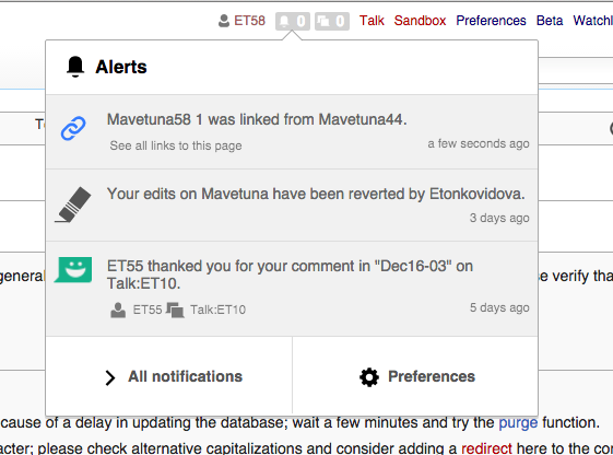
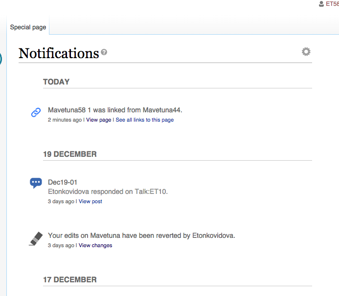
When observing the use of notifications we found some confusion about the link and revert icons.
This ticket proposes to replace them with the versions illustrated bellow:

icon-updates.png (282×992 px, 37 KB)

The current icons icons make sense when you have an understanding of the implications of linking and reverting actions (making content more connected, or replacing content with a previous version), but don't seem to immediately communicate their meaning. In the case of reverting it is also important not to present it under a negative light (that the user may feel as blaming) as a red trash can would.

Graphical assets
The SVG version of the icons are:

Event Timeline

Pginer-WMF raised the priority of this task from to Needs Triage.
Pginer-WMF updated the task description. (Show Details)
Pginer-WMF added a project: Notifications.
Pginer-WMF added subscribers: Pginer-WMF, Catrope.
Restricted Application added subscribers: StudiesWorld, Aklapper. · View Herald Transcript
Catrope triaged this task as Medium priority.Dec 16 2015, 4:14 PM
Catrope set Security to None.

Catrope.
I'd be interested in doing this task as I just did a similar one. Would it be possible to import this into the GCI website?
Thanks,
MtDu

Catrope.
I'd be interested in doing this task as I just did a similar one.

Great!

Would it be possible to import this into the GCI website?

I'm not a GCI admin, so I don't have access (I also don't know anything about how GCI works). @Legoktm: ?

Change 259785 had a related patch set uploaded (by Legoktm):
Clarify link and revert icons on notifications

https://gerrit.wikimedia.org/r/259785

Change 259785 merged by jenkins-bot:
Clarify link and revert icons on notifications

https://gerrit.wikimedia.org/r/259785

The reverted action icon usage:

Screen Shot 2015-12-19 at 11.04.04 AM.png (321×537 px, 42 KB)

Screen Shot 2015-12-19 at 11.04.31 AM.png (492×751 px, 52 KB)

Thanks for the screenshots @Etonkovidova.
Based on those, I think we could do some adjustments on the icon size to make them fit better with the existing ones. It seems that the revert icon is a bit bigger than average while the link one is smaller.

I tried to adjust the white space around the icons to make them more consistent. Please, consider updating with these versions:

I also updated the blue color to the new blue proposed at T109915 as standard. This is closer to the one used in current flow icons. So the transition to the new standard palette (if there are no further changes) would be less jarring for people getting a mix of old and new notification icons.

Change 264914 had a related patch set uploaded (by Catrope):
Tweak link-blue and revert icons

https://gerrit.wikimedia.org/r/264914

Change 264914 merged by jenkins-bot:
Tweak link-blue and revert icons

https://gerrit.wikimedia.org/r/264914